Analyzing Data Visualization Techniques
In this content, we explore various data visualization scenarios including trends in sales, age demographics, film preferences, and histogram construction. The graphical representations shed light on interpreting data effectively. Learn about histograms, bar charts, age distributions, film preferences, and frequency densities to enhance your data analysis skills.

Download Presentation

Please find below an Image/Link to download the presentation.
The content on the website is provided AS IS for your information and personal use only. It may not be sold, licensed, or shared on other websites without obtaining consent from the author.If you encounter any issues during the download, it is possible that the publisher has removed the file from their server.
You are allowed to download the files provided on this website for personal or commercial use, subject to the condition that they are used lawfully. All files are the property of their respective owners.
The content on the website is provided AS IS for your information and personal use only. It may not be sold, licensed, or shared on other websites without obtaining consent from the author.
E N D
Presentation Transcript
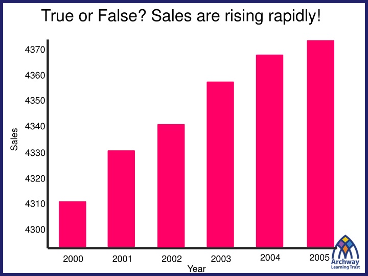
True or False? Sales are rising rapidly! 4370 4360 4350 4340 Sales 4330 4320 4310 4300 2004 2005 2000 2001 2002 2003 Year
True or False? There are more 15 year old boys than girls. Girls Boys 18 year olds 18 year olds 15 year olds 15 year olds 17 year olds 17 year olds 16 year olds 16 year olds
True or False? Twice as many people like Thriller s than Romance films. 150 120 100 Number of People 60 40 25 20 5 Action Thriller Horror Romance Comedy Favourite Films
Pablo is hosting a party. He counts how many people are between 15 and 20, and 20 and 50. Why is below graph unhelpful? How could we fix it? Age (years) 15 a < 20 20 a < 50 Frequency 15 15 Draw Graph Frequency 15 The 15 people in the second group are more spread out in age, but this graph seems to suggest that people s ages are spread out uniformly between 15 and 50. 10 20 30 40 50 Age
Lets presume that within each age group, the ages are evenly spread. Then there would 3 people of each age in the 15-20 group, and 0.5 people of each age in the 20-50 group. Age (years) 15 a < 20 20 a < 50 Frequency ? 15 15 ? Redraw Graph 3 Frequency Density The resulting diagram is known as a Histogram. The frequency per age is known as the frequency density . In general, given the frequency and class width, we can calculate it using: Frequency Density = Frequency Class Width Estimated Frequency 2 ? 1 10 20 30 40 50 Age
Bar Charts vs Histograms Bar Charts For discrete data. Frequency given by height of bars. ? Histograms For continuous data. Data divided into (potentially uneven) intervals. Frequency given by area of bars. ? ? ? Frequency Density Frequency 0.8m 1.2m 1.4m 1.6m 1.8m 6 7 8 9 Shoe Size Height
On your whiteboard What are the missing Frequency Density values? Weight (w kg) Frequency Frequency Density 4 1.2 2.6 1 ? ? 0 < w 10 10 < w 15 15 < w 35 35 < w 45 40 6 52 10 ? ? What are the missing Frequency values?
Title: Constructing Histograms To construct a histogram the frequency density values must be calculated. The vertical axis represents the frequency density values. The horizontal axis represents the continuous variable. Frequency Density is calculated by dividing the frequency of each group by the class width. Frequency Density
In your books: 1. Draw the Histograms for these two sets of data.
In your books: 1. Draw the Histograms for these two sets of data. ? ? ? ? ? ?? ?? ? ? ?? ?? ?? ?? ?? ?? ?? ?? ?.? ?.?
2. Work out the scale of the Frequency Density axis. Height (m) 0 ? < 5 Height (m) Height (m) 0 ? < 15 20 ? < 32 Frequency Frequency Frequency 60 30 6 4 2 16 3 12 ? ? 1 ? 2 8 1 4 0 10 20 20 28 36 0 10 20
Summary So Far Area: The area of a bar is equal to the frequency*. Purpose: Histograms allow us to display continuous grouped data. ? ? Working out the F.D. scale: If the frequency is known and the bar height is known, we can work out the scale using the formula on the left. ? Frequency Density Formula: Frequency Class Width ?