Analyzing Pleistocene Climate History Through Ice Core Data in MS Excel
Explore Pleistocene climate history using ice core data manipulated and plotted in MS Excel. Analyze climate proxy measurements from Antarctic cores, calculate ice accumulation rates, and examine temperature variations over different periods. The project involves tasks like data manipulation, plotting, and interpretation to understand past climate dynamics.

Uploaded on | 0 Views
Download Presentation

Please find below an Image/Link to download the presentation.
The content on the website is provided AS IS for your information and personal use only. It may not be sold, licensed, or shared on other websites without obtaining consent from the author. If you encounter any issues during the download, it is possible that the publisher has removed the file from their server.
You are allowed to download the files provided on this website for personal or commercial use, subject to the condition that they are used lawfully. All files are the property of their respective owners.
The content on the website is provided AS IS for your information and personal use only. It may not be sold, licensed, or shared on other websites without obtaining consent from the author.
E N D
Presentation Transcript
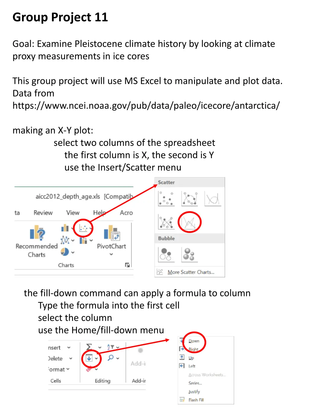
Group Project 11 Goal: Examine Pleistocene climate history by looking at climate proxy measurements in ice cores This group project will use MS Excel to manipulate and plot data. Data from https://www.ncei.noaa.gov/pub/data/paleo/icecore/antarctica/ making an X-Y plot: the first column is X, the second is Y use the Insert/Scatter menu select two columns of the spreadsheet the fill-down command can apply a formula to column Type the formula into the first cell select the column use the Home/fill-down menu
Group 1 1. Load the file Goup1_depth_age.xls, make a work copy (this is data from an Antarctic core) 2. Spot check the data by viewing the spreadsheet why are some ages negative? 3. calculate the ice accumulation rate Ddepth/Dage label Col 3 by typing Dd/Dt in row 1 in cell Col C Row 3 type the formula =(A3-A2)/(B3-B2) select Col C from Row 3 end of column and fill down 4. plot X=age, Y=Dd/Dt in range Row 3 to end describe the plot, what are the units, do they make sense? why is the beginning and end of the plot different from middle save the plot in a separate document (via screen save) then delete plot from spreadsheet 5. Copy and paste-as-values Col C to Col D and then delete Col D The last interglacial was about 115,000 to 130,000 years ago and the last glacial (ice age) ended about 12,000 years ago. So delete all row outside of the 5,000 to 150,000 year rane (but leave the column names)
Group Project 1 (Cont) 6. Plot the X=age and Y-Dd/Dt. save the plot in a separate document (via screen save) What is Dd/Dt a proxy for (in the most general terms) What is the overall range of variation? Are the present and last interglacial high or low compared the ice age? How stable (constant) was Dd/Dt during the ice age? Is there a Younger Dryas?
Group 2 1. Load the file Goup2_age_O18.xls, make a work copy (this is data from an Antarctic core) 2. Spot check the data by viewing the spreadsheet why are some ages negative? 3. calculate the temperature label Col C by typing T in row 1 in cell Col C Row 2 type the formula =(B2/10+30)*20/16-30 select Col C from Row 2 end of column and fill down 4. plot X=age, Y=T change the Y scale to the range -40 to -60 to improve plot describe the plot, what are the units, do they make sense? what is the overall range in temperature? save the plot in a separate document (via screen save) then delete plot from spreadsheet 5. Copy and paste-as-values Col C to Col D and then delete Col D
6. The last interglacial was about 115,000 to 130,000 years ago and the last glacial (ice age) ended about 12,000 years ago. So delete all row outside of the 5,000 to 150,000 year range (but leave the column names) Make a new plot. You will need to adjust the Y-axis again. 7. save the plot in a separate document (via screen save) Identify the Holocene, last glacial (ice age) and last interglacial What is the overall range of variation in temperature? Do the present and last have the same temperature? How stable (constant) was temperature during the ice age? Is there a Younger Dryas? FYI: I based the temperature formula on this plot of present-day temperatures. Don t use it for research purposes. -46
Group 3 1. Load the file Group3_age_CO2_o18.xlsx, make a work copy (this is data from an Antarctic core) 2. Spot check the data by viewing the spreadsheet What is the age range? Is CO2 lower or higher than today? 3. calculate the temperature label Col D by typing T in Row 1 in cell Col D Row 2 type the formula =(C2/10+30)*20/16-30 select Col D from Row 3 end of column and fill down 4. plot X=age, Y=CO2 change the Y scale to the range 150 to 300 to improve plot describe the plot, what are the units, do they make sense? what is the overall range in CO2? save the plot in a separate document (via screen save) 5. plot X=age, Y=T (put plot below previous plot) change the Y scale to the range -55 to -40 to improve plot describe the plot, what are the units, do they make sense? what is the overall range in T? compare the two plots. How similar are the shapes save the plot in a separate document (via screen save) then delete the plots
5. Copy and paste-as-values Col D to Col E and then delete Col D 6. The last interglacial was about 115,000 to 130,000 years ago and the last glacial (ice age) ended about 12,000 years ago. So delete all row outside of the 5,000 to 150,000 year range (but leave the column names) Make new plot. You will need to adjust the Y-axes again. 7. plot X=T Y=CO2 (copying COL B to E makes it easier but use a scatter plot with dots not lines adjust the axes again How well correlated are T and CO2? How much does T go up for a 100 ppm increase in CO2? How much has CO2 gone up in your lifetime? FYI: The O18 to T conversion is very approximate. Don t use it for research purposes.
Group 4 1. Load the file Group4_age_dust.xlsx, make a work copy (this is data from an Antarctic core) 2. Spot check the data by viewing the spreadsheet What is the age range? 3. plot X=age, Y=dust when was dust the highest? how would you describe the overall pattern 4. Let s focus on the last 25,000 years. So delete the dataset beyond that time. Replot the data. How sharp is the transition at the end of the Ice Age? 5. Let s compare the dust curve to the sea level rise curve below. A practical problem is the mismatch in direction so the time axis.
Group 4 6. Maybe one can switch the direction of the axes of Excel plots? You might research that and do it if you can. I would probably just change the sign of the age columns: Insert a blank column between age and dust, so that the black column is Col B. Then into Row 2 type ==-1*A2 then select column 2 from row 2 to the end and fill down. When you plot columns B and C, it will have the right direction. If you futz with the axes, you can get if from -24,000 to zero, like the sea level plot. In a separate document, align the two graphs and study and think about the relationship. When did dust turn off?


")


