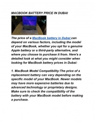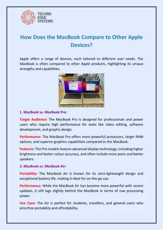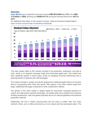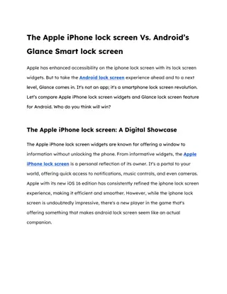
Apple Financial Performance: Insights and Analysis in Charts
Explore Apple's financial performance through a series of informative charts covering revenue growth, product sales trends, profitability comparisons, and more. Gain valuable insights into Apple's market position and growth strategies.

Download Presentation

Please find below an Image/Link to download the presentation.
The content on the website is provided AS IS for your information and personal use only. It may not be sold, licensed, or shared on other websites without obtaining consent from the author. If you encounter any issues during the download, it is possible that the publisher has removed the file from their server.
You are allowed to download the files provided on this website for personal or commercial use, subject to the condition that they are used lawfully. All files are the property of their respective owners.
The content on the website is provided AS IS for your information and personal use only. It may not be sold, licensed, or shared on other websites without obtaining consent from the author.
E N D
Presentation Transcript
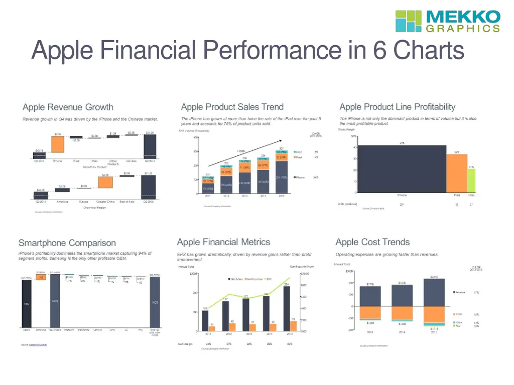
Apple Revenue Growth Revenue growth is driven by the iPhone and the Chinese market. Tip: Use a cascade chart, one of the unique chart types available in Mekko Graphics but not in PowerPoint, to walk your audience through the components of change. An axis break also helps to focus attention on the changes.
Apple Product Sales Trend The iPhone has grown at more than twice the rate of the iPad over the past 5 years and accounts for 75% of product units sold. Tip: The growth line shows overall volume changes but the CAGR column allows you to compare products over time. These chart enhancements are features of the Mekko Graphics add-in for PowerPoint.
Apple Product Line Profitability The iPhone is not only the largest product in terms of volume, but it is also the most profitable product. Tip: A bar mekko chart allows you to compare products on a key metric while adding another dimension (bar width) to help the audience understand the impact in a single chart. This is one of the most popular chart types for Mekko Graphics users.
Smartphone Comparison iPhone s profitability dominates the smartphone market capturing 94% of segment profits. Samsung is the only other profitable OEM. Tip: A cascade chart allows you to show positive and negative contributions to industry profits. You cannot do this using a pie chart or 100% stacked bar chart.
Apple Financial Metrics EPS has grown dramatically, driven by revenue gains rather than profit improvement. Tip: Adding a data row to this bar-line chart helps to reinforce the message that margin improvement is not the driver of earnings growth. You don t have to use manual text boxes for data when using Mekko Graphics.
Apple Cost Trends Operating expenses are growing faster than revenues. Tip: Adding a CAGR column to this stacked bar chart allows you to easily compare revenue and cost growth. You can calculate the CAGR directly in the Mekko Graphics data sheet and automatically align the data with your chart.
More Tips Start making your own charts or editing these charts by downloading a free 30-day trial of Mekko Graphics Get the Windows version Get the Mac version Save $100 on a Mekko Graphics annual subscription by using this promotional code: PROMO100OFF Visit our Chart Gallery to see more charts