Learn how to create effective presentations by avoiding common mistakes such as using bad color choices, distracting backgrounds, and poorly designed graphs. Ensure your content is easy to read, comprehend, and visually appealing for your audience.
Please find below an Image/Link to download the presentation.
The content on the website is provided AS IS for your information and personal use only. It may not be sold, licensed, or shared on other websites without obtaining consent from the author. If you encounter any issues during the download, it is possible that the publisher has removed the file from their server.
You are allowed to download the files provided on this website for personal or commercial use, subject to the condition that they are used lawfully. All files are the property of their respective owners.
The content on the website is provided AS IS for your information and personal use only. It may not be sold, licensed, or shared on other websites without obtaining consent from the author.
E N D
Presentation Transcript
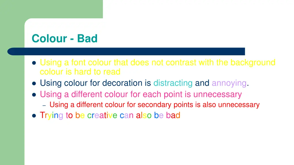
Colour - Bad Using a font colour that does not contrast with the background colour is hard to read Using colour for decoration is distracting and annoying. Using a different colour for each point is unnecessary Using a different colour for secondary points is also unnecessary Trying to be creative can also be bad
Background - Good Use backgrounds such as this one that are attractive but simple Use backgrounds which are light Use the same background consistently throughout your presentation
Background Bad Avoid backgrounds that are distracting or difficult to read from Always be consistent with the background that you use
Graphs - Good Use graphs rather than just charts and words Data in graphs is easier to comprehend & retain than is raw data Trends are easier to visualize in graph form Always title your graphs
Graphs - Bad January February March April Blue Balls Red Balls 20.4 30.6 27.4 38.6 90 20.4 31.6 34.6
Graphs - Good Items Sold in First Quarter of 2002 100 90 80 70 60 Blue Balls Red Balls 50 40 30 20 10 0 January February March April
Graphs - Bad 100 90 90 80 70 60 Blue Balls Red Balls 50 38.6 40 34.6 31.6 30.6 27.4 30 20.4 20.4 20 10 0 January February March April
Graphs - Bad Minor gridlines are unnecessary Font is too small Colours are illogical Title is missing Shading is distracting
Spelling and Grammar Proof your slides for: speling mistakes the use of of repeated words grammatical errors you might have make If English is not your first language, please have someone else check your presentation!