Cascading Style Sheets
Cascading Style Sheets (CSS) play a crucial role in defining the visual appearance of web pages. The evolution of CSS from CSS1 to CSS3 has brought about significant advancements in web design, introducing new features and improving styling capabilities. This overview covers the levels of CSS, content positioning, and different types of positioning such as relative and absolute. Understanding these concepts is essential for web developers to create visually appealing and well-structured websites.

Download Presentation

Please find below an Image/Link to download the presentation.
The content on the website is provided AS IS for your information and personal use only. It may not be sold, licensed, or shared on other websites without obtaining consent from the author. If you encounter any issues during the download, it is possible that the publisher has removed the file from their server.
You are allowed to download the files provided on this website for personal or commercial use, subject to the condition that they are used lawfully. All files are the property of their respective owners.
The content on the website is provided AS IS for your information and personal use only. It may not be sold, licensed, or shared on other websites without obtaining consent from the author.
E N D
Presentation Transcript
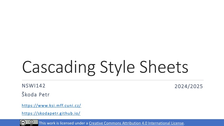
Cascading Style Sheets NSWI142 NSWI142 2024/2025 2024/2025 koda Petr koda Petr https://www.ksi.mff.cuni.cz/ https://www.ksi.mff.cuni.cz/ https://skodapetr.github.io/ https://skodapetr.github.io/ Creative Commons Attribution 4.0 International License This work is licensed under a Creative Commons Attribution 4.0 International License.
Levels CSS 1 (1996) The CSS Working Group considers the CSS1 specification to be obsolete. CSS 2 (1998) CSS 2.1 Once CSS2.1 became Candidate Recommendation - effectively though not officially the same level of stability as CSS2 - obsoleted the CSS2 Recommendation. CSS 3 (1999-present) CSS Level 3 builds on CSS Level 2 module by module, using the CSS2.1 specification as its core. Each module adds functionality and/or replaces part of the CSS2.1 specification. CSS4 There is no CSS Level 4. Independent modules can reach level 4 or beyond, but CSS the language no longer has levels. 2
Content positioning Positioning-related properties Size properties (related to box model) width, height size of the element contents min-/max- width/height size limits Location properties (for positioned elements only) top, bottom, left, right Distance from the edge at the corresponding side It does not make sense to set left, width, and right simultaneously width Content right padding margin 4
Content Positioning Page Rendering Algorithm The elements and their content are processed from the beginning to the end. Each element is positioned according to its size, margins, and display properties (block, inline, ). Except for the floating elements! This behavior can be modified by position property. Value Description static Default page rendering algorithm is used. relative Like static, but element is moved relative to its computed position after the layout is created. absolute Element is positioned inside closest positioning context. fixed Element is fixed within the browser viewport. sticky Sticks to ancestor viewport when scrolling. 5
Content Positioning Relative positioning Element is positioned by normal rendering algorithm. Afterwards, it is shifted from its computed position relatively. Can be combined with other position-related styles inline-block, floating elements. Often used in combination with absolute positioning. Relatively positioned element creates positioning context for its children. Top Relative div Left 6
Content Positioning Absolute positioning Nearest positioned element or the whole document. The content is taken out of the page layout. #positioned-div { position: absolute; left: 10px; right: 20px; top: 30px; height: 50px; } 30px 10px 50px positioned-div 20px Determined by parent width. Fixed positioning Like absolute positioning, but the frame of reference is the viewport. 7
Content Positioning Sticky Positioning Hybrid between relative and fixed positioning. Element is positioned regularly if it is entirely visible. When not entirely visible, due to scrolling, it is positioned relatively to its nearest scrolling viewport. Keep in mind there can be more than on scrolling viewport. top, right, bottom, or left specify the relative position and the threshold when the scrolling changes the behavior of the element. 8
Content Positioning Additional positioning-related properties z-index depth in the stack of positioned elements. Higher number is closer to the top. opacity useful (not only) for overlapping elements. 0 for fully transparent, and 1 for opaque. overflow when contents does not fit its explicitly-sized element. visible content overflows and may overlap. hidden content is cropped to the element boundaries. scroll scroll bars are added and the element has its own viewport in which the whole content is displayed. auto like scroll, but scroll bars are initially hidden. 9
Demo Positioning
Page layout Visual structure of the content blocks of the whole page or its logical part. Placement of menu-bar, additional sidebar, page header and footer, Placement of items in navigation, offered goods in e-shop, header There are different approaches. Whether the page scrolls as whole or not. How each container handle content overflows. menu bar side bar content footer 11
Page layout Creating Layout with Sidebars Tables Floating Sidebars Quite easy to design, but The sidebars must precede main content It is a little bit tricky to ensure correct sidebar height Absolute/Fixed Sidebars Cover the contents underneath Sidebars can be almost anywhere in the document More modern approach, which can be used for more complex situations than floating sidebars Slightly more difficult to design and code 12
Flex A way to create flexible smaller layouts (e.g., flow of UI controls) without too much customization. 13
Selected properties Flex - Container Properties Flex Item Properties display: flex order Items are sorted by their order values. Items with the same order are sorted by HTML positions. flex-direction Direction of main axis. flex-wrap Whether wrapping is allowed. flex-grow, flex-shrink How much should the item grow/shrink if there is space left or not enough space. justify-content Alignment and spacing along the main axis. flex-basis Default size of the item, before growing or shrinking. align-items, align-content Alignment, spacing, and padding along the cross axis. 14
Selected properties justify-content align-content align-items 15
Demo Flex
Grid Container Defines rectangular grid where items can be placed. Column/row sizes can be specified using various units, including new fr unit (fraction). Items Direct descendants (children) of the container. Aligned within grid lines (i.e., inside a rectangle). 17
Grid .container { display: grid; grid-template-columns: 50px auto 30vw; grid-template-rows: 40px 80px; } <div class="container"> <div class="item1"> </div> <div class="item2"> </div> <div class="item3"> </div> <div class="item4"> </div> </div> .item1 { grid-column: 1 / 2; grid-row: 1 / 3; } .item2 { grid-column: 2 / 3; grid-row: 2 / 3; } .item3 { grid-column: 3 / -1; grid-row: 2 / 3; } .item4 { grid-column: 1 / 2; grid-row: 2 / 4; } item4 item1 item3 item2 18
Grid .container { display: grid; grid-template-columns: ... grid-template-rows: ... grid-template-areas: "header header header" "main . sidebar" "footer footer footer"; } <div class="container"> <div class="item1"> </div> <div class="item2"> </div> <div class="item3"> </div> <div class="item4"> </div> </div> item1 .item1 { grid-area: header; } .item2 { grid-area: main; } .item3 { grid-area: sidebar; } .item4 { grid-area: footer; } item2 item3 item4 19
Grid Gaps and Alignment Spacing and alignment can be set for items within the cells as well as for cells themselves. Both horizontally and vertically Items can be smaller than cells And the grid may be smaller than container 20
Demo Grid
Center content Question: How do I center a div? Center floating or absolutely positioned elements with fixed width. margin-left: auto; margin-right: auto; Flex display: flex; align-items: center; justify-content: center; Grid display: grid; justify-content: center; align-content: center; 22
Calculating values Dynamic Computations in CSS var() Reads value of a custom property (CSS variable) Custom properties must start with -- calc() A function which can be used to compute CSS values Works for numeric values only Limited to basic operators +, -, *, and / :root { --gap: 20px; } body { padding: var(--gap); } #somediv { width: calc(100vh 2 * var(--gap)); } 23
Frameworks Predefined styles (and possibly scripts) which automatically handle various screen sizes. Many frameworks currently available Twitter Bootstrap W3.CSS Skeleton Foundation HTML5 Boilerplate HTML KickStart Responsive design <meta name="viewport" content="width=device-width,initial-scale=1.0"> 24
CSS Preprocessing Major CSS Issues Selectors are quite powerful but possibly tedious. Limited possibilities of using variables/calculations. Not particularly DRY-friendly. CSS Preprocessing Styles are written in preprocessing language and generated into CSS files. Several languages/tools available (LESS, SASS). 26
SASS Selector is updated to .message, .error Syntactically Awesome Stylesheets. .message { border: 3px solid yellow; } A style sheet language that extends CSS. .error { @extend .message; border-color: red; } It is interpreted into CSS files. The most important features are: Variables allow single definition of a value Nesting more logical organization of the styles, coming to CSS as well. Mixins CSS templates that can be reused Selector inheritance simplifies selector construction Scripting (loops, conditions, expressions, ) nav { ul { margin: 0; li { display: inline-block; } } } $size: 300px; @mixin mybox($width){ width: $width; } #div1 { @include mybox($size); } 27
SASS Partials and Includes Partial files are meant for including only Naming convention partial files start with underscore (e.g., _partial.scss ) Import directive @import is preprocessed CSS @import leads to another HTTP request SASS @import works like include in C/C++/PHP Typically used with partial files @import '_part.scss @include for mixins 28
Demo Container Query, ::has,
There is more YouTube Twitter Learn CSS CSS current work CSSBattle 31