Comparing MiddleMojo and The Moth: A Journalistic Analysis
Explore the contrasting styles of MiddleMojo and The Moth blogs in this critique. MiddleMojo focuses on music and storytelling, offering Q+As with artists and podcasts, while The Moth lacks organization and coherence, with overwhelming options and brief summaries on its Radio page.
Download Presentation

Please find below an Image/Link to download the presentation.
The content on the website is provided AS IS for your information and personal use only. It may not be sold, licensed, or shared on other websites without obtaining consent from the author. If you encounter any issues during the download, it is possible that the publisher has removed the file from their server.
You are allowed to download the files provided on this website for personal or commercial use, subject to the condition that they are used lawfully. All files are the property of their respective owners.
The content on the website is provided AS IS for your information and personal use only. It may not be sold, licensed, or shared on other websites without obtaining consent from the author.
E N D
Presentation Transcript
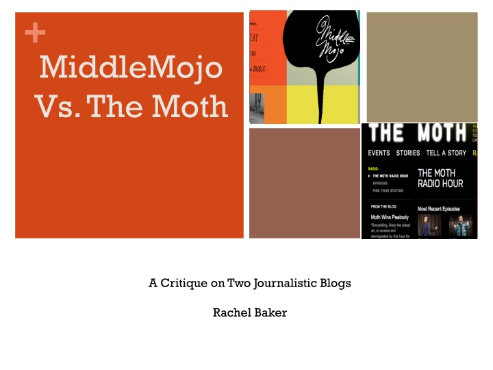
+ MiddleMojo Vs. The Moth A Critique on Two Journalistic Blogs Rachel Baker
+Blog Content Middle Mojo The Moth Theme is based on Music and creativity combined 1. Theme is focused on the craft of storytelling itself 1. Q+A s with music artists 2. 2. Includes podcasts Follows blog writer s creative process of music writing 3. 3. Does not involve the writer s storytelling style just other journalist s Includes a Listening Lab where blogger posts music from the artists she interviews 4. 4. Includes a Radio show which is airing on over 200 stations
+MiddleMojo The opening page follows the classic Z flow of design. The brightest color box is on the top left and the right, middle square is one of the lighter colors, so the eye goes straight to the top left corner box. It s easily navigable. Instead of listing sections horizontally, with no distinct/unique shape, the opening page reads as a chart or a game board. The colors of the boxes compliment one another. Each color is roughly in the same scheme.
+MiddleMojo (Contd) The inside pages are convenient. Sufficient image to text ratio Open feel not cluttered. Interview page allows you to read a snippet of the interview before clicking on the entire transcription. Organized flow Aesthetically pleasing
+The Moth Opening page slightly disorganized No leading lines Advertisements Contrasting colors Multiple slideshows per page Very busy
+The Moth (Contd) Radio Page doesn t allow listeners to sample the podcasts. Overwhelming options to choose from in every section Summaries of stories/podcasts are very brief
