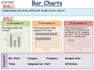
Creating Stunning Pie Charts in Microsoft Excel
Learn how to transform your data into visually appealing pie charts using Microsoft Excel. Follow step-by-step instructions to organize your data, select chart elements, and customize labels for a professional presentation. Enhance your data visualization skills with this comprehensive guide by Rene F. Pack, MIS.

Download Presentation

Please find below an Image/Link to download the presentation.
The content on the website is provided AS IS for your information and personal use only. It may not be sold, licensed, or shared on other websites without obtaining consent from the author. If you encounter any issues during the download, it is possible that the publisher has removed the file from their server.
You are allowed to download the files provided on this website for personal or commercial use, subject to the condition that they are used lawfully. All files are the property of their respective owners.
The content on the website is provided AS IS for your information and personal use only. It may not be sold, licensed, or shared on other websites without obtaining consent from the author.
E N D
Presentation Transcript
Making Data Into Charts USING MICROSOFT EXCEL by Rene F. Pack, MIS
Organizing Your Data The first step to creating a chart or graph is organizing your data. It can be organized either vertically or horizontally Horizontal Vertical by Rene F. Pack, MIS
Organizing Your Data Typically data is presented vertically Once you have your data organized you can begin the process of making a chart Vertical by Rene F. Pack, MIS
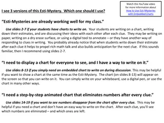
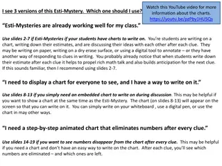
Pie Charts We will begin with a Pie Chart A Pie Chart shows the part of the whole Step 1: Select the titles and the data (DO NOT select the Total(s) , you only want the data in a Pie Chart.) Select the data and your titles Do not select the totals by Rene F. Pack, MIS
Pie Charts Step 2: Click the Insert tab on the Ribbon Click Pie in the Charts group Click Insert tab Click Pie Charts Group by Rene F. Pack, MIS
Pie Charts Step 3: Click the first 2-D Pie in the list by Rene F. Pack, MIS
Pie Charts Step 4: Voil a Pie Chart Monthly Sales Report 2012 January February March April May June July August September by Rene F. Pack, MIS
Pie Charts Step 5: If you want labels on the pieces of the Pie, position your mouse pointer over the pie and click the right mouse button Step 6: Click Add Data Labels in the pop-up menu by Rene F. Pack, MIS
Pie Charts Step 7: Now your chart should look like the one below If you want to change the labels just right click on one of the labels in the chart and click Format Data Labels Monthly Sales Report 2012 15,000 18,000 16,000 January 50,000 February 25,000 40,000 March April 35,000 24,000 May 19,000 42,000 June 9,000 30,000 by Rene F. Pack, MIS
Pie Charts Step 8: In the Format Data Labels Dialog Box, in the Label Options group you can choose a variety of label contents including Series Name Category Name Value Percentage In this case we will use Percentage and make sure that there is a check mark in Show Leader Lines Step 9: In the Label Position group choose Outside End Step 10: Click Close by Rene F. Pack, MIS
Pie Charts Here is your new chart Monthly Sales Report 2012 5% 6% 15% January 5% February March 8% April 12% May 11% June 7% July August 6% 13% September 3% 9% by Rene F. Pack, MIS
Single Line Chart Just like the Pie Chart Step 1: Select the titles and the data (DO NOT select the Total(s) , you only want the data in your chart.) Select the data and your titles Do not select the totals by Rene F. Pack, MIS
Single Line Chart Step 3: Click the first 2-D Line in the list by Rene F. Pack, MIS
Single Line Chart Step 4: Voil a Line Chart 60000 50000 40000 30000 20000 Series1 10000 0 by Rene F. Pack, MIS
Multiple Line Chart When you have Multiple Line Charts you are comparing data. For Instance comparing sales from one year to another and in this case we will be comparing 2011 to 2012 sales Step 1: Select the titles and the data for both years (DO NOT select the Total(s) , you only want the data in your chart.) Select the data and your titles by Rene F. Pack, MIS
Multiple Line Chart Step 3: Click the first 2-D Line in the list by Rene F. Pack, MIS
Multiple Line Chart Step 4: Voil a Multiple Line Chart 60000 50000 40000 30000 20000 Series1 10000 Series2 0 by Rene F. Pack, MIS