Creative Paper Cut-Outs for Color Blending Experiments
Explore the art of making two colors appear as one through inventive paper cut-outs in this colorful Albers exercise. Get inspired by examples created by high school students and push your creativity with more intricate cut-outs like Chinese paper traditions.

Download Presentation

Please find below an Image/Link to download the presentation.
The content on the website is provided AS IS for your information and personal use only. It may not be sold, licensed, or shared on other websites without obtaining consent from the author. If you encounter any issues during the download, it is possible that the publisher has removed the file from their server.
You are allowed to download the files provided on this website for personal or commercial use, subject to the condition that they are used lawfully. All files are the property of their respective owners.
The content on the website is provided AS IS for your information and personal use only. It may not be sold, licensed, or shared on other websites without obtaining consent from the author.
E N D
Presentation Transcript
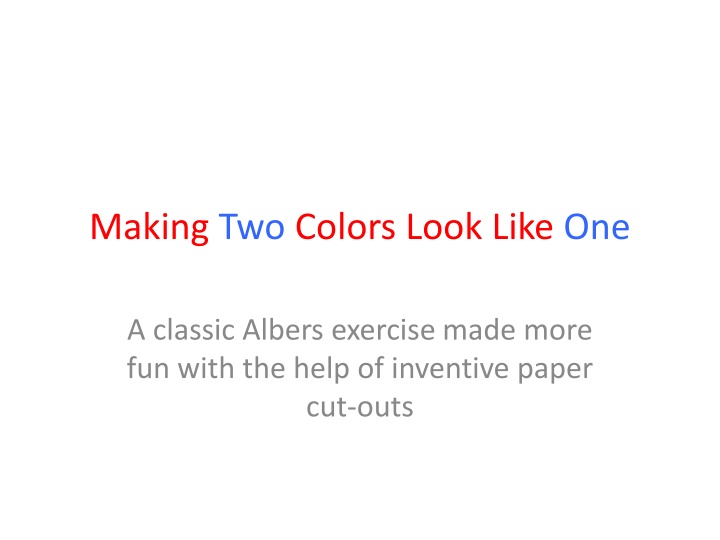
Making Two Colors Look Like One A classic Albers exercise made more fun with the help of inventive paper cut-outs
First example. You can see the true hues at the center (two conjoined triangles). All the cut-outs on the left are a red hue and the ones on the right are an orange hue, close but noticeably different colors. First there is an effect of Value the maroon is much darker. Then there is assimilation (Bezold), the yellow background makes the red-orange more of a standard orange and the maroon background makes the standard orange more of a red orange. Let see if we can do this starting with two adjacent hues for the cut-outs and find 1 shade and 1 tint for backgrounds. Your backgrounds should be opposite your cut-outs in terms of hue relationship. The shade on the right should express the cut-out hue on the left, plus black, while the tint on the left should express the hue of the cut- outs on the right, plus white.
In the case below the blue-green tint cut out at left has more blue than the green- yellow tint cut-out on the right. While both contain green and white, one has more yellow and less blue, one more blue and less yellow. (They have equal amounts of white.) This second example succeeds by staging an evening out of a hue the overtones of the cut-outs become the background and equalize the colors. I believe that the background on the left is a YYYG hue or shade 1 the background on the right is a BG shade 1. You can t do this completely analytically, but you can use your brain to look in the right zones and then let your eyes make the match. Some of you will have better analytic powers, others of you will have stronger intuitive ability to perceive color. Use the color aid chart and numbering to help.
Here the pinkish-violet color on the left, about RVR tint2, has more red-violet than the mauve color to the right, VRV tint 4, which has more blue-violet. Therefore the left cut-out must go on a bluer background, BV tint 4 and the right on a more red background, hue RVR. The cut-out to the left has less white than the one on the right, so not only is more blue added but also more white with the background of BV tint 4. The background on the right adds red and takes away the amount of white, evening the relationship. Whew! This is hard work, but it helps to use the color-aid charts.
All those examples were made by high school students. ( Im assuming very bright high school students.) But you are art students so I ask that you up your game when it comes to the cut- outs. Don t opt for simple triangles, create more skilled cut-outs by looking at some great paper traditions. Here are Chinese cut-outs.
Or the Victorian art of cutting cameo silhouettes
Just remember The cut-outs must be much smaller than the surrounding hues that will act upon them to equalize your chosen hues. You may want to use small curved scissors rather than the exacto knife. This exercise must be finished by next week. You should also study for your test and complete one more free choice assignment in your color journal.