Creative Ways to Use Tally Charts for Data Collection
Discover the effectiveness of tally charts for collecting data on favorite colors in group settings. Learn why tally charts are efficient tools for organizing and presenting information quickly and easily.

Download Presentation

Please find below an Image/Link to download the presentation.
The content on the website is provided AS IS for your information and personal use only. It may not be sold, licensed, or shared on other websites without obtaining consent from the author. If you encounter any issues during the download, it is possible that the publisher has removed the file from their server.
You are allowed to download the files provided on this website for personal or commercial use, subject to the condition that they are used lawfully. All files are the property of their respective owners.
The content on the website is provided AS IS for your information and personal use only. It may not be sold, licensed, or shared on other websites without obtaining consent from the author.
E N D
Presentation Transcript
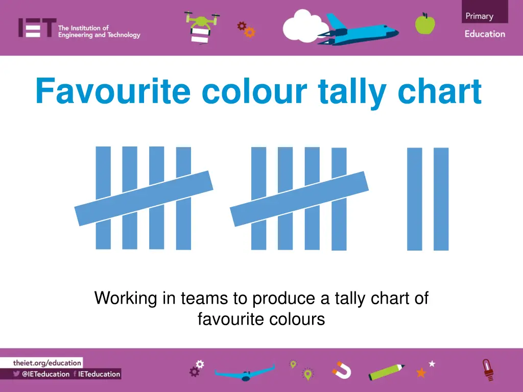
Favourite colour tally chart Working in teams to produce a tally chart of favourite colours
Why do we use tally charts? Why do we use tally charts? A tally chart is a quick and easy way of writing down and showing data. Tally marks are used instead of numbers or words. The totals are then added up. This makes them very easy and fast to produce!
Collecting your data Collecting your data Get into groups of three. Go round to each other group and ask each person what their favourite colour is. Record what they tell you in your tally chart. Add up the totals in the totals column. Which were the most and least favourite colours in the class?
Favourite colour tally chart Favourite colour tally chart Colour Tally Total Red Blue Green Yellow Purple Pink Orange Other