Data Visualization: Types, Uses, and Color Palettes
Data visualization involves visually presenting data to communicate information effectively. Learn about infographic and diagram types, common chart examples, and color palette options for engaging and informative visuals.
Download Presentation

Please find below an Image/Link to download the presentation.
The content on the website is provided AS IS for your information and personal use only. It may not be sold, licensed, or shared on other websites without obtaining consent from the author. If you encounter any issues during the download, it is possible that the publisher has removed the file from their server.
You are allowed to download the files provided on this website for personal or commercial use, subject to the condition that they are used lawfully. All files are the property of their respective owners.
The content on the website is provided AS IS for your information and personal use only. It may not be sold, licensed, or shared on other websites without obtaining consent from the author.
E N D
Presentation Transcript
What is data visualization? A simple definition of data visualization: Data visualization is the visual presentation of data or information. The goal of data visualization is to communicate data or information clearly and effectively to readers. Typically, data is visualized in the form of a chart, infographic, diagram or map. The field of data visualization combines both art and data science. While a data visualization can be creative and pleasing to look at, it should also be functional in its visual communication of the data.
Data visualization can be used for: Making data engaging and easily digestible Identifying trends and outliers within a set of data Telling a story found within the data Reinforcing an argument or opinion Highlighting the important parts of a set of data
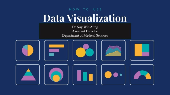
infographic types: the most common types of charts are: 1. Statistical infographics 2. Informational infographics 3. Timeline infographics 4. Process infographics 5. Geographic infographics 6. Comparison infographics 7. Hierarchical infographics 8. List infographics 9. Resume infographics 1. Bar graphs/charts 2. Line charts 3. Pie charts 4. Bubble charts 5. Stacked bar charts 6. Treemaps 7. Word clouds 8. Pictographs 9. Area charts 10.Scatter plot charts 11.Multi-series charts
the most common types of diagrams are: 1. Flowcharts 2. Mind maps 3. Venn diagrams 4. Tree diagrams 5. SWOT analysis 6. Fishbone diagrams 7. Histograms 8. Wireframes 9. Site maps 10.Use case diagrams
Types of Color Palette Three major types of color palette exist for data visualization: Qualitative palettes Sequential palettes Diverging palettes
Qualitative palette A qualitative palette is used when the variable is categorical in nature. Categorical variables are those that take on distinct labels without inherent ordering. Examples include country or state, race, and gender. Each possible value of the variable is assigned one color from a qualitative palette.
Sequential palette When the variable assigned to be colored is numeric or has inherently ordered values, then it can be depicted with a sequential palette. Colors are assigned to data values in a continuum, usually based on lightness, hue, or both.
Diverging palette If our numeric variable has a meaningful central value, like zero, then we can apply a diverging palette. A diverging palette is essentially a combination of two sequential palettes with a shared endpoint sitting at the central value. Values larger than the center are assigned to colors on one side of the center, while smaller values get assigned to colors on the opposing side.
Discrete vs. continuous palette Sequential and diverging palettes can be associated with data values in two different ways: either as a discrete set of colors, each one associated with a numeric range, or as a continuous function between numeric value and color.


