Learn about essential design principles for creating user-friendly graphical user interfaces (GUIs). Understand the importance of using appropriate language, providing the right amount of information, and designing an effective layout. Consider aspects like text elements, whitespace, and user expectations to enhance the usability of your interfaces.
Please find below an Image/Link to download the presentation.
The content on the website is provided AS IS for your information and personal use only. It may not be sold, licensed, or shared on other websites without obtaining consent from the author. If you encounter any issues during the download, it is possible that the publisher has removed the file from their server.
You are allowed to download the files provided on this website for personal or commercial use, subject to the condition that they are used lawfully. All files are the property of their respective owners.
The content on the website is provided AS IS for your information and personal use only. It may not be sold, licensed, or shared on other websites without obtaining consent from the author.
E N D
Presentation Transcript
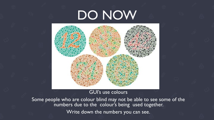
DO NOW GUI s use colours Some people who are colour blind may not be able to see some of the numbers due to the colour s being used together. Write down the numbers you can see.
Language The language used in an interface should be understandable by your users. Use Appropriate Language for User Needs The age, experience & accessibility needs should be considered in language used. Language aimed at children should be simple & with as few words as possible. Use Language Appropriate for User Skill Level Not all users will be technical users who know complex terminology. Technical language should be minimised to ensure users don t become confused.
Amount of Information We need to keep our users well informed. | However, too much information can be overwhelming. Provide an Appropriate Amount of Information for the Task An interface should provide relevant information & clear guidance. Excessive information can be overwhelming/confusing. Only provide what is needed. Make Appropriate Use of White Space Whitespace is areas that don t have text/images, just the background. Whitespace & text should be balanced as the eye needs an area to rest when reading.
Layout This is how the different elements (text, images, etc.) are positioned. | It hugely affects interface usability. Consistency There should be a consistent layout across different screens of the interface. For example, the menu should always be in the same position. Keep close to user expectations Matching our interface with ones that users have experience helps make it intuitive to use. Place important items prominently We read from top left to bottom right automatically. Position most important items high & left of the page is best.
Layout Cont. Some further considerations when designing the layout of the interface include the following. Group related tasks Items that relate to each other should be positioned next to each other. This way it s easy to find what you want. Use navigational components Search boxes, breadcrumbs & icons aid navigation to make the interface easier to use. Use input controls Appropriate input methods for forms (e.g. dropdown lists, tick boxes & toggles) make the interface faster/easier to use & reduces errors.
Your task Select one 1. Using software of your choice design a GUI for a mobile phone or a tablet that will be used by children aged 4 to 8 years old. 2. Using software of your choice design a GUI for a mobile phone or a tablet that will be used by a novice adult.