"Explore how line graphs present paired data effectively, with examples and solutions provided. Learn to create line graphs for different types of data, including categorical and numerical data, to visualize trends and changes over time."
Please find below an Image/Link to download the presentation.
The content on the website is provided AS IS for your information and personal use only. It may not be sold, licensed, or shared on other websites without obtaining consent from the author. If you encounter any issues during the download, it is possible that the publisher has removed the file from their server.
You are allowed to download the files provided on this website for personal or commercial use, subject to the condition that they are used lawfully. All files are the property of their respective owners.
The content on the website is provided AS IS for your information and personal use only. It may not be sold, licensed, or shared on other websites without obtaining consent from the author.
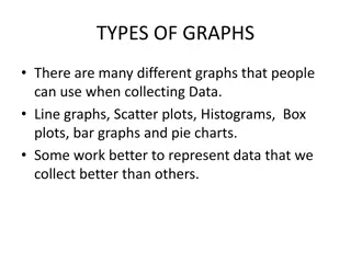
Line Graph Line graphs are used to display paired data. Lines may use time intervals on the horizontal axis. These intervals may be categorical such as months of the year or numerical such as year Line graph may allow us to see a trend or change over time more easily than a bar graph.
Example 1 Make a line graph from the given data. Month January February March April May June July August September October November Rainfall in inches. 1.2 1.0 2.7 3.1 2.5 1.6 1.2 1.1 2.1 1.7 2.5 December 2.3
Solution to Example 1 Solution: The month of the year is categorical, so it should be displayed on the horizontal axis which leaves rainfall in inches on the vertical axis. The rainfall varies from 1.1 inches to 3.1 inches, we can scale the vertical axis from 0 inches to 3.5 inches.
Example 2 Make a line graph using the following information. Quarter Profits 1st $450,000 2nd $345,000 3rd $620,000 4th $515,000
Example 3 Make a double line graph of data below: Year Blacksburg Christiansburg 1970 10,000 13,000 1980 21,000 14,000 1990 30,000 14,000 2000 38,000 16,000
Bar Graphs and Circle Graphs Histograms provide a useful visual display of the distribution of data. However, the data must be quantitative. In this section, we examine other types of graphs, some of which are suitable for qualitative data as well. Let s start with bar graphs. Bar graphs can be used to display quantitative or qualitative data. 10
Example 1 Bar Graph Figure 2-11 shows two bar graphs depicting the life expectancies for men and women born in the designated year. The graphs are called clustered bar graphs because there are two bars for each year of birth. One bar represents the life expectancy for men, and the other represents the life expectancy for women. The height of each bar represents the life expectancy (in years). Life Expectancy Figure 2-11 12
Bar Graphs An important feature illustrated in Figure 2-11(b) is that of a changing scale.Notice that the scale between 0 and 65 is compressed. The changing scale amplifies the apparent difference between life spans for men and women, as well as the increase in life spans from those born in 1980 to the projected span of those born in 2010. 2-11(b) 2-11(a) 13
Practice Problem 1: Draw a Bar Graph and a Pareto Chart A fitness club keeps a record of their clients information about how many times they come to the fitness center every month. The following table gives each person s name and the times they show up to the fitness center per month. Number of times showing up to the fitness center per month Frequency 3 8 13 12 7 4 Name Chris Jessica Tim Mike Peter Rose fitness exercise 12 10 8 Frequency 6 4 2 Bar Graph 0 Chris Jessica Tim Mike Peter Rose Names 15
Circle Graph or Pie Chart Another popular pictorial representation of data is the circle graph or pie chart. Circle graph, ( or pie chart): A circular shaped graph in which the wedge size of the circle visually displays proportional parts of the total population that share a common characteristic. A circle graph is used to show the relationship of parts to a whole and to each other. Each pie-shaped wedge represents a fractional part of a whole. The circle graph is very appropriate for qualitative data, or any data for which percentage of occurrence makes sense. 17
Example 2: Pie Chart Toss a dice 200 times, here are the frequencies observed. Construct a circle graph/pie chart for the data in the table below. 18
Example 2: Pie Chart For outcome 4: Percentage = 25 200 100 =12.5% No. of Degrees = 12.5 % 360o = 12.5 100 360o = 45o Calculating Percentages & Number of Degrees: Percentage = Frequency Total No. of Degrees = Percentage 100 100 360o Note There are 360 degrees in a circle. 19
Example 2: Pie Chart The total quantity, or 100%, is represented by the entire circle. Each wedge of the circle represents a component part of the total. Circle graphs usually indicate the percentages of the various categories that are being graphed. 20
Practice problem #2: Consider the following pie chart representing a sample of voter preferences for five different choices in a referendum. Which is the best estimate of the percentage of the population that supports choice "B"? A. 10% B. 20% C. 30% D. 40% Choice B accounts for about 20% of the whole. So the best estimate of the percentage of the population that supports choice B is 20%. 21
Practice problem #3: Mr. Brown makes $350 a week. How much money does he spend on entertainment each week? 13% A. $13.00 B. $42.00 C. $45.50 D. $87.50 350 * 13% = 350 * 0.13 = $45.50 22