Effective Monitoring with G Charts
Use the G Chart method to track rare events, such as on-the-job injuries or surgical failures, by monitoring the time intervals between occurrences. Learn how to implement G Charts, collect data, and interpret results for quality control purposes effectively.

Download Presentation

Please find below an Image/Link to download the presentation.
The content on the website is provided AS IS for your information and personal use only. It may not be sold, licensed, or shared on other websites without obtaining consent from the author. If you encounter any issues during the download, it is possible that the publisher has removed the file from their server.
You are allowed to download the files provided on this website for personal or commercial use, subject to the condition that they are used lawfully. All files are the property of their respective owners.
The content on the website is provided AS IS for your information and personal use only. It may not be sold, licensed, or shared on other websites without obtaining consent from the author.
E N D
Presentation Transcript
Attribute Control Charts (g Chart) When to use this tool Use the g Chart to monitor the number of opportunities or units (e.g., days, hours) between rarely occurring events such as on-the-job injuries or surgical failures. As an example, you might track the number of days between infection outbreaks or invoice error occurrences. An event can be characterized as rare when one or more of these conditions exists: More than 20% of the samples yield a count (events occurring in those samples) of zero. Tutorial: https://media.moresteam.com/university/tutorials/nonint/new/gchart.mp4 Tutorial: https://media.moresteam.com/university/tutorials/nonint/new/gchart.mp4 The denominator of a typical count-based control chart is so large that the control limits are extremely close to the average. The lower control limit (LCL) is missing.
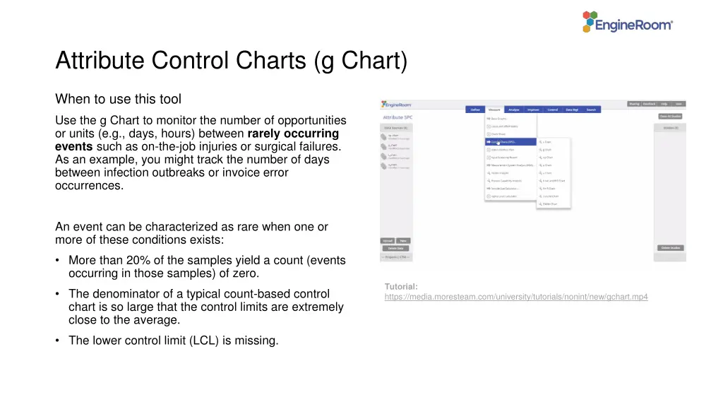
Using EngineRoom Measure > Control Charts (SPC) > g Chart
Using EngineRoom To use the g Chart, collect data on the rare event by documenting the dates of occurrence, the days until the occurrence, or the days between two occurrences. There are three drop zones attached to the study: Data Variable (required): You can use the dates of occurrences or time between occurrences as the data. This must be a date/time or numeric variable. Time Order Variable (optional): Use this variable if you want to label the x-axis with the timestamps of the occurrences. This variable can be numeric or date/time. Stage Variable (optional): Use if you have a variable identifying different stages (e.g., the before and after stages of an improvement initiative). This variable can be numeric, text, or date/time.
g Chart Example The data set contains a column showing the actual dates of the medication errors (Date) as well as the doses between medication errors (Doses b/w medication errors). In addition, it has a Stage variable containing the ID 1 for the year 2009 and 2 for the year 2010 You can create the g Chart in two ways using these data: 1. Using Dates of medication errors 2. Using Doses between medication errors
g Chart (Using Dates) Click on the data file in the data sources panel and drag Dates onto the Data Variable drop zone. Click Continue.
g Chart (Using Doses) Click on the data file in the data sources panel and drag Doses b/w medication errors onto the Data Variable drop zone. Click and drag Date onto the Time Order Variable drop zone. Click Continue.
g Chart Example Plotting Stages For either chart, you can use the Stage variable to get separate control limits for years 1 and 2: Drag Stage onto the Stage Variable drop zone. Click Continue.
g Chart Example Plotting Stages To plot the control limits based on the first stage only, click the graph setup button and under the Chart Display tab and select On. Click Save Changes.
g Chart Example Plotting Stages The chart now calculates control limits based only on the first stage:
")


")
")


