Effective Slide Design Tips for Academic Conferences
Learn how to enhance your presentation slides for academic conferences with tips on fonts, colors, layout, and content organization. Ensure your slides convey information clearly and engage your audience effectively.
Download Presentation

Please find below an Image/Link to download the presentation.
The content on the website is provided AS IS for your information and personal use only. It may not be sold, licensed, or shared on other websites without obtaining consent from the author. If you encounter any issues during the download, it is possible that the publisher has removed the file from their server.
You are allowed to download the files provided on this website for personal or commercial use, subject to the condition that they are used lawfully. All files are the property of their respective owners.
The content on the website is provided AS IS for your information and personal use only. It may not be sold, licensed, or shared on other websites without obtaining consent from the author.
E N D
Presentation Transcript
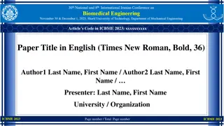
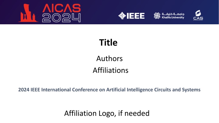
Title Authors Affiliations 2024 IEEE International Conference on Artificial Intelligence Circuits and Systems Affiliation Logo, if needed
Outline Background Page setup Fonts and colors General guideline for good slides Text and figures Saving and bringing your file 2
Page setup Set up the slide for Wide screen(16:9). Do not use A4 or 35mm slide. Take 5mm for top, bottom, right and left margins. All pages should be in horizontal (landscape) format, not vertical. No logos are permitted except on the title page. Put page number in the bottom right. 3
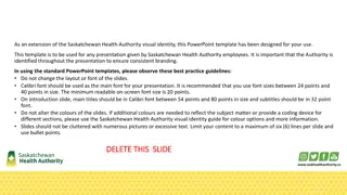
Fonts Use Calibri or Helvetica font in bold type. Use sans-serif fonts. Don t use serif fonts, which project poorly. ex.: Times New Roman, Century. Use 24 points or larger. Anything less than 20 points is too small (e.g., 18 points). Think about the audience watching your presentation from the back of a large ballroom. You have to be innovative to limit and reconfigure the contents of a slide to increase the font size. 4
Colors All backgrounds must be white with no pattern. Text must be in black. Color may be used only when it adds clarity of the presentation. Use colors with good contrast. Reds and blues are OK. Avoid yellows and light colors, except as local background in a boxed area. 5
Example: color and font choices This text is clear and standard but if your font is too thin, it won t be visible. This combination has good contrast. This combination will be impossible to see - no contrast. This 18-point text is too small. This combination is not suitable for color- vision deficient people. 6
General guidelines Keep concepts as simple as possible. Limit each page to one main idea. Use several simple figures rather than one complex one. Make duplicate copies of a page, if you plan to refer to it more than once. Do not plan to go back to a slide. Rehearse your talk aloud in front of colleagues. 7
Text slides Don t use lengthy sentences. Use short phrases and simple sentences. - Explain with sentences verbally but don t write the sentences on your slides. Use no more than 10 lines of text per page. 8
Graphs and figures Use a minimum line width of 2 points for all lines in drawings. Fonts embedded in figures should also comply with the text guidelines. Graphics imported from other programs may have small fonts & thin lines. - Completely redraw them, if you can t fix this. 9
Example of good figure Simple graph, with thick, bold axes, and large fonts 1.5 Case 1 Case 2 Case 3 Power ( W) 1.0 0.5 0.0 0 1 2 3 4 5 Delay (ps) 10
Example of bad figure Fonts & lines too small Colors difficult to read 1.4 Anneal 1 1.2 Anneal 2 Anneal 3 1 IDSAT (mA/um) 0.8 0.6 0.4 0.2 0 0 2 4 6 EOT (nm) 11
Saving your file Save your file with the following format "Session Name_Paper Sequence No_Presenter Name.pptx e.g.: B1L-B_2_Mike Phelps.pptx Bring your file to the conference using a USB memory stick. 12

