"Learn the essential steps for designing a standout CURC poster presentation, including guidelines on content, design, printing, and presentation delivery. Get expert advice on text sizes, color choices, and engaging your audience effectively. Discover how to craft a compelling poster that showcases your research or service-learning project with impact."
Please find below an Image/Link to download the presentation.
The content on the website is provided AS IS for your information and personal use only. It may not be sold, licensed, or shared on other websites without obtaining consent from the author. If you encounter any issues during the download, it is possible that the publisher has removed the file from their server.
You are allowed to download the files provided on this website for personal or commercial use, subject to the condition that they are used lawfully. All files are the property of their respective owners.
The content on the website is provided AS IS for your information and personal use only. It may not be sold, licensed, or shared on other websites without obtaining consent from the author.
E N D
Presentation Transcript
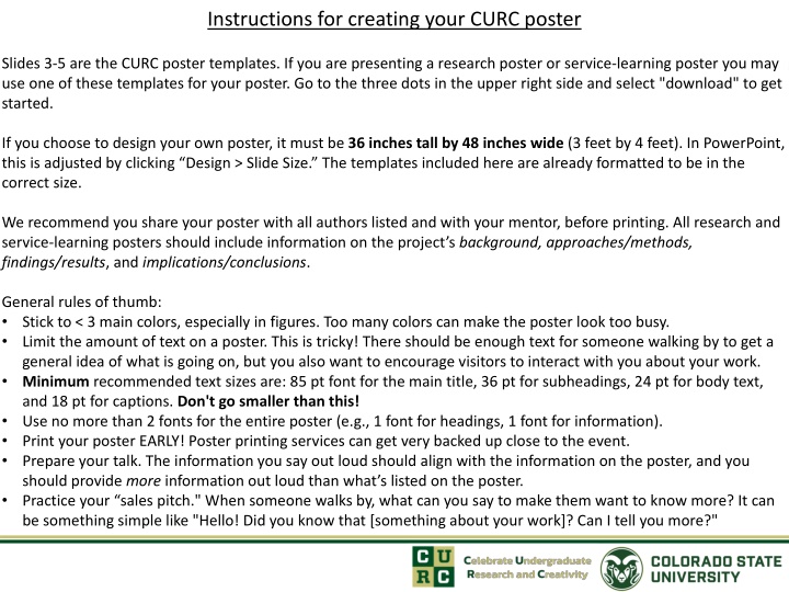
Instructions for creating your CURC poster Slides 3-5 are the CURC poster templates. If you are presenting a research poster or service-learning poster you may use one of these templates for your poster. Go to the three dots in the upper right side and select "download" to get started. If you choose to design your own poster, it must be 36 inches tall by 48 inches wide (3 feet by 4 feet). In PowerPoint, this is adjusted by clicking Design > Slide Size. The templates included here are already formatted to be in the correct size. We recommend you share your poster with all authors listed and with your mentor, before printing. All research and service-learning posters should include information on the project s background, approaches/methods, findings/results, and implications/conclusions. General rules of thumb: Stick to < 3 main colors, especially in figures. Too many colors can make the poster look too busy. Limit the amount of text on a poster. This is tricky! There should be enough text for someone walking by to get a general idea of what is going on, but you also want to encourage visitors to interact with you about your work. Minimum recommended text sizes are: 85 pt font for the main title, 36 pt for subheadings, 24 pt for body text, and 18 pt for captions. Don't go smaller than this! Use no more than 2 fonts for the entire poster (e.g., 1 font for headings, 1 font for information). Print your poster EARLY! Poster printing services can get very backed up close to the event. Prepare your talk. The information you say out loud should align with the information on the poster, and you should provide more information out loud than what s listed on the poster. Practice your sales pitch." When someone walks by, what can you say to make them want to know more? It can be something simple like "Hello! Did you know that [something about your work]? Can I tell you more?"
Printing your poster We recommend printing your poster before the week of CURC. Talk with your mentor to see if your department can assist in poster printing. All posters can be printed at the Morgan Library for a fee. Below are instructions on how to prepare your poster to print at the library. 1. Create your poster using one of the templates, and remove all other slides in the presentation so you have only 1 slide. (If you are designing your own poster, adjust the slide size under Design > Slide Size to be 36 tall x 48 wide). 2. Export your pptx slide as a PDF (NOTE: do NOT go to Print > Save as PDF, as this will probably force the document dimensions to the typical printing size of 8.5"x11". Instead, click File > Export. ) 3. Save your PDF file on a USB drive or email it to yourself. 4. Visit the Morgan Library Help Desk and one of the staff members will print it for you. You must be present when printing a poster. The Help Desk closes at 9:45pm and will not be able to print posters after 9:15pm. 5. Remove any excess white edges or borders off your printed poster using the library s poster slicer.
Eye-Catching, Informative Title [100pt, Arial Narrow Bold] Presenter First Last, Author 2, Author 3, Professor First Last [48pt, Arial Narrow Italic] College of ??? Background and Significance [72pt, Arial Narrow Bold] What background information might the audience need to know in order to understand your research? What are the questions you hope to address with your research? What are your hypotheses? Why is this work important? [48pt Arial Narrow]. Main Findings [72pt, Arial Narrow Bold] Results and Conclusions [72pt, Arial Narrow Bold] What are the results, findings, or outcomes from the project, experiment, or study? If you haven t quite completed some of the experiments, what are the possible or expected results, and what would they mean? This section is usually in the center of the board to emphasize it. Make sure you articulate your results clearly and with enthusiasm! You can always bold sentences to really emphasize importance. Try to limit words. Figures are more informative and appealing. [48pt Arial Narrow]. What do your results/findings mean? This section can be closely tied with FutureDirections and you may not need to separate them into different sections. Some general rules for any section: 1. Lists/bullet points can be nice. Concise language is best. 2. White space makes the poster look less busy, and usually more appealing to the audience. 3. Stick to 3 or less main colors if possible. 4. Be consistent with fonts and section sizes 5. Make sure figure text is legible 6. This example poster has a LOT of text. Try to make your poster have less. Figures > text. Future Directions [72pt, Arial Narrow Bold] You do not have to restrain yourself to these typical section titles. You can be more description, which ends up saving word-space as well. For example, instead of Main Findings you could make that heading Truncation Schemes Alter Optimized Positions , or something that concisely explains the main takeaway of that section. Figure 1. A brief description so someone can understand the figure if you aren t there to explain it. Make sure the figure font is legible when printed! Figure from Ref. 1. [36pt Arial Narrow]. Methods/Techniques/Experiments [72pt, Arial Narrow Bold] Acknowledgements [72pt, Arial Narrow Bold] What is your approach to answering the research questions/ testing your hypotheses? How does this method work? Do you use this method in a novel way? You may include pictures here if the particular method is very important to understanding the results. [48pt Arial Narrow]. Figure 2. a.) Figures and tables are essential to have in this section. Spending time on appealing, informative figures is worthwhile. Tables can be helpful but often that data is better portrayed in a figure/plot, especially if it is a larger table filled with numbers. b.) Multi-panel figures work well when the information is tied together. c.) Make sure to talk about each figure. Figure from Ref. 1. [36pt Arial Narrow]. You probably want to thank your research advisor and any other mentors. This is also the space to list any scholarships/internships/funding that in anyway made it easier/possible for you to do undergraduate research. [1] Klem, H., McCullagh, M. & Paton, R.S. Topics in Catalysis, 65, 165-186 (2022). Citations can go here. It is common to have 1-5 citations in the background and significance and methods/experiments sections. Follow the citation format that is most common in your field. [36pt Arial]
Eye-Catching, Informative Title [100pt, Arial Narrow Bold] Presenter First Last, Author 2, Author 3, Professor First Last [48pt, Arial Narrow Italic] College of ??? Background and Significance [72pt, Arial Narrow Bold] What background information might the audience need to know in order to understand your research? What are the questions you hope to address with your research? What are your hypotheses? Why is this work important? [48pt Arial Narrow]. Main Findings [72pt, Arial Narrow Bold] Results and Conclusions [72pt, Arial Narrow Bold] What do your results/findings mean? This section can be closely tied with FutureDirections and you may not need to separate them into different sections. Some general rules for any section: 1. Lists/bullet points can be nice. Concise language is best. 2. White space makes the poster look less busy, and usually more appealing to the audience. 3. Stick to 3 or less main colors if possible. 4. Be consistent with fonts and section sizes 5. Make sure figure text is legible 6. This example poster has a LOT of text. Try to make your poster have less. Figures > text. What are the results, findings, or outcomes from the project, experiment, or study? If you haven t quite completed some of the experiments, what are the possible or expected results, and what would they mean? This section is usually in the center of the board to emphasize it. Make sure you articulate your results clearly and with enthusiasm! You can always bold sentences to really emphasize importance. Try to limit words. Figures are more informative and appealing. [48pt Arial Narrow]. Future Directions [72pt, Arial Narrow Bold] You do not have to restrain yourself to these typical section titles. You can be more description, which ends up saving word-space as well. For example, instead of Main Findings you could make that heading Truncation Schemes Alter Optimized Positions , or something that concisely explains the main takeaway of that section. Figure 1. A brief description so someone can understand the figure if you aren t there to explain it. Make sure the figure font is legible when printed! Figure from Ref. 1. [36pt Arial Narrow]. Methods/Techniques/Experiments [72pt, Arial Narrow Bold] Acknowledgements [72pt, Arial Narrow Bold] What is your approach to answering the research questions/ testing your hypotheses? How does this method work? Do you use this method in a novel way? You may include pictures here if the particular method is very important to understanding the results. [48pt Arial Narrow]. You probably want to thank your research advisor and any other mentors. This is also the space to list any scholarships/internships/funding that in anyway made it easier/possible for you to do undergraduate research. Figure 2. a.) Figures and tables are essential to have in this section. Spending time on appealing, informative figures is worthwhile. Tables can be helpful but often that data is better portrayed in a figure/plot, especially if it is a larger table filled with numbers. b.) Multi-panel figures work well when the information is tied together. c.) Make sure to talk about each figure. Figure from Ref. 1.[36pt Arial Narrow]. [1] Klem, H., McCullagh, M. & Paton, R.S. Topics in Catalysis, 65, 165-186 (2022). Citations can go here. It is common to have 1-5 citations in the background and significance and methods/experiments sections. Follow the citation format that is most common in your field. [36pt Arial]
Eye-Catching, Informative Title [100pt, Arial Narrow Bold] Presenter First Last, Author 2, Author 3, Professor First Last [48pt, Arial Narrow Italic] College of ??? Background and Significance [72pt, Arial Narrow Bold] What background information might the audience need to know in order to understand your research? What are the questions you hope to address with your research? What are your hypotheses? Why is this work important? [48pt Arial Narrow]. Main Findings [72pt, Arial Narrow Bold] Results and Conclusions [72pt, Arial Narrow Bold] What do your results/findings mean? This section can be closely tied with FutureDirections and you may not need to separate them into different sections. Some general rules for any section: 1. Lists/bullet points can be nice. Concise language is best. 2. White space makes the poster look less busy, and usually more appealing to the audience. 3. Stick to 3 or less main colors if possible. 4. Be consistent with fonts and section sizes 5. Make sure figure text is legible 6. This example poster has a LOT of text. Try to make your poster have less. Figures > text. What are the results, findings, or outcomes from the project, experiment, or study? If you haven t quite completed some of the experiments, what are the possible or expected results, and what would they mean? This section is usually in the center of the board to emphasize it. Make sure you articulate your results clearly and with enthusiasm! You can always bold sentences to really emphasize importance. Try to limit words. Figures are more informative and appealing. [48pt Arial Narrow]. Future Directions [72pt, Arial Narrow Bold] You do not have to restrain yourself to these typical section titles. You can be more description, which ends up saving word-space as well. For example, instead of Main Findings you could make that heading Truncation Schemes Alter Optimized Positions , or something that concisely explains the main takeaway of that section. Figure 1. A brief description so someone can understand the figure if you aren t there to explain it. Make sure the figure font is legible when printed! Figure from Ref. 1. [36pt Arial Narrow]. Methods/Techniques/Experiments [72pt, Arial Narrow Bold] Acknowledgements [72pt, Arial Narrow Bold] What is your approach to answering the research questions/ testing your hypotheses? How does this method work? Do you use this method in a novel way? You may include pictures here if the particular method is very important to understanding the results. [48pt Arial Narrow]. Figure 2. a.) Figures and tables are essential to have in this section. Spending time on appealing, informative figures is worthwhile. Tables can be helpful but often that data is better portrayed in a figure/plot, especially if it is a larger table filled with numbers. b.) Multi-panel figures work well when the information is tied together. c.) Make sure to talk about each figure. Figure from Ref. 1. [36pt Arial Narrow]. You probably want to thank your research advisor and any other mentors. This is also the space to list any scholarships/internships/funding that in anyway made it easier/possible for you to do undergraduate research. [1] Klem, H., McCullagh, M. & Paton, R.S. Topics in Catalysis, 65, 165-186 (2022). Citations can go here. It is common to have 1-5 citations in the background and significance and methods/experiments sections. Follow the citation format that is most common in your field. [36pt Arial]
Catchy, Informative Title [100pt, Comic Sans Bold] Presenter First Last, Author 2, Author 3, Professor First Last [48pt, Comic Sans Italic] College of ??? Background and Significance [72pt, Comic Sans Bold] What background information might the audience need to know in order to understand your research? What are the questions you hope to address with your research? What are your hypotheses? What is the impact of this work? [48pt Comic Sans]. Main Findings [72pt, Comic Sans Bold] What are the results from the performed experiments? If you haven t quite completed some of the experiments, what are the possible results, and what would they mean? This section is usually in the center of the board to emphasize it. Make sure you articulate your results clearly and with enthusiasm! You can always bold sentences to really emphasize importance. Try to limit words. Figures are more informative and appealing. [48pt Arial Narrow]. Implications [72pt, Comic Sans Bold] What do your results mean? This section can be closely tied with FutureDirections and you may not need to separate them into different sections. Some general rules for any section: 1. Lists/bullet points can be nice. Concise language is best. 2. White space makes the poster look less busy, and usually more appealing to the audience. 3. Stick to 3 or less main colors if possible. 4. Be consistent with fonts and section sizes 5. Make sure figure text is legible 6. This example poster has a LOT of text. Try to make your poster have less. Figures > text. Future Directions [72pt, Comic Sans Bold] You do not have to restrain yourself to these typical section titles. You can be more description, which ends up saving word-space as well. For example, instead of Main Findings you could make that heading Truncation Schemes Alter Optimized Positions , or something that concisely explains the main takeaway of that section. Figure 1. A brief description so someone can understand the figure if you aren t there to explain it. Make sure the figure font is legible when printed! [36pt Arial Narrow]. Methods/Approach [72pt, Comic Sans Bold] What is your approach to answering the research questions/testing hypotheses? How does this method work? Do you have to use this method in a novel way? You could have pictures here if the particular method is really important to understanding the results. [48pt Comic Sans]. Acknowledgements [72pt, Comic Sans Bold] You probably want to thank your research advisor and any other mentors. This is also the space to list any scholarships/internships or funding that made it easier/possible for you to do undergraduate research. Figure 2. a.) Figures and tables are essential to have in this section. Spending time on appealing, informative figures is worthwhile. Tables can be helpful but often that data is better portrayed in a figure/plot, especially if it is a larger table filled with numbers. b.) Multi-panel figures work well when the information is tied together. c.) Make sure to talk about each figure. [36pt Arial Narrow].