Effective Visualizations for Business Cases with Data Storytelling
Learn about the power of data analytics in business, the significance of effective visual storytelling, and the importance of context in presenting information to drive informed decision-making. Discover how to tell compelling stories with data through appropriate visual displays and key strategies for impactful business communication.

Download Presentation

Please find below an Image/Link to download the presentation.
The content on the website is provided AS IS for your information and personal use only. It may not be sold, licensed, or shared on other websites without obtaining consent from the author. If you encounter any issues during the download, it is possible that the publisher has removed the file from their server.
You are allowed to download the files provided on this website for personal or commercial use, subject to the condition that they are used lawfully. All files are the property of their respective owners.
The content on the website is provided AS IS for your information and personal use only. It may not be sold, licensed, or shared on other websites without obtaining consent from the author.
E N D
Presentation Transcript
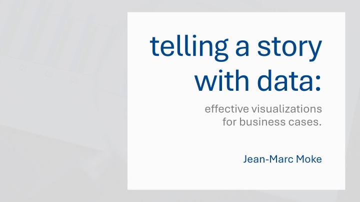
telling a story with data: effective visualizations for business cases. Jean-Marc Moke
Outline: 2
1. data analytics in the business world: an overview. 3
what are business analytics? Businesses collect data for insights. Techniques reveal trends and metrics. Promise to increase system efficiency. Example: Manufacturing companies record runtime, downtime, and work queues, analyze data to improve peak capacity of machines. 4
what are business analytics? Analytics do more than improve bottlenecks Businesses hire consultants to synthesize collected data. In-house or from graduate programs. In sum: Data-driven approaches inform business decisions. Good analysts ensure their story aligns with client needs. 5
2. showing vs. story-telling: telling business stories with visuals. 6
Analysts were asked to answer the prompt: When I m asked to When I m asked to show show the data, I the data, I feel feel Frustrated because I don t think I ll be able to tell the whole story. Inadequate. Boss: Can you drill down into that? Give me the split by x, y, and z. We aren t naturally good at telling stories with data (Knaflic, 2015) 7
Showing vs. Story-telling 6 keys for visual storytelling in business: Understand the context. Choose an appropriate visual display. Eliminate clutter. Focus attention on the important. Think like a designer. Tell the story! 8
3. the importance of context: who, what, and how. 9
the who, what, and how Consider this example: Who: The budget committee that can approve funding for continuation of the summer learning program. What: The summer learning program on science was a success; please approve budget of $X to continue. How: Illustrate success with data collected through the survey conducted before and after the pilot program. 10
the who, what, and how Questions that need answers: 1. What background information is relevant or essential? 2. Who is the decision maker? 3. What bias do they have? 4. What data would strengthen our case? 5. Where are the risks factors? 6. What would a successful outcome look like? 7. If you only had limited time, what would you say? 11
4. choosing effective visuals general recommendations for visual storytelling. 12
outline I. Recommended Visuals: Simple Text Scatterplots Line Graphs Bar Graphs II. Graphs you avoid at all costs. 13
Simple Text Job Satisfaction in the U.S. Job Satisfaction in the U.S. % of American employees who reported satisfaction across 26 job components. Figure 1 70 Job Satisfaction original graph 62% 60 50 43% 40 30 20 10 0 2010 2022 Note. The 26 components were separated into compensation and non-compensation factors. Source Source: Job Satisfaction 2023, THE CONFERENCE BOARD Consumer Confidence Survey, Nov. 2022 14
Simple Text 62% 62% of American employees feel satisfied with their job feel satisfied with their job in 2022, compared to 43% in 2010 Figure 2 Job Satisfaction simple text makeover 15
Scatterplots Figure 3 Scatterplot: Basic 16
Scatterplots Figure 4 Scatterplot: Focused 17
Line Graphs Figure 5 Time Series Examples 18
Line Graphs Figure 5 Left: Simple Slope graph Right: Focused Slope graph 2022 2023 2022 2023 19
Bar Graphs Too much 8 7 2019 6 2020 5 2021 Figure 6 4 2022 3 2023 2 Basic 2024 1 Bar Graph 2025 0 Recommendations A B C D Too thin Too thick Just right 20
Graphs to avoid The pie chart Figures 7 & 8 Pie and Donut 26% 34% charts Supplier A Supplier B Supplier C Supplier D The donut chart 9% 31% 21
5. summary 6 things to remember. 22
6 things to remember: Always know your audience. Choose a visual display they will understand. Clutter is your enemy. Focus attention on the important. Form follows function. KEY KEY: Remember your story! 23
thank you. Jean-Marc Moke PSYC6135: The Psychology of Data Visualization Dr. Michael Friendly April 11, 2024 24
References Berinato, S. (2016, June). Analytics and data science: Visualizations the really work. Harvard Business Review, 92-100. https://hbr.org/2016/06/visualizations-that- really-work Knaflic, C. N. (2015). Storytelling with data: A data visualization guide for business professionals. Wiley. Lavelle, A., Mat , A., Trujillo, J., & Rizzi, S. (2024). Visualization requirements for business intelligence analytics: A goal-based, iterative framework. 2019 IEEE 27th International Requirements Engineering Conference (RE), pp. 109-119. https://ieeexplore.ieee.org/document/10428306. The Conference Board. (2023, May). Job Satisfaction 2023: US Worker Satisfaction Continues to Increase. https://www.conference- board.org/pdfdownload.cfm?masterProductID=46114. Zheng, J. G. (2017). Data Visualization in Business Intelligence. In J. M. Munoz (Eds.), Global business intelligence (pg. 67-81). Routledge. 25


