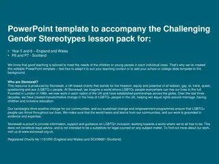
Enhance Your Presentation with Master Slide Background Customization
"Learn how to easily change background shapes and logos in your presentation by accessing the slide master. Utilize recommended font styles, colors, and spacing techniques to create visually appealing slides. Improve readability and visual hierarchy with serif and sans serif fonts, along with proper alignment and contrast. Follow these tips to create a professional and engaging presentation design."

Download Presentation

Please find below an Image/Link to download the presentation.
The content on the website is provided AS IS for your information and personal use only. It may not be sold, licensed, or shared on other websites without obtaining consent from the author. If you encounter any issues during the download, it is possible that the publisher has removed the file from their server.
You are allowed to download the files provided on this website for personal or commercial use, subject to the condition that they are used lawfully. All files are the property of their respective owners.
The content on the website is provided AS IS for your information and personal use only. It may not be sold, licensed, or shared on other websites without obtaining consent from the author.
E N D
Presentation Transcript
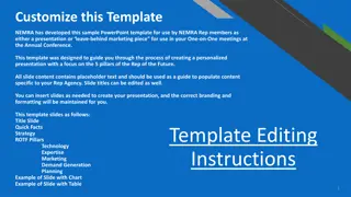
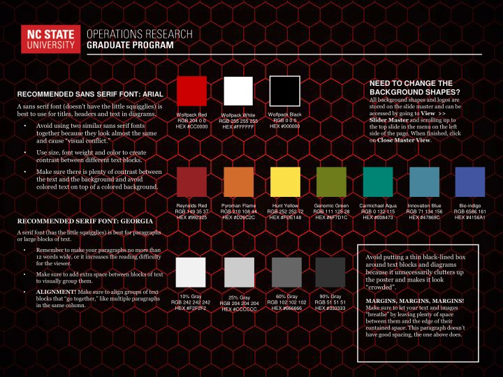
NEED TO CHANGE THE BACKGROUND SHAPES? All background shapes and logos are stored on the slide master and can be accessed by going to View >> Slider Master and scrolling up to the top slide in the menu on the left side of the page. When finished, click on Close Master View. RECOMMENDED SANS SERIF FONT: ARIAL A sans serif font (doesn t have the little squigglies) is best to use for titles, headers and text in diagrams. Wolfpack Black RGB 0 0 0 HEX #000000 Wolfpack Red RGB 204 0 0 HEX #CC0000 Wolfpack White RGB 255 255 255 HEX #FFFFFF Avoid using two similar sans serif fonts together because they look almost the same and cause visual conflict. Use size, font weight and color to create contrast between different text blocks. Make sure there is plenty of contrast between the text and the background and avoid colored text on top of a colored background. Reynolds Red RGB 149 35 37 HEX #992325 Pyroman Flame RGB 210 108 44 HEX #D26C2C Hunt Yellow RGB 252 252 72 HEX #FDE148 Genomic Green RGB 111 125 28 HEX #6F7D1C Carmichael Aqua RGB 0 132 115 HEX #008473 Innovation Blue RGB 71 134 156 HEX #47869C Bio-indigo RGB 6586 161 HEX #4156A1 RECOMMENDED SERIF FONT: GEORGIA A serif font (has the little squigglies) is best for paragraphs or large blocks of text. Remember to make your paragraphs no more than 12 words wide, or it increases the reading difficulty for the viewer. Avoid putting a thin black-lined box around text blocks and diagrams because it unnecessarily clutters up the poster and makes it look crowded . Make sure to add extra space between blocks of text to visually group them. ALIGNMENT! Make sure to align groups of text blocks that go together, like multiple paragraphs in the same column. 10% Gray RGB 242 242 242 HEX #F2F2F2 60% Gray RGB 102 102 102 HEX #666666 90% Gray RGB 51 51 51 HEX #333333 25% Gray RGB 204 204 204 HEX #CCCCCC MARGINS, MARGINS, MARGINS! Make sure to let your text and images breathe by leaving plenty of space between them and the edge of their contained space. This paragraph doesn t have good spacing, the one above does.
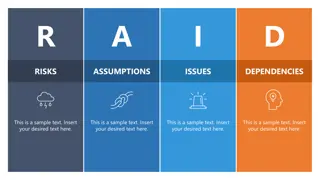
[HEADING] [HEADING] [HEADING] [HEADING]
[HEADING] [HEADING] [HEADING] [HEADING]
1 2