Learn how to create accessible PowerPoint presentations at Trinity College Dublin with practical tips on font type, size, color choices, and more. This inclusive curriculum project aims to support staff in developing content that is easy to read and engage with. Get insights on adapting templates for better accessibility and seeking feedback from users to enhance usability.
Please find below an Image/Link to download the presentation.
The content on the website is provided AS IS for your information and personal use only. It may not be sold, licensed, or shared on other websites without obtaining consent from the author. If you encounter any issues during the download, it is possible that the publisher has removed the file from their server.
You are allowed to download the files provided on this website for personal or commercial use, subject to the condition that they are used lawfully. All files are the property of their respective owners.
The content on the website is provided AS IS for your information and personal use only. It may not be sold, licensed, or shared on other websites without obtaining consent from the author.
E N D
Presentation Transcript
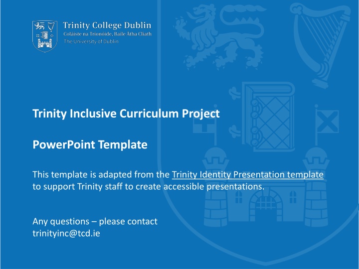
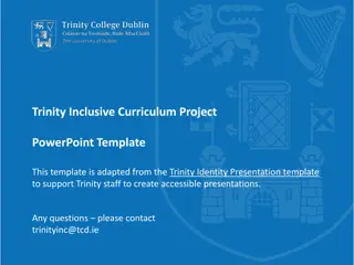
Trinity Inclusive Curriculum Project PowerPoint Template This template is adapted from the Trinity Identity Presentation template to support Trinity staff to create accessible presentations. Any questions please contact trinityinc@tcd.ie
What is different about this template? While the Trinity Identity template is accessible by design in many ways, this template has been adjusted in small ways to enhance accessibility. This includes adjusting the slide background to light blue to avoid glare. 2 Trinity College Dublin, The University of Dublin
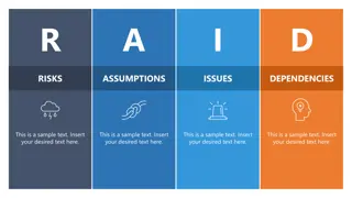
Top tips 1. Font Type: Sans serif, e.g. Calibri or Arial (this template uses Calibri). 2. Font Size: Minimum recommended is 20. 3. Space: Don t overpack the slide with information. Use the 6-word strategy: 6 words per line, 6 lines per text and 6 elements per graphic. 4. Alt Text: Add meaningful descriptions to all your images and videos, or mark them as decorative , i.e. doesn t add any information to the content of a page. (Right click / ctrl click, or go to Review tab.) 5. Accessibility Checker: This tool helps you to identify and address anything you have overlooked (Go to Review tab, or add it from Customise ribbon ). 3 Trinity College Dublin, The University of Dublin
Practical strategies for colour choice Colour Contrast (red and green) Colour Contrast (black and white) Black font on white background can give too much reflection. This is a particular difficulty for dyslexic students. These are the same colour for colour-blind students. ALL CAPS IS MUCH HARDER TO READ USE CAPITAL LETTERS FOR ISOLATED LETTERS ONLY AND FOR SOME HEADINGS FOR MAIN TEXT USE UPPER AND LOWER CASE LETTTERS, AS WORDS RETAIN THEIR SHAPE FOR EASY READING High Contrast colours (blue and navy) Muted contrasts can be easier to read at a distance 4 Trinity College Dublin, The University of Dublin
Finally Ask Users for Feedback: Remember to check in with your audience about if they can access & interact/use your materials. Learn more about how to make your PowerPoint presentations more accessible (microsoft.com) 5 Trinity College Dublin, The University of Dublin