Enhancing Coordinated Entry Systems for Housing Services
Explore the design and implementation of client-focused and provider-centric dashboards to improve transparency and effectiveness in Coordinated Entry systems for housing and services. Utilize tools and insights from KCRHA's dashboard for inspiration and guidance.

Uploaded on | 0 Views
Download Presentation

Please find below an Image/Link to download the presentation.
The content on the website is provided AS IS for your information and personal use only. It may not be sold, licensed, or shared on other websites without obtaining consent from the author. If you encounter any issues during the download, it is possible that the publisher has removed the file from their server.
You are allowed to download the files provided on this website for personal or commercial use, subject to the condition that they are used lawfully. All files are the property of their respective owners.
The content on the website is provided AS IS for your information and personal use only. It may not be sold, licensed, or shared on other websites without obtaining consent from the author.
E N D
Presentation Transcript
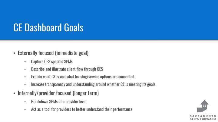
CE Dashboard Goals Externally focused (immediate goal) Capture CES specific SPMs Describe and illustrate client flow through CES Explain what CE is and what housing/service options are connected Increase transparency and understanding around whether CE is meeting its goals Internally/provider focused (longer term) Breakdown SPMs at a provider level Act as a tool for providers to better understand their performance
KCRHA CE Dashboard King County has an elegant solution to address similar goals https://kcrha.org/coordinated-entry-for-all/ Use their dashboard as a starting point in the design of our own
Quick Overview Tabs for stages of client flow Description Metrics and visualizations Terminology and methodology tab as a final supplement
Landing Page / System Summary Define terms for common baseline Flowchart helps explains ins and outs of system Update to match our system flow (add move-ins; reconfigure prioritization) Keep annual metrics Committee Question: Aggregate by household or by individual? Add move-ins/housed No Diversion (housing problem solving) tab to begin with; can be added once this is built out more
Assessments General Impression: feels concise, clear, and clean Keep only the housing composition breakdown for first chart Keep all additional filters for second chart Attempt to include general population comparison for race/ethnicity Committee Question: For the first chart, should we orient with household composition first and have a drop down that includes race, or lead with race? This would be consistent across all tabs. Committee Question: Do we want an assessment type breakdown? Committee Question: Do we want to cover who is giving assessments?
Prioritization / Eligibility Tab structure is near equivalent to Assessments Prioritization in KC is very different from Sacramento Replace with BNL metrics of eligibility for different program types Example chart
Prioritization / Eligibility Tab structure is near equivalent to Assessments Prioritization in KC is very different from Sacramento Replace with BNL metrics of eligibility for different program types 6000 Individuals were BNL eligible in the past 12 months Example chart
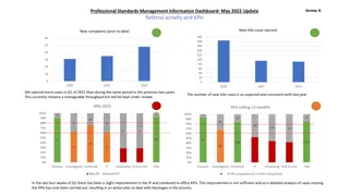
Referrals Bottom row charts are very straightforward and useful Top row question should be answered differently for Sacramento Committee Question: Should we capture the unique number of households referred (unduplicated) or the plain number of referrals? Breakdown by program type: RRH, PSH, other PH (with bubble explaining inclusion of EHV for 21/22) Dropdown option for household composition including veterans' detail Include note in description that the number of referrals is dependent on available housing/services inventory
Enrollments Very similar to Prioritization and Assessments tabs Top row chart should complement that of Referrals tab (program type breakdown)
Move-Ins Not included in KC dashboard but would mirror Enrollments tab Move-ins are not an explicit responsibility of CE, however, they are an important metric demonstrating CES performance
Resources & Length of Process Replace first chart with similar flow chart to Intro tab Add Diversion (HPS) as second item Remove prioritized metric because KC operates differently Add Move-Ins as final item Second row charts can be adjusted to reflect: Days Between Assessment and Referral Days Between Referral and Enrollment Days Between Enrollment and Move-In Include breakdowns for length of time based on race and on program type
Terminology & Methodology Adjust to terms/methods used by our community
Questions Questions? Thoughts/Comments? Additional Ideas? Does this dashboard fulfill our goal(s)? Consolidate multiple data sources into a dashboard which supports the CE Committee s work Tells the story of CE in a digestible way