Gain insights into the basic characteristics of data including types of data sets, attributes, data objects, and attribute types such as nominal, ordinal, and numeric. Understand the distinction between discrete and continuous attributes for effective data analysis.
Please find below an Image/Link to download the presentation.
The content on the website is provided AS IS for your information and personal use only. It may not be sold, licensed, or shared on other websites without obtaining consent from the author. If you encounter any issues during the download, it is possible that the publisher has removed the file from their server.
You are allowed to download the files provided on this website for personal or commercial use, subject to the condition that they are used lawfully. All files are the property of their respective owners.
The content on the website is provided AS IS for your information and personal use only. It may not be sold, licensed, or shared on other websites without obtaining consent from the author.
E N D
Presentation Transcript
Understanding Basic Characteristics of Data Based in part on: Data Mining: Concepts and Techniques, Third Edition, by Han, Kamber, & Pei
Types of Data Sets Record/Semi-Structured Ordered Relational records Data matrix, e.g., numerical matrix, crosstabs Document data: text documents: term-frequency vector Transaction data Video data: sequence of images Temporal data: time-series Sequential Data: transaction sequences Genetic sequence data Spatial and multimedia Graph and network Spatial data: maps Image data Video data World Wide Web Social or information networks Molecular Structures 2
Basic Data Objects Data sets are made up of data objects. A data object represents an entity. Examples: sales database: object customers, store items, sales medical database: object patients, treatments university database: object students, professors, courses Also called samples , examples, instances, data points, objects, tuples, vectors. Data objects are described by attributes. Database rows data objects; columns attributes. 3
Attributes Attribute (or dimensions, features, variables): a data field representing a characteristic or property of a data object E.g., customer _ID, name, address, income, GPA, . Types: Nominal (Categorical) Ordinal Numeric: quantitative Interval-scaled Ratio-scaled 4
Attribute Types Nominal (Categorical): categories, states, or names of things Hair_color = {auburn, black, blond, brown, grey, red, white} marital status, occupation, ID numbers, zip codes Often attributes with yes and no as values Binary Nominal attribute with only 2 states (0 and 1) Ordinal Values have a meaningful order (ranking) but magnitude between successive values is not known. Size = {small, medium, large}, grades, army rankings Month = {jan, feb, mar, } Numeric Quantity (integer or real-valued) Could also be intervals or ratios 5
Discrete vs. Continuous Attributes DiscreteAttribute Has only a finite or countable set of values E.g., zip codes, profession, or the set of words in a collection of documents Sometimes, represented as integer variables Note: Binary attributes are a special case of discrete attributes ContinuousAttribute Has real numbers as attribute values E.g., temperature, height, or weight Practically, real values can only be measured and represented using a finite number of digits Continuous attributes are typically represented as floating-point variables 6
Basic Statistical Descriptions of Data Before deeper analysis, it s important to explore the basic characteristics and relationships in the data set Descriptive Statistics To better understand the characteristics of attributes and fields: central tendency, variation, spread, etc. To get a feel for general patterns or relationships among variables: e.g., correlation, covariance, etc. Data Visualization Visual examination of data distributions often help in uncovering important patterns and guide further investigation or decision making 7
Measuring the Central Tendency 1 n = i x Mean (algebraic measure) (sample vs. population): = x ix = n n N Note: n is sample size and N is population size. 1 = i w x Weighted arithmetic mean: i i = 1 x Trimmed mean: chopping extreme values n = i w i Median: 1 Middle value if odd number of values, or average of the middle two values otherwise Estimated by interpolation (for grouped data): Mode Median interval Value that occurs most frequently in the data Unimodal, bimodal, trimodal = 3 ( ) mean mode mean median Empirical formula: 8
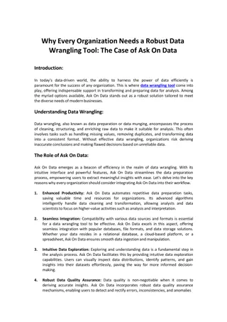
Symmetric vs. Skewed Data Median, mean and mode of symmetric, positively and negatively skewed data symmetric positively skewed negatively skewed March 20, 2025 Data Mining: Concepts and Techniques 9
Measuring the Dispersion of Data Quartiles, outliers and boxplots Quartiles: Q1 (25th percentile), Q3 (75th percentile) Inter-quartile range: IQR = Q3 Q1 Five number summary: min, Q1, median,Q3, max Boxplot: ends of the box are the quartiles; median is marked; add whiskers, and plot outliers individually Outlier: usually, a value higher/lower than 1.5 x IQR Variance and standard deviation (sample:s, population: ) Variance: (algebraic, scalable computation) = i i n n 1 1 1 1 1 1 n n n = i 1 1 n n 2 = = = i = i 2 2 2 ( ) [ ( ) ] s x x x x 2 = = 2 2 2 ( ) x x i i i n i i N N = 1 1 1 1 Standard deviation s (or ) is the square root of variance s2 (or 2) 10
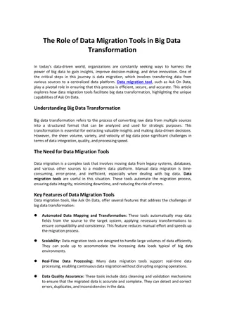
Properties of Normal Distribution Curve The normal (distribution) curve From to + : contains about 68% of the measurements ( : mean, : standard deviation) From 2 to +2 : contains about 95% of it From 3 to +3 : contains about 99.7% of it 11
Graphic Displays of Basic Statistical Descriptions Boxplot: graphic display of five-number summary Histogram: x-axis are values, y-axis repres. frequencies Quantile plot: each value xiis paired with fi indicating that approximately 100 fi % of data are xi Quantile-quantile (q-q) plot: graphs the quantiles of one univariant distribution against the corresponding quantiles of another Scatter plot: each pair of values is a pair of coordinates and plotted as points in the plane 12
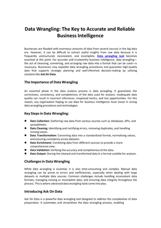
Boxplot Analysis Five-number summary of a distribution Minimum, Q1, Median, Q3, Maximum Boxplot Data is represented with a box The ends of the box are at the first and third quartiles, i.e., the height of the box is IQR The median is marked by a line within the box Whiskers: two lines outside the box extended to Minimum and Maximum Outliers: points beyond a specified outlier threshold, plotted individually 13
Histogram Analysis Histogram: Graph display of tabulated frequencies, shown as bars 40 35 It shows what proportion of cases fall into each of several categories 30 25 Differs from a bar chart in that it is the area of the bar that denotes the value, not the height as in bar charts, a crucial distinction when the categories are not of uniform width 20 15 10 5 The categories are usually specified as non-overlapping intervals of some variable. The categories (bars) must be adjacent 0 10000 30000 50000 70000 90000 14
Quantile Plot Displays all of the data (allowing the user to assess both the overall behavior and unusual occurrences) Plots quantile information For a data xidata sorted in increasing order, fiindicates that approximately 100 fi% of the data are below or equal to the value xi Data Mining: Concepts and Techniques 15
Scatter plot Provides a first look at bivariate data to see clusters of points, outliers, etc Each pair of values is treated as a pair of coordinates and plotted as points in the plane 16
Correlation Analysis (Nominal Data) 2 (chi-square) test 2 Observed ( ) Expected = 2 Expected The larger the 2 value, the more likely the variables are related The cells that contribute the most to the 2 value are those whose actual count is very different from the expected count Correlation does not imply causality # of hospitals and # of car-theft in a city are correlated Both are causally linked to the third variable: population 19
Chi-Square Calculation: An Example Play chess 250(90) Not play chess 200(360) Sum (row) 450 Like science fiction Not like science fiction 50(210) 1000(840) 1050 Sum(col.) 300 1200 1500 2 (chi-square) calculation (numbers in parenthesis are expected counts calculated based on the data distribution in the two categories) 2 2 2 2 ( 250 90 ) 50 ( 210 ) ( 200 360 ) 1000 ( 840 ) = + + + = 2 507 93 . 90 210 360 840 It shows that like_science_fiction and play_chess are correlated in the group 20
Correlation Analysis (Numeric Data) Correlation coefficient (also called Pearson s product moment coefficient) n n ( )( ) ( ) a A b B a ) 1 b n A B i i i i = = = = 1 1 i i ( r , A B ) 1 ( n n A B A B A B where n is the number of tuples, and are the respective means of A and B, A and B are the respective standard deviation of A and B, and (aibi) is the sum of the AB cross- product. If rA,B> 0, A and B are positively correlated (A s values increase as B s). The higher, the stronger correlation. rA,B = 0: independent; rAB < 0: negatively correlated 21
Correlation (viewed as linear relationship) Correlation measures the linear relationship between objects To compute correlation, we standardize data objects, A and B, and then take their dot product = ' ( ( )) / ( ) a a mean A std A k k = ' ( ( )) / ( ) b b mean B std B k k = ( , ) ' ' correlatio n A B A B 23
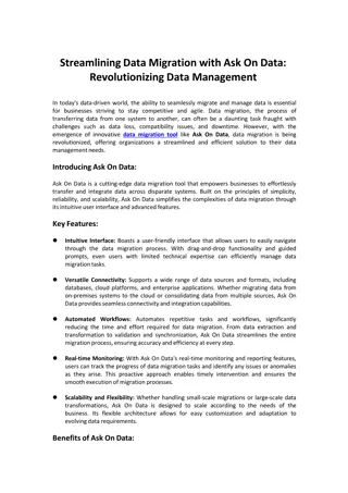
Visualizing Patterns Using Aggregation Example: Cross Tabulation Windy Not Windy Outlook = sunny 2 3 ID 1 2 3 4 5 6 7 8 9 10 11 12 13 14 Outlook sunny sunny overcast rain rain rain overcast sunny sunny rain sunny overcast overcast rain Temperature Humidity 85 80 83 70 68 65 58 72 69 71 75 73 81 75 Windy FALSE TRUE FALSE FALSE FALSE TRUE TRUE FALSE FALSE FALSE TRUE TRUE FALSE TRUE 85 90 78 96 80 70 65 95 70 80 70 90 75 80 Outlook = rain 2 3 Outlook = overcast 2 2 3 2.5 2 Outlook = sunny Outlook = rain Outlook = overcast 1.5 1 0.5 0 Windy Not Windy 24


")

")

")