Essentials of Colour Theory
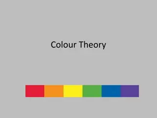
Primary colours are red, yellow, and blue, which can be mixed to create secondary colours like green, orange, and purple. Tertiary colours result from mixing primary and secondary colours. Analogous colours on the wheel are harmonious, while complementary colours create striking contrasts. Artists like Monet and Van Gogh used these concepts in their works to evoke different emotions and create visual interest.

Download Presentation

Please find below an Image/Link to download the presentation.
The content on the website is provided AS IS for your information and personal use only. It may not be sold, licensed, or shared on other websites without obtaining consent from the author.If you encounter any issues during the download, it is possible that the publisher has removed the file from their server.
You are allowed to download the files provided on this website for personal or commercial use, subject to the condition that they are used lawfully. All files are the property of their respective owners.
The content on the website is provided AS IS for your information and personal use only. It may not be sold, licensed, or shared on other websites without obtaining consent from the author.
E N D
Presentation Transcript
PAINT AND COLOUR colour theory
How many primary colours are there? What are they?
Primary colours are basic colours that can be mixed together to make other colours. They are red, yellow and blue. What do you get when you mix all 3 together? What do you think a secondary colour is?
A secondary colour is what you get when you mix 2 primary colours together. These are green, orange and purple.
Finally, tertiary colours are what you get when you mix a primary colour with a secondary colour.
Colours which are close to each other on the colour wheel are considered to have a harmonious relationship and are called analogous colours.
Claude Monet used analogous colours in many of his paintings, particularly in his water lilies series.
Colours which are opposite to each other on the colour wheel are complementary colours. There is a striking contrast when you place two complementary colours next to each other. For example, yellow and purple, or orange and blue. Vincent van Gough was very fond of contrasting orange and blue in many of his paintings.
When you mix complementary colours, you are essentially mixing all three primary colours together and the result is usually mud. For example, say you mix red with green (which are complements of each other). Green can be made by mixing yellow with blue. So by mixing red with green, you are essentially mixing red, blue and yellow (the primary colours).
Most artists break the colour wheel into warm colours and cool colours. Other artists think of colour temperature as a relative term, rather than an absolute term. For example, a red colour could be warmer or cooler than the colour next to it.
WHAT ABOUT WHITE AND BLACK? White and black do not have positions on the colour wheel as they do not have direct positions in the visual spectrum of colours. White is what you get when all the colours of light are combined. This is different from the way our paints work - when we combine all the colours we get mud rather than white light. When you add white to your colours, you increase the value (make the colour lighter). In other words, you create tints of the colours.
Black on the other hand, is the absence of colour. When you add black to your colours, you decrease the value (make the colour darker). In other words, you create shades of the colours.
When you add white or black to a colour, you reduce the saturation of the colour (make it less vivid). So although white and black do not have positions on the colour wheel, they do have the power to alter the value and saturation of the colours.