Exploring Data Representations and Outliers in Statistical Analysis
Discover the significance of outliers in statistical data representation through examples, box plots, and cumulative frequency analysis. Learn how to identify outliers, calculate quartiles, and compare data sets visually with box plots. Dive into the world of data analysis and explore various methods to interpret and clean data effectively.

Download Presentation

Please find below an Image/Link to download the presentation.
The content on the website is provided AS IS for your information and personal use only. It may not be sold, licensed, or shared on other websites without obtaining consent from the author. If you encounter any issues during the download, it is possible that the publisher has removed the file from their server.
You are allowed to download the files provided on this website for personal or commercial use, subject to the condition that they are used lawfully. All files are the property of their respective owners.
The content on the website is provided AS IS for your information and personal use only. It may not be sold, licensed, or shared on other websites without obtaining consent from the author.
E N D
Presentation Transcript
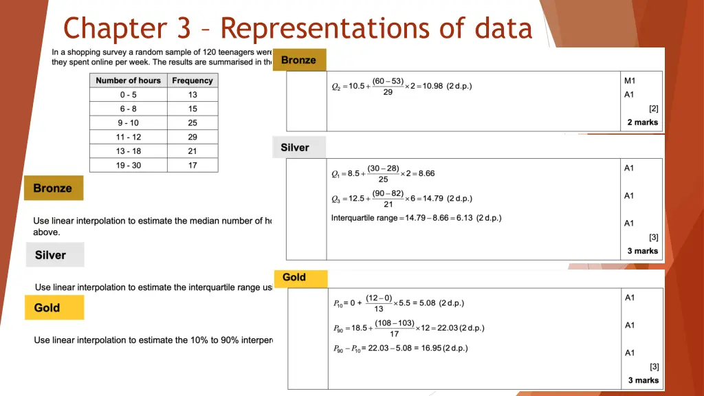
3.1 - Outliers These are extreme values that lay outside of the pattern. The formulas you need to follow are in the form Greater than Q3 + k(IQR) Less than Q1 - k(IQR) K will be given to you in the question Individual data that should be removed are called anomalies Cleaning the data is the name given when removing anomalies
Examples The diameters of 11 different Roman coins are measured in centimetres: 2.2 2.5 2.7 2.7 2.8 3.0 3.1 3.1 3.2 4.0 4.7 Determine the quartiles and hence any outliers. The lengths, in cm, of 12 giant African land snails are given below: 17 18 18 19 20 20 20 20 21 23 24 32 a) Calculate the mean and standard deviation, given that ? = 252 and ?2= 5468. b) An outlier is an observation which lies 2 standard deviations from the mean. Identify any outliers for this data.
3.2 Box plots Box Plots allow us to visually represent the distribution of the data. Minimum Lower Quartile 15 Median Upper Quartile 22 Maximum 3 17 27 range IQR 0 5 10 15 20 25 30
Example with an outlier Smallest values 0, 3 Largest values 21, 27 Lower Quartile 8 Median Upper Quartile 14 10 Any data 1.5 x interquartile rate above Q3 or below Q1 is an outlier.
Comparing box plots Croydon Kingston 400k 450k 500k 550k 600k 650k 700k 750k Compare the prices of houses in Croydon with those in Kingston . (2 marks) For 1 mark, one of: The interquartile range of house prices in Kingston is greater than Croydon meaning its less consistent. For 1 mark: The median house price in Kingston was greater than that in Croydon. Include some measure of location (median is best). Include some measure of spread.
Class example (c) The company claims that for 75% of the months, the amount received per month is greater than 10 000. Comment on this claim, giving a reason for your answer. (2)
Exercise book Exercise 3A/B pages 42-43 and 45
3.3 Cumulative frequency (CF) Cumulative frequency is used with group data. To find CF you keep adding the next interval on like a running total. When plotting you use the end of the interval with the CF value
Plotting Time (s) 9.6 < t 9.7 9.7 < t 9.9 9.9 < t 10.05 10.05 < t 10.2 Frequency 1 4 10 17 Cum Freq 1 5 15 32 32 28 Cumulative Frequency 24 Estimate of ?2= 10.07s 20 Estimate of ?1= 9.95s 16 Estimate of ?3= 10.13s 12 8 Interquartile Range = 0.18s 4 0 9.5 9.6 9.7 9.8 9.9 10.0 10.1 10.2 10.3 Time (s)
Exercise book Exercise 3C pages 47-48
3.4 Histograms Only grouped continuous data can be plotted on histograms. Area of the bars is proportional to the frequencies. ????????? ????? ???? ????????? ??????? = To create a frequency polygon join the middle of the tops together. Don t connect the first and last point together
Example 1 A random sample of 200 students was asked how long it took them to complete their homework the previous night. The time was recorded and summarised in the table to the right. a) Draw a Histogram and frequency polygon for this data b) Estimate how many students took less than 32 minutes c) Estimate how many students took more than 46 minutes d) Estimate how many students took between 36 and 45 minutes to complete their homework Time, t (mins) Frequency 55 39 68 32 6 25 ? < 30 30 ? < 35 35 ? < 40 40 ? < 50 50 ? < 80
Example 2 A random sample of daily mean temperatures (?, ) was taken from the large data set for Hurn in 2015. The temperatures were summarised in a grouped frequency and represented by a Histogram. a) Give a reason to support the use of a Histogram to represent this data b) Write down the underlying feature associated with each of the bars in a Histogram On the Histogram, the rectangle representing the 16 ? < 18 class was 3.2cm high and 2cm wide. The frequency for this class was 8. c) Show that each day is represented by an area of 0.8 d) Given that the total area of the Histogram was 48cm2, find the total number of days in the sample.
Exercise book Exercise 3D pages 50-52
3.5 Comparing data Comment on measure of location and measure of spread Use mean and standard deviation or Use Median and IQR You can t cross over for example mean and IQR. If the data contains extreme values, then use median and IQR. Explain each question with its scenario and what it means.


")