Global Temperature Patterns Winter 2013-2014
Explore a case study on global temperature patterns in the winter of 2013-2014, analyzing data trends in the Great Lakes region of North America and across the entire globe. Understand the importance of drawing trend lines to identify overall trends accurately.

Download Presentation

Please find below an Image/Link to download the presentation.
The content on the website is provided AS IS for your information and personal use only. It may not be sold, licensed, or shared on other websites without obtaining consent from the author. If you encounter any issues during the download, it is possible that the publisher has removed the file from their server.
You are allowed to download the files provided on this website for personal or commercial use, subject to the condition that they are used lawfully. All files are the property of their respective owners.
The content on the website is provided AS IS for your information and personal use only. It may not be sold, licensed, or shared on other websites without obtaining consent from the author.
E N D
Presentation Transcript
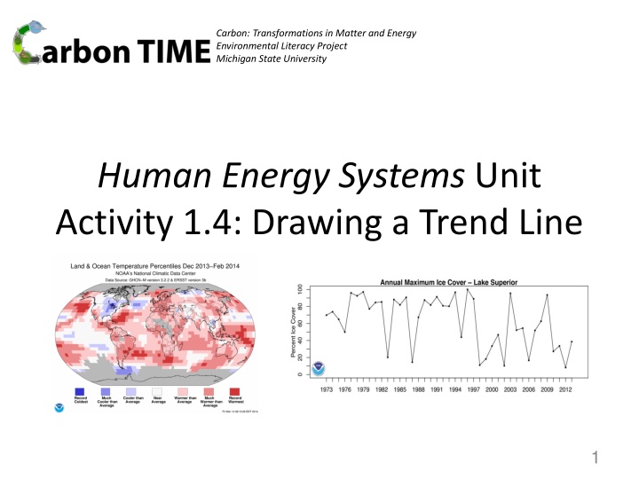
Carbon: Transformations in Matter and Energy Environmental Literacy Project Michigan State University Human Energy Systems Unit Activity 1.4: Drawing a Trend Line 1
You are here 2
Finding Overall Patterns Look at this graph. This shows places where the temperatures were hotter or colder than average in the winter of 2013-2014. Look at the Great Lakes region in North America. Then, look at the entire globe. 3
Finding overall trends If we relied only on the data about temperature in the great lakes region of North America, we might think that the entire planet was having a very cold winter. However, when we look across the globe, we see a different pattern. 4
What is the global pattern? Turn and Talk: find a partner and describe the overall trend you see in the global temperatures in the winter of 2013-2014. Be prepared to share your description with the class. 5
Describing the global pattern Below, combine answers from the class to construct an overall description of the global pattern from the winter of 2013-2014. Classroom description: (write class ideas here) 6
Positive and Negative Trends This graph has a negative trend because the trend line goes down from left to right. This graph has a positive trend because the trend line goes up from left to right. Trends (patterns of change over time) are difficult to see when the data are messy or noisy. When you have a scatter plot graph, sometimes it helps to draw a trend line. That makes it easier to see which direction the data are moving. In this activity, we are going to practice drawing trend lines. 7
Different kinds of trend lines This trend line (the blue line) is straight because it was calculated using a mathematical formula that considers every data point in the graph. This trend line (the red line) is curvy because it was calculated using a 5 year running average, which only considers data points in five year periods. There are lots of ways to draw trend lines. Sometimes we use a mathematical formula to calculate a straight line that shows us the general trend. Other times we calculate averages over time. 8
Practice Making Trend Lines On your worksheet, practice making trend lines for two graphs. One graph is new: this shows ice cover on lake Superior. The other graph is familiar: this is the arctic ice graph that you created in the previous activity. 9