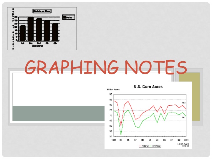
GRAPHING NOTES
Dive into effective strategies for graphing and visualizing data in this comprehensive guide. Learn the key techniques for creating informative and visually appealing graphs that help convey your information clearly. Explore various types of graphs and charts with detailed examples to enhance your understanding. Gain insights on choosing the right graph for your data and presenting it effectively. Master the art of graphing with practical tips and step-by-step instructions to improve your data visualization skills.

Download Presentation

Please find below an Image/Link to download the presentation.
The content on the website is provided AS IS for your information and personal use only. It may not be sold, licensed, or shared on other websites without obtaining consent from the author.If you encounter any issues during the download, it is possible that the publisher has removed the file from their server.
You are allowed to download the files provided on this website for personal or commercial use, subject to the condition that they are used lawfully. All files are the property of their respective owners.
The content on the website is provided AS IS for your information and personal use only. It may not be sold, licensed, or shared on other websites without obtaining consent from the author.
E N D
Presentation Transcript
GRAPHING NOTES PART 1
TYPES OF GRAPHS Graphs are used to illustrate what happens during an experiment. Bar graph - used for comparing data. Pie graph - used to show percentages. Line graph - used to show continuous change, usually change over time.
CREATING A DATA TABLE A data table has 2 columns (not always). The first column is the independent variable. The second column is the dependent variable. INDEPENDENT VARIABLE DEPENDENT VARIABLE
INDEPENDENT VARIABLE This is the factor that we can change. Example: How long the thermometer is in the water, or how far the runner races.
DEPENDENT VARIABLE These are the results we get. Example: The water temperature, or how fast the runner ran.
VARIABLE & CONTROLLED PARAMETERS Controlled parameters are the factors that stay constant during the experiment. Example: The amount of salt used or the material used. Variable Parameters are factors that change during the experiment. Example: The mass or volume of the gummy bear in water.
CREATING A GRAPH Data tables help you organize data. Graphs help you understand and use data.
AXES An axis is a line that forms one side of the graph. X-axis: the horizontal line that represents the independent variable. Y-axis: the vertical line that represents the dependent variable.
RANGE & SCALE To find the range of each axis, subtract the smallest value on the data table from the largest value. Scale: Each axis has its own scale, or how many spaces between numbers.
DATA POINTS You plot the data points by putting a dot on the graph for each pair of data on the data table.
LABELS Title: The title tells people what the graph describes. Do NOT use the word graph in your title. Label axes: Also label the x-axis and y-axis. Include the name and unit label if necessary, like distance (m) or time (sec.) .
STEPS FOR MAKING A GRAPH ALWAYS USE A RULER! ALWAYS MAKE AS LARGE AS POSSIBLE! 1) Draw the x and y axes. 2) Label the axes. Include units if needed. column of data table = x-axis data table = y-axis 3) Decide - line graph or bar graph? 4) Choose a scale and fill in numbers. 5) Plot your data. 6) Write a title for your graph. 1st 2nd column of
REMEMBER TO CHECK FOR: T Title L Labels U D Units Data