Guidelines for Creating an Effective Poster Presentation
Learn how to create an impactful poster presentation with this detailed guide. Explore design considerations, font selections, color templates, and layout suggestions. Maximize visual data and enhance readability for a successful display. Elevate your poster presentation skills today!
Download Presentation

Please find below an Image/Link to download the presentation.
The content on the website is provided AS IS for your information and personal use only. It may not be sold, licensed, or shared on other websites without obtaining consent from the author. If you encounter any issues during the download, it is possible that the publisher has removed the file from their server.
You are allowed to download the files provided on this website for personal or commercial use, subject to the condition that they are used lawfully. All files are the property of their respective owners.
The content on the website is provided AS IS for your information and personal use only. It may not be sold, licensed, or shared on other websites without obtaining consent from the author.
E N D
Presentation Transcript
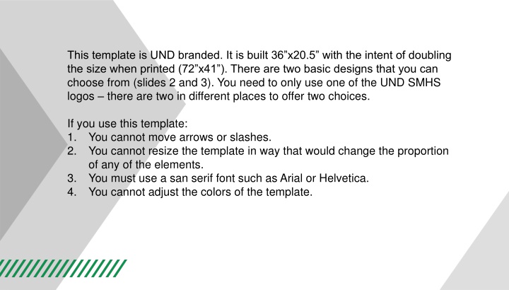
This template is UND branded. It is built 36x20.5 with the intent of doubling the size when printed (72 x41 ). There are two basic designs that you can choose from (slides 2 and 3). You need to only use one of the UND SMHS logos there are two in different places to offer two choices. If you use this template: 1. You cannot move arrows or slashes. 2. You cannot resize the template in way that would change the proportion of any of the elements. 3. You must use a san serif font such as Arial or Helvetica. 4. You cannot adjust the colors of the template.
This would be the area for your title Authors, authors authors Department of XXXXXXXXXXXX, University of North Dakota School of Medicine & Health Sciences Grand Forks, ND 58012-9037 med.UND.edu. Use the logo you need only one SMHS logo. Abstract, 30pt = 60 when doubled Discussion Experiments Conclusions If you have results or data in visual form (anything that is NOT text) make them large. They catch the eye, and tell your story quickly. Is there a way to represent more of your poster with visual data? Pictures, charts, tables, graphs? Use them. You can copy from your many slides presentation and paste into this one large page presentation. Font sizes can be adjusted to fit the new format. You can also apply any of the powerpoint color templates to this large page. If necessary, the color templates can be changed to suit your needs by viewing the Master Page, and adjusting the elements there. You used pastel blue shades in your original files. These would both work, but we might have to make them a little lighter. Each of these sections can have a decorative headline, using a line or box to set it off . if you want. The rest of the section should be a plain font (this is Helvetica but Arial is also acceptable) and should be at least 24 pt. This is 34 pt (17x2). It s good to divide this big page into 3 or 4 columns. You can use decorative dividing lines between the columns, or leave white space. You can box in sections with results/data, or other sections you want to emphasize. You only need one logo on your poster. You can either have it in the header or elsewhere in your poster (like one of the bottom corners. You can copy from your many slides presentation and paste into this one large page presentation. Font sizes can be adjusted to fit the new format. You can also apply any of the powerpoint color templates to this large page. If necessary, the color templates can be changed to suit your needs by viewing the Master Page, and adjusting the elements there. You used pastel blue shades in your original files. These would both work, but we might have to make them a little lighter. Each of these sections can have a decorative headline, using a line or box to set it off . if you want. The rest of the section should be a plain font (this is Helvetica but Arial is also acceptable) and should be at least 24 pt. This is 34 pt (17x2). It s good to divide this big page into 3 or 4 columns. You can use decorative dividing lines between the columns, or leave white space. You can box in sections with results/data, or other sections you want to emphasize. You can copy from your many slides presentation and paste into this one large page presentation. Font sizes can be adjusted to fit the new format. You can also apply any of the powerpoint color templates to this large page. If necessary, the color templates can be changed to suit your needs by viewing the Master Page, and adjusting the elements there. You used pastel blue shades in your original files. These would both work, but we might have to make them a little lighter. Each of these sections can have a decorative headline, using a line or box to set it off . if you want. The rest of the section should be a plain font (this is Helvetica but Arial is also acceptable) and should be at least 24 pt. This is 34 pt (17x2). It s good to divide this big page into 3 or 4 columns. You can use decorative dividing lines between the columns, or leave white space. You can box in sections with results/data, or other sections you want to emphasize. 90 80 70 60 50 East 40 West North 30 20 10 0 1st Qtr 2nd Qtr 3rd Qtr 4th Qtr Methods Results Thanks each of these sections can have a decorative headline, using a line or box to set it off . if you want. The rest of the section should be a plain font (this is Helvetica but Arial is also acceptable) and should be at least 24 pt. This is 34 pt (17x2). The Green slashes are optional. If you have room, feel free to use them. Just make sure that the angle of the slashes are parallel to the nearest side of the gray triangle. each of these sections can have a decorative headline, using a line or box to set it off . if you want. The rest of the section should be a plain font (this is Helvetica but Arial is also acceptable) and should be at least 24 pt. This is 34 pt (17x2). each of these sections can have a decorative headline, using a line or box to set it off . if you want. The rest of the section should be a plain font (this is Helvetica but Arial is also acceptable) and should be at least 24 pt. This is 34 pt (17x2). Can use logo at the top or the bottom. 1st Qtr 2nd Qtr 3rd Qtr 4th Qtr
This would be the area for your title Authors, authors authors Department of XXXXXXXXXXXX, University of North Dakota School of Medicine & Health Sciences Grand Forks, ND 58012-9037. Use the logo you need to only use one SMHS logo. med.UND.edu Abstract, 30pt = 60 when doubled Discussion Experiments Conclusions If you have results or data in visual form (anything that is NOT text) make them large. They catch the eye, and tell your story quickly. Is there a way to represent more of your poster with visual data? Pictures, charts, tables, graphs? Use them. You can copy from your many slides presentation and paste into this one large page presentation. Font sizes can be adjusted to fit the new format. You can also apply any of the powerpoint color templates to this large page. If necessary, the color templates can be changed to suit your needs by viewing the Master Page, and adjusting the elements there. You used pastel blue shades in your original files. These would both work, but we might have to make them a little lighter. Each of these sections can have a decorative headline, using a line or box to set it off . if you want. The rest of the section should be a plain font (this is Helvetica but Arial is also acceptable) and should be at least 24 pt. This is 34 pt (17x2). It s good to divide this big page into 3 or 4 columns. You can use decorative dividing lines between the columns, or leave white space. You can box in sections with results/data, or other sections you want to emphasize. You only need one logo on your poster. You can either have it in the header or elsewhere in your poster (like one of the bottom corners. You can copy from your many slides presentation and paste into this one large page presentation. Font sizes can be adjusted to fit the new format. You can also apply any of the powerpoint color templates to this large page. If necessary, the color templates can be changed to suit your needs by viewing the Master Page, and adjusting the elements there. You used pastel blue shades in your original files. These would both work, but we might have to make them a little lighter. Each of these sections can have a decorative headline, using a line or box to set it off . if you want. The rest of the section should be a plain font (this is Helvetica but Arial is also acceptable) and should be at least 24 pt. This is 34 pt (17x2). It s good to divide this big page into 3 or 4 columns. You can use decorative dividing lines between the columns, or leave white space. You can box in sections with results/data, or other sections you want to emphasize. You can copy from your many slides presentation and paste into this one large page presentation. Font sizes can be adjusted to fit the new format. You can also apply any of the powerpoint color templates to this large page. If necessary, the color templates can be changed to suit your needs by viewing the Master Page, and adjusting the elements there. You used pastel blue shades in your original files. These would both work, but we might have to make them a little lighter. Each of these sections can have a decorative headline, using a line or box to set it off . if you want. The rest of the section should be a plain font (this is Helvetica but Arial is also acceptable) and should be at least 24 pt. This is 34 pt (17x2). It s good to divide this big page into 3 or 4 columns. You can use decorative dividing lines between the columns, or leave white space. You can box in sections with results/data, or other sections you want to emphasize. 90 80 70 60 50 East 40 West North 30 20 10 0 1st Qtr 2nd Qtr 3rd Qtr 4th Qtr Methods Results Thanks each of these sections can have a decorative headline, using a line or box to set it off . if you want. The rest of the section should be a plain font (this is Helvetica but Arial is also acceptable) and should be at least 24 pt. This is 34 pt (17x2). The Green slashes are optional. If you have room, feel free to use them. Just make sure that the angle of the slashes are parallel to the nearest side of the gray triangle. each of these sections can have a decorative headline, using a line or box to set it off . if you want. The rest of the section should be a plain font (this is Helvetica but Arial is also acceptable) and should be at least 24 pt. This is 34 pt (17x2). each of these sections can have a decorative headline, using a line or box to set it off . if you want. The rest of the section should be a plain font (this is Helvetica but Arial is also acceptable) and should be at least 24 pt. This is 34 pt (17x2). Can use logo at the top or the bottom.
HERE IS MY LIST OF DONTS: DONT USE ALL CAPS FOR THE TITLE. The title already has a position of prominence. DO edit your work. A poster isn t like a term paper or journal article - it s more like a bumper sticker. Be concise. Use bullets and pictures. Keep your font size in the 26-30 point range. DO size your poster correctly Go to File, then Page Set-up Choose Custom, and enter the size you want your poster. 42 is the width of our paper; your poster can be wider or longer than this in the other dimension. DO use charts, graphs, pictures DO use the Insert, Picture, From File commands. Don t copy and paste photos into powerpoint they may not print. Pictures from the web will usually be low quality and look jaggy DON T Put your text or pictures right to the edge of the page! It may get cut off. DON T put all the text in boxes It makes the whole poster harder to look at. Save boxes for special items. RESIST THE URGE to use pale colored text on a dark background - the toner (ink) required to print the dark boxes can wrinkle the paper. DID YOU KNOW that 25% of your audience could have some color-blindness? Greens on reds, Greens on Orange, Blues on red, and Blues on Green can be really hard to see. DON T use text that is too similar to its background color. DON T use dark gradations as a background color if you have a lot of text to go over them. No matter what color you choose, eventually it gets harder to read DON T use SHADOWS similar to the text color. It looks blurry. Results DON T make your font size too small; people won t want to read it. Edit your message if necessary. This is nice. It s subtle, but legible. At size 36 points, it is plenty large enough. It s all about your data. The graphics should enhance, not detract, from it. Conclusions DON T make your visual data too small. Why put a 6 photo on a 5 foot long poster? Now is your chance to show it off. 9 0 8 0 7 0 6 0 5 0 Ea st We st Nor t h 4 0 3 0 2 0 10 0 1st Qt r 2 nd Qt r 3 r d Qt r 4 t h Qt r DON T FORGET computer monitor colors are NOT the same as colors which will print on your poster. This bright green will print much darker. TEXTURES BEHIND TEXT= hard to read TEXTURES BEHIND TEXT= hard to read If you have questions, call John Lee (7.3204) or Laura Cory (7.3206), in the Department of Information Resources at the Medical School. You can e-mail your file to us at und.med.medicalmedia@med.UND.edu

