Interpreting Pie Charts
This content provides essential vocabulary and a clear video tutorial on interpreting pie charts. It includes guidance on presenting and measuring data, along with a hands-on activity to reinforce learning. Explore the world of pie charts and enhance your data interpretation skills.

Download Presentation

Please find below an Image/Link to download the presentation.
The content on the website is provided AS IS for your information and personal use only. It may not be sold, licensed, or shared on other websites without obtaining consent from the author.If you encounter any issues during the download, it is possible that the publisher has removed the file from their server.
You are allowed to download the files provided on this website for personal or commercial use, subject to the condition that they are used lawfully. All files are the property of their respective owners.
The content on the website is provided AS IS for your information and personal use only. It may not be sold, licensed, or shared on other websites without obtaining consent from the author.
E N D
Presentation Transcript
Interpreting Pie Charts If any of the links don t work: 1) Right click on the image and go to open hyperlink 2) Copy the address and paste it into the address bar on the internet 3) Google it! We ve included the image so you will be able to find it more easily.
Presenting and Measuring Data Important vocabulary to learn for the week! Click to check you know the definition. Data Information that has been collected by counting or measuring. Scale Points on the axis with equal intervals. Axis A graph has two perpendicular lines (lines at right angles). The horizontal axis is called the x-axis. The vertical axis is called the y-axis. Graph A diagram showing data. Frequency The number of times an event occurs. Line graph A graph where straight lines join points together to show the data. Average Loosely means an ordinary or typical value. There are 3 types of average that we learn about: mean, median and mode. When just the word average is used, it refers to the mean. Mean The sum of a set of numbers, or quantities, divided by the number of terms in the set. Example: The arithmetic mean of 5, 6, 14, 15 and 45 is (5 + 6 + 14 + 15 + 45) 5 i.e. 17. Pie Chart Also known as pie graph. A form of presentation of data. Within a circle, sectors like slices of a pie represent the quantities involved.
Interpreting Pie Charts Click on the picture to go to the video. This was the clearest video we could find to explain pie charts. Please remember that we call them PIE CHARTS but the teacher in the video calls them circle graphs! Reading circle graphs (pie charts) tutorial -https://www.youtube.com/watch?v=KzXZfv9anpU
DO IT! In the lesson 4 folder there is a PDF document called Pie Charts. Choose one of the pages of questions (pages 1-4) from this document and complete it (if you also want to fill in your own one on page 5, you can do that after). The answers are at the bottom of the document (pages 6 & 7) for you to check your work.
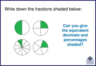
TWIST IT! Click for answer...
TWIST IT! 192 people
TWIST IT! Click for answer...
EXPLORE IT! Ice Cream Pie!