Explore the use of scatter graphs and lines of best fit in predicting missing data. Understand correlations between variables, make estimations, and analyze relationships based on plotted points in various scenarios such as student test scores, men's mass and shoe size, and museum visitor numbers versus hours of sunshine.
Please find below an Image/Link to download the presentation.
The content on the website is provided AS IS for your information and personal use only. It may not be sold, licensed, or shared on other websites without obtaining consent from the author. If you encounter any issues during the download, it is possible that the publisher has removed the file from their server.
You are allowed to download the files provided on this website for personal or commercial use, subject to the condition that they are used lawfully. All files are the property of their respective owners.
The content on the website is provided AS IS for your information and personal use only. It may not be sold, licensed, or shared on other websites without obtaining consent from the author.
E N D
Presentation Transcript
Jordan felt ill during the end of year tests. He had done his science and English tests, but was away for his maths test. His teacher decided to draw two scatter graphs of the other students results to help predict what Jordan might have scored in his maths tests had he been there.
Here are the two graphs the teacher drew. Jordan scored 55 marks in his English test and 40 in his science test Maths results Maths results English results Science results Which would be the most useful for a prediction and why?
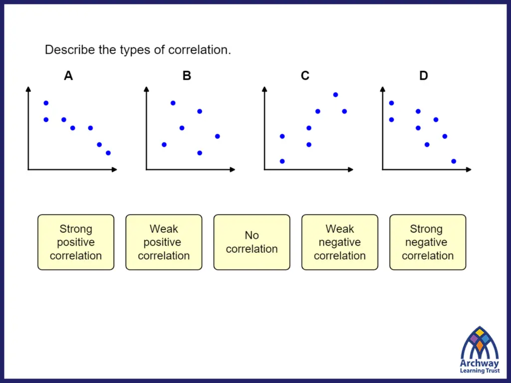
When a scatter graph shows correlation, it can be used to predict missing data. To do this more accurately, we draw a line of best fit. The line of best fit is a line that best represents the data on the graph. It does: Go in the general direction of the plotted points Has roughly a similar amount of points on either side of the line. It doesn t necessarily: Go through the points Start in the bottom corner Go uphill
Lets look at a graph we plotted two lessons ago that compares the mass of men with their show size. Does the graph show a correlation between the mass and shoe size? 100 95 To draw a line of best fit: 90 Look at the general direction of the points, then draw a line in that direction. 85 Mass (kg) 80 Are there roughly the same amount of points on either side? 75 70 65 60 9 10 11 12 13 8 6 7 Shoe Size 4 5
Lets look at a graph we plotted two lessons ago that compares the mass of men with their show size. Does the graph show a correlation between the mass and shoe size? 100 95 Use your line of best fit to estimate: 87 kg 90 (i) The mass of a man with shoe size 10 . 85 Mass (kg) 80 (ii) The shoe size of a man with a mass of 69 kg. 75 70 65 Size 6 60 9 10 11 12 13 8 6 7 Shoe Size 4 5
This graph shows how many visitors there were to a museum compared to the hours of sunshine each day. Does the graph show a correlation between the number of visitors and the hours of sunshine? Visitors 500 Draw a line of best fit 450 Number of Visitors 400 Use your line of best fit to estimate: 350 (i) The number of visitors for 4 hours of sunshine. 300 310 250 (ii) The hours of sunshine when 250 people visit. 200 150 5 100 0 6 7 5 8 9 10 3 4 1 2 Hours of Sunshine