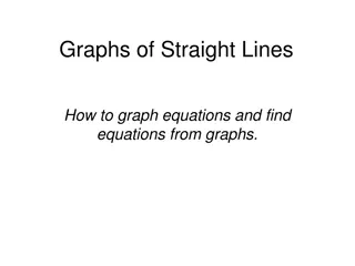
Introduction to Graphs: Visual Representation of Relationships
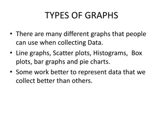
A graph is a visual representation showing the relationship between two variables through one- or two-dimensional figures. There are different types of graphs like bar, line, and pie charts used to represent discrete or continuous data. This introduction explains the basics of graphs, scales, coordinates, and types of graphs to help understand how data can be visually depicted.

Download Presentation

Please find below an Image/Link to download the presentation.
The content on the website is provided AS IS for your information and personal use only. It may not be sold, licensed, or shared on other websites without obtaining consent from the author.If you encounter any issues during the download, it is possible that the publisher has removed the file from their server.
You are allowed to download the files provided on this website for personal or commercial use, subject to the condition that they are used lawfully. All files are the property of their respective owners.
The content on the website is provided AS IS for your information and personal use only. It may not be sold, licensed, or shared on other websites without obtaining consent from the author.
E N D
Presentation Transcript
Graphs An Introduction
What is a graph? A graph is a visual representation of a relationship between, but not restricted to, two variables. A graph generally takes the form of a one- or two- dimensional figure. Although, there are three- dimensional graphs available, they are usually considered too complex to understand easily. A graph commonly consists of two axes called the x-axis (horizontal) and y-axis (vertical). A graph can show Discrete or Continuous data types. Data types determines which graph to use.
Discrete or Continuous Discrete: Data that can be separated by some interval, for example: Recording the shoe sizes of a class Bar graph Continuous: When data collected is continuous, for example: Recording temperature Line graph
Scale or Increments This is a graph Y axis 25 20 All graphs (except Pie Chart) have common elements: Axis x and y (also z in 3D graphs) Axis labels A title Scales or Increments Can represent negative values Y axis label 15 10 5 Origin does not always have to start at 0,0 X-axis 10 20 30 40 50 -20 -10 X-axis label -5 Scale or Increments -10
If we draw a vertical line from any point on the x-axis and a horizontal line from the y-axis the point at which they meet gives us the co-ordinate Co-ordinates Y axis 25 20 A (3,15) 15 B (-4,10) 10 5 1 2 3 4 5 -5 -4 -3 -2 -1 -5 X-axis -10 -15 C (-5,-15) Back Back
Types of Graphs Four basic types of graph or chart Line Pie Line Pie Bar Scatter Bar Scatter
See creating a line graph presentation Line Graphs A good method of showing the relationship between two variables Exercise and Pulse Rate Pulse - Beats per minute 200 150 Alan - 28 year old former athlete 100 Janet - 38 year old secretary 50 0 0 30 60 90 120 Time in minutes Back Back
Bar Chart / Graph Used to compare values in a category or between categories. Fat content of cheeses 40 35 Fat / 100g total 30 25 20 15 10 5 The graph shown here makes a visual comparison of the fat content of types of cheese 0 Edam Cheshire Cheddar Danish blue Camembert Caerphilly Cottage cheese Cheese spread Double Gloucester Cheeses
Bar Chart / Graph Can be useful to study trends over time Daily Temperature Fluctuation 00:00 20:00 Time (24 hr) 16:00 12:00 08:00 04:00 00:00 -4 -2 0 2 Temperature (oC) 4 6 8 10 12
See creating a bar graph presentation Bar Chart / Graph Multiple (or group) bar graphs compare relationships of closely related sets Back Back
See creating a pie chart presentation Pie Charts A pie chart is used to show how a part of something relates to the whole. This kind of graph is particularly suited to showing percentages Survey of female hair colour Multi- coloured 7% Red 7% Blonde 47% Brunette 39% Back Back
Scatter Graph Drawing a scatter graph is similar to drawing a line graph in that co-ordinates are used to plot the points. There are usually more points to be plotted in a scatter graph and the points can be in groups, therefore it is not possible to draw a line through all of the points. show the trend A scatter graph shows how much correlation there is between two variables that you suspect may be linked for instance height and weight as shown here: Weight (kg) It is sometimes useful to draw a line of best fit to Line of best fit Height (cm) Back Back
Summary A good graph: Accurately shows the data Grabs the reader's attention Has a title and labels Is simple and uncluttered Clearly shows any trends or differences in the data Is visually accurate (i.e., if one data value is 25 and another 50, then 50 should appear to be twice the size of 25).