Optimizing Research Poster Layout: Graphics, Fonts, and Content Recommendations
Enhance your research posters with expert tips on graphics, fonts, and content layout. Learn how to create visually appealing designs, choose suitable fonts, and structure your content effectively to engage your audience. Follow these guidelines to create impactful posters that communicate your research findings clearly and professionally.

Download Presentation

Please find below an Image/Link to download the presentation.
The content on the website is provided AS IS for your information and personal use only. It may not be sold, licensed, or shared on other websites without obtaining consent from the author. If you encounter any issues during the download, it is possible that the publisher has removed the file from their server.
You are allowed to download the files provided on this website for personal or commercial use, subject to the condition that they are used lawfully. All files are the property of their respective owners.
The content on the website is provided AS IS for your information and personal use only. It may not be sold, licensed, or shared on other websites without obtaining consent from the author.
E N D
Presentation Transcript
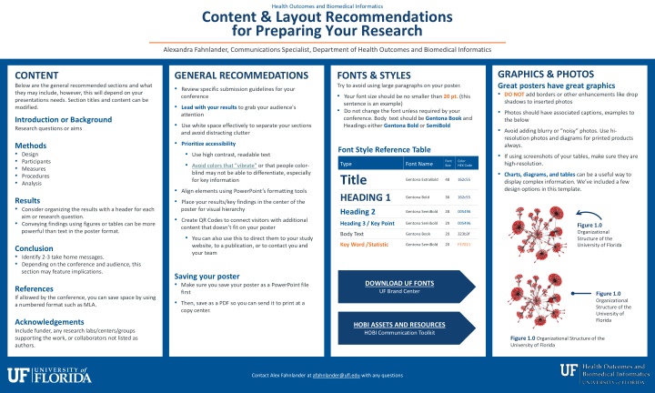
Health Outcomes and Biomedical Informatics Content & Layout Recommendations for Preparing Your Research Alexandra Fahnlander, Communications Specialist, Department of Health Outcomes and Biomedical Informatics GRAPHICS & PHOTOS Great posters have great graphics DO NOT add borders or other enhancements like drop shadows to inserted photos Photos should have associated captions, examples to the below Avoid adding blurry or noisy photos. Use hi- resolution photos and diagrams for printed products always. If using screenshots of your tables, make sure they are high-resolution. Charts, diagrams, and tables can be a useful way to display complex information. We ve included a few design options in this template. CONTENT Below are the general recommended sections and what they may include, however, this will depend on your presentations needs. Section titles and content can be modified. GENERAL RECOMMEDATIONS Review specific submission guidelines for your conference Lead with your results to grab your audience's attention Use white space effectively to separate your sections and avoid distracting clutter Prioritize accessibility Use high contrast, readable text Avoid colors that vibrate or that people color- blind may not be able to differentiate, especially for key information Align elements using PowerPoint s formatting tools Place your results/key findings in the center of the poster for visual hierarchy Create QR Codes to connect visitors with additional content that doesn t fit on your poster You can also use this to direct them to your study website, to a publication, or to contact you and your team FONTS & STYLES Try to avoid using large paragraphs on your poster. Your font size should be no smaller than 20 pt. (this sentence is an example) Do not change the font unless required by your conference. Body text should be Gentona Book and Headings either Gentona Bold or SemiBold Introduction or Background Research questions or aims Methods Design Participants Measures Procedures Analysis Font Style Reference Table Font Size Color HEX Code Type Title HEADING 1 Font Name Gentona ExtraBold 48 162c55 Gentona Bold 36 162c55 Results Consider organizing the results with a header for each aim or research question. Conveying findings using figures or tables can be more powerful than text in the poster format. Heading 2 Gentona SemiBold 28 005496 Heading 3 / Key Point Gentona Semibold 20 005496 Figure 1.0 Organizational Structure of the University of Florida Body Text Gentona Book 20 323b3f Key Word /Statistic Gentona SemiBold 20 F37021 Conclusion Identify 2-3 take home messages. Depending on the conference and audience, this section may feature implications. DOWNLOAD UF FONTS UF Brand Center Saving your poster Make sure you save your poster as a PowerPoint file first Then, save as a PDF so you can send it to print at a copy center. DOWNLOAD UF FONTS UF Brand Center References If allowed by the conference, you can save space by using a numbered format such as MLA. Figure 1.0 Organizational Structure of the University of Florida HOBI ASSETS AND RESOURCES HOBI Communication Toolkit Acknowledgements Include funder, any research labs/centers/groups supporting the work, or collaborators not listed as authors. HOBI ASSETS AND RESOURCES HOBI Communication Toolkit Figure 1.0 Organizational Structure of the University of Florida Contact Alex Fahnlander at afahnlander@ufl.edu with any questions
Graphic Elements for Using in Your Poster Design: Use Intentionally to Make Your Poster Pop! Author 1, Author 2, Author 3 Location 1, Location 2, Location 3 GRAPHICS & PHOTOS MORE TIPS CALL ATTENTION Use these to connect ideas and points to graphics. You can change their color in the formatting pane. FONTS & STYLES Tips & Examples Text in the center of your poster can be made a larger font size to emphasize your outcomes! You can copy and paste font formatting Great posters have great graphics DO NOT add borders or other enhancements, like drop shadows, to inserted photos Photos should have associated captions, examples to the right Avoid adding blurry or noisy photos. Use hi-resolution photos and diagrams for printed products always. Charts, diagrams, and tables can be a useful way to display complex information. If using screenshots of your tables, make sure they are high-resolution. Examples and template for charts are provided here but are not required for use Saving your poster Make sure you save your poster as a PowerPoint first Then, save as a PDF so you can send it to print at a copy center Copy & Paste Formatting Tool Select a portion of the text style you want to copy, click the icon (Home Ribbon), and select the portion of text or entire text box you want to reformat Resources Resources for finding icons and stock photos can be found in the HOBI toolkit Below are some icons you can use. If you use these icons, please add Icons designed by Freepik in your references. Resize as needed. Header Sub-header Header Sub-header HEADING 1 For important titles such as introduction, results and discussion (see the example at the top of this section). This should also be the largest text of your poster. Heading 2 For secondary headlines and for highlighting important information, such as your research questions or steps for methodology. Examples Example Table HEADER HEADER HEADER Heading 3: For calling out important information in your text or has a third heading in your content. Optionally, use this formatting sparingly for key words/statistics in text. Figure 1.0 Organizational Structure of the University of Florida Category Data Data Sub-category Data Data Category Data Data Bulleted lists and key points Avoid large paragraphs on your poster. Bulleted lists and headings will help your user understand your key points. You can copy the formatting below: Bullet Point Bullet Point Bullet Point Bar Graph Title 6 Figure 1.0 Organizational Structure of the University of Florida 5 4 3 2 You can also try using the following format to summarize key points: 1 Figure 1.0 Organizational Structure of the University of Florida 0 Key point 1: Lorem ipsum Key point 2: Lorem ipsum category category category category Series 1 Series 2 Series 3
Poster Title: Sometimes These are Long and Take up a lot of Space, but This Should Suffice Author 1, Author 2, Author 3 Affiliation 1, Affiliation 2, Affiliation 3 BACKGROUND Try to avoid using large paragraphs on your poster. RESULTS You can include a key statement or finding here to bring attention to the primary focus of your poster: Grab attention! DISCUSSION Bulleted lists and key points Try to avoid using large paragraphs on your poster. Bulleted lists combined with headings will help your user understand your key points. You can use the bulleted list template below: Bullet Point Bullet Point Bullet Point Bulleted lists and key points Try to avoid using large paragraphs on your poster. Bulleted lists combined with headings will help your user understand your key points. You can use the bulleted list template below: Bullet Point Bullet Point Bullet Point Bulleted lists and key points This is a separate preformatted text box you can move to add more context to your results section. USE WHITE SPACE & COLOR To frame and increase focus on your key images, charts, tables, and diagrams You can also try using the following format to summarize key points: You can also try using the following format to summarize key points: The font is slightly larger than other sections to draw your viewers eyes to the center section. Bullet Point Bullet Point Bullet Point Key point 1: Lorem ipsum Key point 2: Lorem ipsum Key point 1: Lorem ipsum Key point 2: Lorem ipsum MORE INFORMATION Use a QR code to direct the audience to view more info about your research, center, lab, videos, etc. Figure 1.0 Organizational Structure of the University of Florida METHODS Try to avoid using large paragraphs on your poster. QR Code Replace this shape with a QR Code Bar Graph Title 6 5 4 REFERENCES This section s font size can be reduced to make room for more information. 3 2 DATA Try to avoid using large paragraphs on your poster. 1 0 ACKNOWLEDGMENTS This section s font size can be reduced to make room for more information. Make sure to include the correct information provided by your funder if required. category category category category Series 1 Series 2 Series 3 Figure 1.0 Organizational Structure of the University of Florida
Poster Title: Sometimes These are Long and Take up a lot of Space, but This Should Suffice Author 1, Author 2, Author 3 Affiliation 1, Affiliation 2, Affiliation 3 BACKGROUND Try to avoid using large paragraphs on your poster. RESULTS You can include a key statement or finding here to bring attention to the primary focus of your poster: Grab attention! DISCUSSION Try to avoid using large paragraphs on your poster. Bulleted lists and key points Try to avoid using large paragraphs on your poster. Bulleted lists combined with headings will help your user understand your key points. You can use the bulleted list template below: Bullet Point Bullet Point Bullet Point Chart Title USE WHITE SPACE & COLOR To frame and increase focus on your key images, charts, tables, and diagrams You can also try using the following format to summarize key points: Key point 1: Lorem ipsum Key point 2: Lorem ipsum MORE INFORMATION Use a QR code to direct the audience to view more info about your research, center, lab, videos, etc. Figure 1.0 Organizational Structure of the University of Florida Series 1 Series 2 Series 3 METHODS Try to avoid using large paragraphs on your poster. QR Code Replace this shape with a QR Code Bulleted lists and key points This is a separate preformatted text box you can move to add more context to your results section. 1 Step One Description text REFERENCES This section s font size can be reduced to make room for more information. DATA Try to avoid using large paragraphs on your poster. The font is slightly larger than other sections to draw your viewers eyes to the center. Bullet Point Bullet Point Bullet Point 2 Step Two Description text ACKNOWLEDGMENTS This section s font size can be reduced to make room for more information. Make sure to include the correct information provided by your funder if required. 3 Step Three Description text Acknowledgement text may go here instead to save space.
ADDITIONAL TEMPLATES Feel free to use these for your posters. Some items are grouped. Right click->Group->Ungroup to modify. 9 Column 1 Column 2 Column 3 8.2 8 31.1% 27.1% Explanation 7 42.1% 39.6% Explanation 6 43.3% 40.3% Explanation 5 44.5% 44.9% Explanation 4 3.2 3 45.4% 45.5% Explanation Group 1 Group 2 Group 3 Group 4 2 1.4 1.2 31.1% 27.1% Explanation 1 42.1% 39.6% Explanation 0 Group 1 Group 2 Group 3 Group 4 43.3% 40.3% Explanation 6 Heading Heading 1 1 5 1 Step One Description text Subtext Subtext 4 Series 1 3 Series 2 Heading Heading 2 2 2 Step Two Description text Series 3 Subtext Subtext 2 Series 4 1 3 Heading Heading Step Three Description text 3 3 0 Subtext Subtext Category 1 Category 2 Category 3 Category 4 Heading 4 16 Subtext Just resize the line groups to fit the height you need Just resize the line groups to fit the height you need Just resize the line groups to fit the height you need 14 12 Heading 5 10 Series 1 Just resize the line groups to fit the height you need Just resize the line groups to fit the height you need Just resize the line groups to fit the height you need Just resize the line groups to fit the height you need Subtext 8 Series 2 Series 3 6 Series 4 Heading 6 4 Subtext 2 0 Category 1 Category 2 Category 3 Category 4 Category 5 YEAR YEAR YEAR YEAR YEAR YEAR YEAR