Phoenix International Freight Forwarding Dashboard Visualization
"Explore how Phoenix International utilizes data visualization to enhance sales capacities, identify new opportunities, and monitor market shifts in the freight industry. Design requirements, client questions, and dashboard overview included."

Download Presentation

Please find below an Image/Link to download the presentation.
The content on the website is provided AS IS for your information and personal use only. It may not be sold, licensed, or shared on other websites without obtaining consent from the author. If you encounter any issues during the download, it is possible that the publisher has removed the file from their server.
You are allowed to download the files provided on this website for personal or commercial use, subject to the condition that they are used lawfully. All files are the property of their respective owners.
The content on the website is provided AS IS for your information and personal use only. It may not be sold, licensed, or shared on other websites without obtaining consent from the author.
E N D
Presentation Transcript
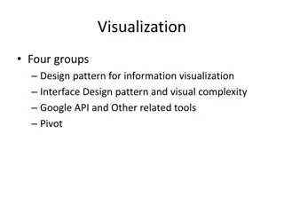
VISUALIZATION Jennifer Downey Tim Taylor David Haffner Alexius Gandy
CASE SCENARIO - VISUALIZATION Client: FREIGHT FORWARDER Phoenix International 710 N Tucker Blvd, Saint Louis, MO 63101 Customer invisions a system that will take known data from Customs and the Census division to utilize and connect to export data. A system like this, will allow Phoenix International development division to identify expanding, shifting, or declining markets to enhanced sales capacities and recognize new opportunities. They would also like to link their current Transportation Management System so that they can forecast peak seasons and commodity shifts.
CLIENT QUESTIONS 1. How do exports from each region compare? 2. What regions growth patterns are consistent with predicted trend lines. 3. Which regions are there unpredicted growth or unpredicted loss of exports. 4. What effect does tariff shifts have on reported loads? 5. What impact do tariff increases due to political issues have on loads per region?
Design Requirements for the Dashboard Client: Phoenix International, Freight Forwarding Company dashboard should Simplify and Streamline business and operational processes Display a summary of export load data by country, which allows users to monitor and understand predicted trend lines and unpredicted shift that can be used to determine market expansions. Display a summary of import tariff data by country, which allows users to monitor and understand predicted trend lines and unpredicted shift in tariffs and trade policy that can be used to determine if market shift is necessary.
Exports by Region - Load by Country Dashboard Question 1 - How do loads in each region compare? Question 2 - What regions growth patterns are consistent with predicted trend lines. Question 3 - Which regions are there unpredicted growth or decline.
Exports by Region Main Dashboard - Closer Look Drop down menu lets you choose countries for comparison. The view overtime shows actual load representation in the solid line and the predicted trendline as dashed lines. The view is a quick look at which regions are performing above their trend and could lead to new opportunity.
Exports by Region Main Dashboard - Closer Look Whisker Plot allows you to see how the countries compare to the mean range. In this year you can see which of the countries move in relationship to the mean. You can also see how India has quickly closed the gap.
Exports by Region Main Dashboard - What if? What if you wanted to compare China, India and US exports for years beyond 2015 so that you could see projected trendline growth. You could select only those countries and move the line to 2015. You would see that U.S and China are pretty close to their trendlines and are accurate, but look how India is peaking above their normal trend, this might be an area to look at for expansion.
Exports by Region Main Dashboard - What if? What if you wanted to compare China, India and US exports for years all years to see all of the comparison. You could select only those countries and select all of the years. You would see the the plotted growth but you would notice the quick close in gap and proximity that India gets to the mean 2014- 2016.
Tariff Comparison to Loads per Country Question 4 - What effect does tariffs have on reported loads?
Impact on Loads Per Region after Trade War Question 5- What impact do tariff increases due to political issues have on loads per region?
REFERENCES (CREDITS & RESOURCES) Case Studies. Phoenix International Business Logistics, www.phoenixlogistics.com/. Transport Exchange Moves Freight Trading on New Dashboard 18 November 2015. Transport Engineer, www.transportengineer.org.uk/transport-engineer-news/transport-exchange-moves-freight-trading-on-new- dashboard/110100 International Freight Forwarding Services. MIQ Logistics, www.miq.com/services/international-freight-forwarding Tableau Public, https://public.tableau.com/views/OverTimeMapView/OverTimeMapView?:embed=y&:display_count=yes
QUESTIONS? THE DASHBOARD (TABLEAU) THIS PRESENTATION OR


")