Poster Presentation Guidelines for Effective Communication
"Learn about the essential guidelines for creating a compelling poster presentation provided by Thomas Ihle, Ingo Forstner, and Svenja Erdmann. Discover tips on size requirements, avoiding commercial elements, background design, title banner readability, color usage, text formatting, and the importance of clear illustrations. Enhance your poster's visual appeal and communication effectiveness with these expert suggestions."

Download Presentation

Please find below an Image/Link to download the presentation.
The content on the website is provided AS IS for your information and personal use only. It may not be sold, licensed, or shared on other websites without obtaining consent from the author. If you encounter any issues during the download, it is possible that the publisher has removed the file from their server.
You are allowed to download the files provided on this website for personal or commercial use, subject to the condition that they are used lawfully. All files are the property of their respective owners.
The content on the website is provided AS IS for your information and personal use only. It may not be sold, licensed, or shared on other websites without obtaining consent from the author.
E N D
Presentation Transcript
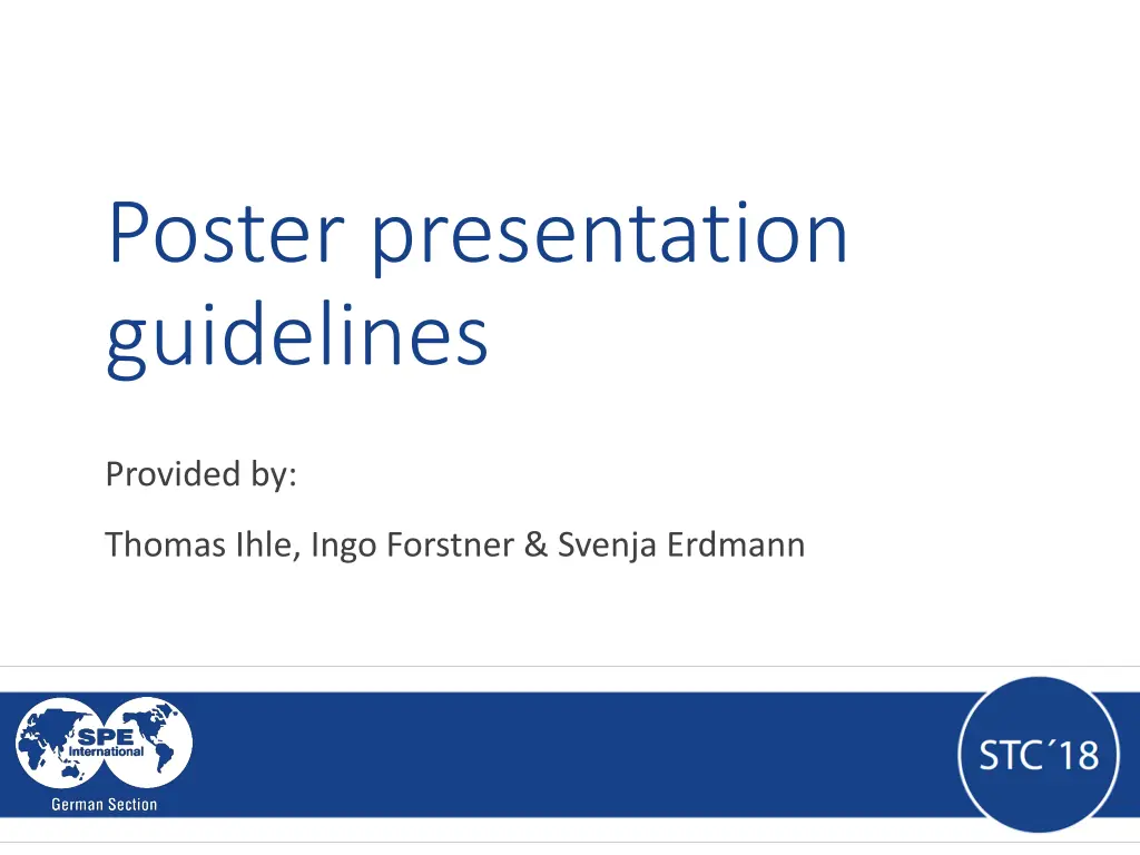
Poster presentation guidelines Provided by: Thomas Ihle, Ingo Forstner & Svenja Erdmann
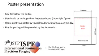
Size & General Comments Size & General Comments Size: A0 - 841 x 1189 mm (portrait), please stick to this size! No limitations for the design of the poster Poster design should emphasize aesthetics: attractiveness, color, clarity and legibility 2
Commercialism Commercialism Take out commercial character! Only mention company and product names at top or bottom of poster More guidelines on structure and presentation formats can be found in this SPE video: http://youtu.be/_SMLMWx6JGA 3
The The Poster s Poster s Background Background Artistry does not substitute the content The fancier the poster, the greater the time investment Softer color for background offer the best contrast for text, graphic and photographs 4
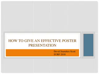
The Title The Title banner banner Think Big! Banner should be readable from 1m away Use first names for authors to facilitate interactions Use abbreviations where possible but explain them when introduced 5
Use Use of of Color Color Use a colored background to unify your poster Use a light background for darker photos; a dark background with lighter photos Use a neutral background (grey) to emphasize color in photos; a white background to reduce the impact of colored photos But do not mix too many colors! 6
Poster Poster text text Use left-justification; texts with even left sides and jagged right sides is easiest to read Text should be large enough to read easly from at least 50cm One suggestion (font = Arial narrow): Poster title = 48 pt / Subtitel (e.g. author names) = 30 pt Section titles (Introduction, Method, Results, Conclusion, ) = 38 pt Body text = 32 pt Figure captions = 26 pt Add emphasis by using boldface, underling or color 7
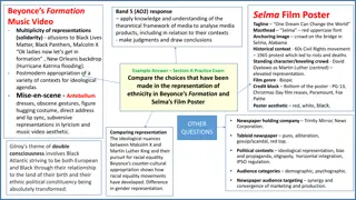
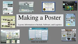
Illustrations Illustrations The success of a poster directly relates to the clarity of the illustrations and tables Self-explanatory graphics should dominate the poster Graphic materials should be visible easily from a minimum distance of 50cm adjust line style properly! (at least 1pt) Restrained use of 2-3 colors for emphasis is valuable overuse is not! 8
Putting Putting it it together together ..you have to have a good theme, supported by bunches of data and lots of quality graphics How do you go about making all this accessible to an audience ? keep it simple and well-arranged! Essential: Do not try to show EVERYTHING!!! It is not about quantity but quality. Less information, which is nicely visualized may be beneficial! 9
Miscellaneous Miscellaneous comments comments Since a poster ist essentially a virtual presentation try to find ways to show what was done Design the poster to adress one central question Provide a specific take-home message Summarize implications and conclusions briefly and in user-friendly language 10
More More Miscellaneous Miscellaneous comments comments Vary the size and spacing of the poster sections to add visual interest Do not wander too far away from your poster during the session; be available for discussion! Approach the people if you feel that they might have a question. 11
Thank you! Questions? Please contact us!