Explore guidelines for designing accessible print materials for diverse audiences, including people with disabilities, developed by the Massachusetts Department of Public Health in partnership with the Institute for Human Centered Design. Learn about essential elements, cultural considerations, and the importance of plain language to enhance communication access for all.
Please find below an Image/Link to download the presentation.
The content on the website is provided AS IS for your information and personal use only. It may not be sold, licensed, or shared on other websites without obtaining consent from the author. If you encounter any issues during the download, it is possible that the publisher has removed the file from their server.
You are allowed to download the files provided on this website for personal or commercial use, subject to the condition that they are used lawfully. All files are the property of their respective owners.
The content on the website is provided AS IS for your information and personal use only. It may not be sold, licensed, or shared on other websites without obtaining consent from the author.
E N D
Presentation Transcript
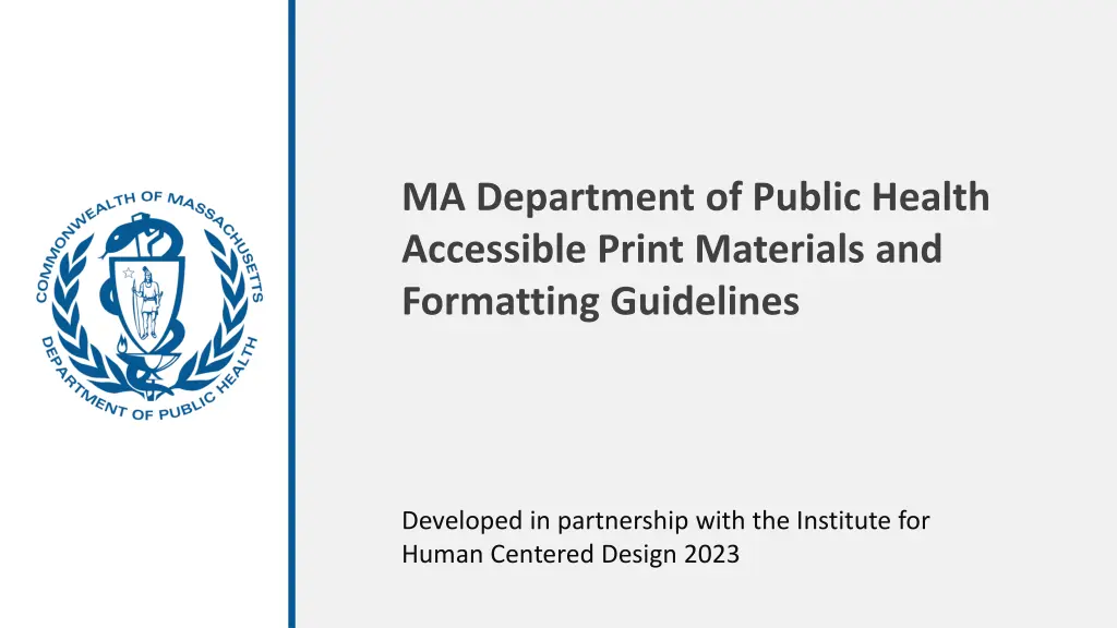
MA Department of Public Health Accessible Print Materials and Formatting Guidelines Developed in partnership with the Institute for Human Centered Design 2023
Accessible Elements for Print Materials Introduction Content Design Layout Graphic Design Use of Images Resources 3 4 9 12 27 30 Prepared by the Institute for Human Centered Design for the Massachusetts Department of Public Health page 2
Materials should be designed for diverse audiences, including people with disabilities. The Massachusetts Department of Public Health (DPH) in adherence with the Americans with Disabilities Act (ADA) requires that people with disabilities have communication access that is equally Accessible Print Materials effective as that provided to people without disabilities. These guidelines contain DPH policies, recommended standards, and website resources for accessible design and print information. Additional resources for alternative communication services, such as having print material produced in braille, are also included. IHCDesign.org page 3 Prepared by the Institute for Human Centered Design for the Massachusetts Department of Public Health
Overview Materials should reflect the target audience. Materials should be culturally and linguistically appropriate. Content The target population should include people with disabilities. Materials should identify disability as a risk factor for health conditions where appropriate. During all phases of the material development process, including initial discussions, concept testing, and focus groups, the target audience sample should include people with disabilities. page 4 Prepared by the Institute for Human Centered Design for the Massachusetts Department of Public Health Prepared by the Institute for Human Centered Design for the Massachusetts Department of Public Health
Plain Language What are the most common techniques that can help you achieve this goal? PlainLanguage.gov Active voice, not passive Short sentences and paragraphs Common, everyday words You and We and other pronouns Content Additional Resources: Checklists and handouts Plain writing page template Writing guidelines page 5 Prepared by the Institute for Human Centered Design for the Massachusetts Department of Public Health
Translation Culturally and Linguistically Appropriate Services (CLAS) The Culturally and Linguistically Appropriate Services (CLAS) standards were developed to provide guidance on how to improve service delivery to clients who may not have sufficient access to care based on race, ethnicity, linguistic capacity, or cultural background. mass.gov/service-details/clas-national-standards Content When creating accessible materials, provide easy-to-understand print and multimedia materials and signage in the languages commonly used by the populations in the service area. mass.gov/doc/clas-introduction/download page 6 Prepared by the Institute for Human Centered Design for the Massachusetts Department of Public Health
Making Print Material Accessible for People Who Use Screen-Reading Software* Use built-in headings and styles To preserve tab order and to make it easier for screen readers to read your documents, use a logical heading order and the built-in formatting tools in Word. Content Include alt text with all visuals Elements, such as a graphics, images, charts or photos need to be described. Alt text helps people who can t see the screen to understand what s important in images and other visuals. Ensure that color is not the only means of conveying information People who are blind, have low vision, or are colorblind might miss out on the meaning conveyed by particular colors. *Screen-reading software allows people who are blind to access content with a voice synthesizer or braille display. page 7 Prepared by the Institute for Human Centered Design for the Massachusetts Department of Public Health
Print Meeting Materials Make sure that: Notices and invitations include information concerning accessibility provided. Content If you re holding the event in an accessible space, use the symbol for wheelchair accessibility. If there will be sign language interpreters, use the sign language interpretation symbol. The Graphic Artist Guild has all the access symbols at graphicartistsguild.org/downloadable-disability-access-symbols. Provide an opportunity for people with disabilities to request accommodations they need to participate. You can have a fill-in space on a registration form, but we recommend that you also provide an individual name and contact information for privacy reasons. page 8 Prepared by the Institute for Human Centered Design for the Massachusetts Department of Public Health
Page Format Make sure that: Design Layout Outside page margins are at least 1/2 inch. The gutter margins (the adjoining margins in two facing pages) is at least 7/8 inch if the document is going to be bound or three hole punched. The space between columns is at least 1/2 inch. page 9 Prepared by the Institute for Human Centered Design for the Massachusetts Department of Public Health
Visual Hierarchy Considerations on content organization*: Guide the eye to critical information through a visual hierarchy. Keep it simple. If there are too many elements fighting for space within the message, information is lost. Design Layout Don t use too many visual elements (for example pictures, decorative fonts or colors). The headline is the piece of information that most viewers will read first so the headline should be clear, concise and accurately represent the content of the message. Make sure that what you add enhances the message and does not distract from it. *ithelp.brown.edu/custom-images/files/Brown_BestPractices_Final_7.22.15%20%20.pdf page 10 Prepared by the Institute for Human Centered Design for the Massachusetts Department of Public Health
Visual Hierarchy Design Layout Hierarchy can be emphasized graphically and is a critical element that allows readers to discern the importance of content and allows them to scan and absorb information quicker. page 11 Prepared by the Institute for Human Centered Design for the Massachusetts Department of Public Health
DPH Style Guide If you are developing a document on behalf of the Department of Public Health, refer to the DPH Style Guide [tinyurl.com/DPHStyleGuide] for specific design, color, and font choices. Graphic Design page 12 Prepared by the Institute for Human Centered Design for the Massachusetts Department of Public Health
Color and Contrast Better color contrast: The Institute for Human Centered Design (IHCD) is an international education and design non-profit organization committed to advancing the role of design in expanding Poor color contrast: The Institute for Human Centered Design (IHCD) is an international education and design non-profit organization committed to advancing the role of design in expanding Graphic Design Ensure there is sufficient contrast and color difference between text and background colors. Text contrast should be 4.5:1 for regular text (less than 18 pt) or 3:1 for large text (more than 18 pt or 14 pt bold). Contrast checkers can be used to confirm that color choices meet contrast minimums: tpgi.com/color-contrast-checker Icons and other graphics should have a contrast ratio of at least 3:1 with the background. page 13 Prepared by the Institute for Human Centered Design for the Massachusetts Department of Public Health
Color and Contrast continued The stark contrast of black on white can sometimes create eye strain for readers. If using a solid black, it can be addressed by toning down the white background to a subtle color. More Effective Contrast Effective Contrast Less Effective Contrast Graphic Design Avoiding a stark contrast between light text and dark background also applies. Light on dark will halo letters due to glare. In this sample the background is 70% black and text is 10% black. Reversing text out can also help with legibility but ensuring proper contrast is critical. page 14 Prepared by the Institute for Human Centered Design for the Massachusetts Department of Public Health
Color and Contrast continued Contrast of Hue: Contrast of hue is what relates most directly to the color wheel combinations. The further away from each other two colors are, the better the contrast. https://webaim.org/resources/contrastchecker/ Graphic Design Contrast of Tint and Shade: Contrast of value is very efficient in creating large contrasts. Colors and Text: Using the right contrast is especially important for text. Using the wrong colors can decrease the readability drastically, and it will quickly tire the reader's eyes. page 15 Prepared by the Institute for Human Centered Design for the Massachusetts Department of Public Health
Color and Contrastcontinued Avoid using color to color code or as the only way to convey information: reds and greens, in particular, are difficult to differentiate from each other for people with color vision deficiency. Provide redundant information with shapes, textures, and other cues in addition to colors. Graphic Design page 16 Prepared by the Institute for Human Centered Design for the Massachusetts Department of Public Health
Font/Typeface Choice Sans serif fonts are easier to read. Because the simple letter shapes make them more recognizable, they have a slightly higher readability. Arial, Verdana, Calibri, and Helvetica are sans serif fonts that have more readability. Graphic Design Sans Serif Serif Serif fonts have small decorative lines attached to the tops and bottoms of the letters. In a large point size they can be legible; however, when used in a digital environment with smaller point sizes or bold face they often become difficult to read. Serif fonts that are common are Times New Roman, Palatino, and Georgia. page 17 Prepared by the Institute for Human Centered Design for the Massachusetts Department of Public Health
Font/Typeface Choice continued This font is too bold. Select a font that This font is too bold. Select a font that when bolded is not so bold that letters when bolded is not so bold that letters begin to close up. The smaller the font begin to close up. The smaller the font the more critical this becomes. the more critical this becomes. Select a font that when bolded is not so bold that letters begin to close up. The smaller the font the more critical this becomes. Graphic Design Be careful when bolding a font. Ensure that when the font is bold the letters counters don t close the small spaces of e, a, g, c, etc. This will render them illegible for some readers. page 18 Prepared by the Institute for Human Centered Design for the Massachusetts Department of Public Health
Font/Typeface Choice continued Upper- and lowercase letters are generally more legible than all uppercase letters. All UPPER- AND LOWERCASE LETTERS ARE NOT LEGIBLE, ESPECIALLY WHEN USED FOR MULTIPLE WORDS OR PARAGRAPHS. Graphic Design Keep uppercase (block capitals) to a minimum and only for words that are familiar. Readers rely on the ability to discern the ascenders and descenders of letters to read words. (i.e., b, d, g, p, etc.) Uppercase should be limited to titles; large blocks of uppercase text are hard to read. page 19 Prepared by the Institute for Human Centered Design for the Massachusetts Department of Public Health
Font/Typeface Choice continued Extra thin, extra black, italic, and condensed fonts are less legible. When using italic ensure that it is a simple, clean font and an appropriate size. San serif type can be more legible based on the font choice. Graphic Design Avoid the use of display fonts and decorative fonts that have distinct variations. If they must be used, the content should always be repeated within body content. page 20 Prepared by the Institute for Human Centered Design for the Massachusetts Department of Public Health
Font/Typeface Choice continued Avoid the use of Roman numerals, as they can be perceived as letters and not numbers. (I., II., III., IV. or i., ii., iii., iv. etc.) Use Arabic numbers instead. (1, 2, 3, 4, etc.) Graphic Design Arabic numbers are easier to read and do not blend in with text. When using numbers ensure that the typeface, type size and type weight do not make numbers such as 3, 5, 6, 8, 9 look the same. page 21 Prepared by the Institute for Human Centered Design for the Massachusetts Department of Public Health
Text Alignment Avoid centered text for body copy as it makes it difficult to track back to the start of the next line. Centered: Materials should be designed for diverse audiences, including people with disabilities. The Massachusetts Department of Public Health (DPH) in adherence with the Americans with Disabilities Act (ADA) requires that people with disabilities have communication access that is equally effective as that provided to people without disabilities. Graphic Design Avoid justified text that creates uneven word spacing and makes it difficult for the eye to track across the line. Justified Text: Materials should be designed for diverse audiences, including people Massachusetts Department of Public Health (DPH) in adherence with the Americans with Disabilities Act (ADA) requires that people with disabilities have communication with disabilities. The Right-Aligned: Materials should be designed for diverse audiences, including people with disabilities. The Massachusetts Department of Public Health (DPH) in adherence with the Americans with Disabilities Act (ADA) requires that people with disabilities have communication Avoid right-aligned text. As noted above, uneven left edge body copy makes it difficult to find the start of the next line. page 22 Prepared by the Institute for Human Centered Design for the Massachusetts Department of Public Health
Text Alignment continued Left-Aligned: Materials should be designed for diverse audiences, including people with disabilities. The Massachusetts Department of Public Health (DPH) in adherence with the Americans with Disabilities Act (ADA) requires that people with disabilities have communication access that is equally effective as that provided to people without disabilities. These guidelines contain DPH policies, recommended standards, and websites resources for accessible Graphic Design Always use left-aligned text for body paragraphs. Keep your eye out for poor line breaks and avoid hyphenation. page 23 Prepared by the Institute for Human Centered Design for the Massachusetts Department of Public Health
Line Length Better: Materials should be designed for diverse audiences, including people with disabilities. The Massachusetts Department of Public Health (DPH) in adherence with the Americans with Disabilities Act (ADA) requires that people with disabilities have communication access that is equally effective as that provided to people without disabilities. These guidelines contain DPH policies, recommended Not long enough: Materials should be designed for diverse audiences, including people with disabilities. The Massachusetts Department of Public Health (DPH) in adherence with the Americans with Disabilities Act (ADA) requires that people with disabilities have communication access that is equally effective as that provided to people without DPH Graphic Design Always use left-aligned text for body paragraphs. Avoid using short lines. Be sure to always keep your eye out for poor line breaks and overused hyphenation. page 24 Prepared by the Institute for Human Centered Design for the Massachusetts Department of Public Health
Line Spacing Too much line spacing: Materials should be designed for diverse Additional space between lines can make it easier to read and therefore understand the content; however, too much space will make it harder. audiences, including people with disabilities. The Massachusetts Graphic Design Department of Public Health (DPH) in adherence with the Americans with Disabilities Act (ADA) requires that people with disabilities have And too little space will also make it difficult. Too little line spacing: Materials should be designed for diverse audiences, including people with disabilities. The Massachusetts Department of Public Health (DPH) in adherence with the Americans with Disabilities Act (ADA) requires that people with disabilities have communication access that is equally effective as that provided to people without disabilities. These guidelines contain DPH More effective line spacing: Materials should be designed for diverse audiences, including people with disabilities. The Massachusetts Department of Public Health (DPH) in adherence with the Americans with Disabilities Act (ADA) requires that people with disabilities have communication access that is equally effective as that provided to people page 25 Prepared by the Institute for Human Centered Design for the Massachusetts Department of Public Health
Letter and Word Spacing Tight Spacing: Materials should be designed for diverse audiences, including people with disabilities. The Massachusetts Department of Public Health (DPH) in adherence with the Americans with Disabilities Act (ADA) requires that people with disabilities have communication access that is equally effective as that provided to Beware of tightening word and letter spacing to fit body copy. Consider using a different font or font size first. Graphic Design When characters are too tight, the letters merge together, creating shapes that are unrecognizable. The lack of word space will cause the reader to read much slower. This could present problems if text content is timed on the digital sign. Untouched: Materials should be designed for diverse audiences, including people with disabilities. The Massachusetts Department of Public Health (DPH) in adherence with the Americans with Disabilities Act (ADA) requires that people with disabilities have communication access that is equally effective as that provided to people without disabilities. These guidelines page 26 Prepared by the Institute for Human Centered Design for the Massachusetts Department of Public Health
Images Health promotion materials should use images representing the target population, including people with disabilities. Images should have sufficient resolution and significant color contrast for easy viewing. Use of Images Make sure that: Alt text is available for all images and graphics perkins.org/resource/how-write-alt-text-and-image-descriptions- visually-impaired Labels are used for each image, and an appropriate font size is used. Ideally 12 point sans serif, although often different fonts can vary in size and appear larger or smaller Line drawings or floor plans are clear and bold, with limited detail and a and an appropriate font size page 27 Prepared by the Institute for Human Centered Design for the Massachusetts Department of Public Health
Images and Legibility Avoid printing text on image backgrounds (overprinting). Overprinting negatively impacts legibility and interferes with the contrast between the text and background. Text should be set against a solid background. Ensure that when you overlay text on an image or pattern that the text remains legible and the contrast is strong. Use of Images Moving the text to a solid portion of the image or adding a transparent or solid bar behind the text will assist with legibility. page 28 Prepared by the Institute for Human Centered Design for the Massachusetts Department of Public Health
Images and Alt Text Ensure that each graphic, image, chart, or photo has alt text. This can be done by right-clicking on the element and selecting Edit Alt Text or View Alt Text, and this feature will appear on your screen. Use of Images page 29 Prepared by the Institute for Human Centered Design for the Massachusetts Department of Public Health
Resources Plain Language plainlanguage.gov Alt Text perkins.org/resource/how-write-alt-text-and-image-descriptions-visually-impaired Resources Color Contrast Checker tpgi.com/color-contrast-checker Screen Readers Make Your Word Documents Accessible to People with Disabilities Make Your PowerPoint Presentations Accessible to People with Disabilities Make Your Excel Documents Accessible to People with Disabilities Culturally and Linguistically Appropriate Services (CLAS) mass.gov/service-details/clas-national-standards mass.gov/doc/clas-introduction/download page 30 Prepared by the Institute for Human Centered Design for the Massachusetts Department of Public Health