Relative Income Poverty Trends in UK Countries
The variations in the percentage of people living in relative income poverty across Wales, England, Scotland, and Northern Ireland over the past two decades. The data reveals stability in Wales, with slight fluctuations in other regions. Visualize the insights to grasp the impact of housing costs on these figures.
Uploaded on Mar 01, 2025 | 2 Views
Download Presentation

Please find below an Image/Link to download the presentation.
The content on the website is provided AS IS for your information and personal use only. It may not be sold, licensed, or shared on other websites without obtaining consent from the author.If you encounter any issues during the download, it is possible that the publisher has removed the file from their server.
You are allowed to download the files provided on this website for personal or commercial use, subject to the condition that they are used lawfully. All files are the property of their respective owners.
The content on the website is provided AS IS for your information and personal use only. It may not be sold, licensed, or shared on other websites without obtaining consent from the author.
E N D
Presentation Transcript
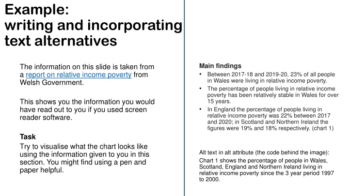
Example: writing and incorporating text alternatives Main findings Between 2017-18 and 2019-20, 23% of all people in Wales were living in relative income poverty. The percentage of people living in relative income poverty has been relatively stable in Wales for over 15 years. In England the percentage of people living in relative income poverty was 22% between 2017 and 2020; in Scotland and Northern Ireland the figures were 19% and 18% respectively. (chart 1) The information on this slide is taken from a report on relative income poverty from Welsh Government. This shows you the information you would have read out to you if you used screen reader software. Task Try to visualise what the chart looks like using the information given to you in this section. You might find using a pen and paper helpful. Alt text in alt attribute (the code behind the image): Chart 1 shows the percentage of people in Wales, Scotland, England and Northern Ireland living in relative income poverty since the 3 year period 1997 to 2000.
Visualising the information This is what I came up with: % Main findings Between 2017-18 and 2019-20, 23% of all people in Wales were living in relative income poverty. The percentage of people living in relative income poverty has been relatively stable in Wales for over 15 years. In England the percentage of people living in relative income poverty was 22% between 2017 and 2020; in Scotland and Northern Ireland the figures were 19% and 18% respectively. (chart 1) 23 Wales England Scotland Northern Ireland 15 Alt text in alt attribute (the code behind the image): Chart 1 shows the percentage of people in Wales, Scotland, England and Northern Ireland living in relative income poverty since the 3 year period 1997 to 2000. 2017-18 to 2019-20 1997 to 2000
Same example with more information People in relative income poverty 23% of people in Wales in relative income poverty Figure 1: Percentage of people in each UK country living in relative income poverty (after housing costs), averages of three-financial- years, 1997 to 2020, FYE = Financial Year Ending On this slide we have rearranged and added to the information given to the user. We have: [Image of chart would sit here] made the section title descriptive given the chart a headline title and a statistical title combined the main bullet points into the text alternative which is now in the body text rather than in the alt attribute Description of figure 1 During the latest period we have data for (FYE 2018 to FYE 2020), 23% of all people in Wales were living in relative income poverty (after accounting for housing costs). In England in the same period, the percentage was 22% - in Scotland and Northern Ireland the figures were 19% and 18% respectively Percentages for all countries have been relatively stable for over 15 years, although Northern Ireland appears to be on a recent downward trend. In the early part of the period (FYE 98 to FYE 00) percentages for all countries were nearer to 25%. Task Try to visualise the chart again using this information. As before you might find using a pen a paper helpful.
Visualising the information again This is what I came up with this time from the given information: % People in relative income poverty 23% of people in Wales in relative income poverty Figure 1: Percentage of people in each UK country living in relative income poverty (after housing costs), averages of three-financial- years, 1997 to 2020, FYE = Financial Year Ending 25 23 Wales England [Image of chart sits here] Scotland Northern Ireland 15 Description of figure 1 During the latest period we have data for (FYE 2018 to FYE 2020), 23% of all people in Wales were living in relative income poverty (after accounting for housing costs). In England in the same period, the percentage was 22% - in Scotland and Northern Ireland the figures were 19% and 18% respectively Percentages for all countries have been relatively stable for over 15 years, although Northern Ireland appears to be on a recent downward trend. In the early part of the period (FYE 98 to FYE 00) percentages for all countries were nearer to 25%. 2018 to 2020 1998 to 2000 Averages of three financial years
People in relative income poverty 23% of people in Wales in relative income poverty Figure 1: Percentage of people in each UK country living in relative income poverty (after housing costs), averages of three-financial- years, 1997 to 2020, FYE = Financial Year Ending Comparing my chart My chart is now closer to the chart in the report. % 25 23 Wales England Scotland Northern Ireland 15 Description of figure 1 During the latest period we have data for (FYE 2018 to FYE 2020), 23% of all people in Wales were living in relative income poverty (after accounting for housing costs). In England in the same period, the percentage was 22% - in Scotland and Northern Ireland the figures were 19% and 18% respectively Percentages for all countries have been relatively stable for over 15 years, although Northern Ireland appears to be on a recent downward trend. In the early part of the period (FYE 98 to FYE 00) percentages for all countries were nearer to 25%. 2018 to 2020 1998 to 2000 Averages of three financial years
Conclusion This example shows that when we consider how to combine the text alternative with the surrounding information we can help all users better understand our content. We can particularly help users who have trouble seeing or reading information from charts.
Exercise Percentage of mothers with children aged 0 to 14 in paid work who stated the listed childcare arrangement helped them go to work, England, 2021 Task Draw a chart of this data and decide what the best text alternative would be. Percentage Childcare arrangements Children at school Have reliable childcare Relatives help with childcare Childcare fits with working hours Have good quality childcare Have free/cheap childcare Children old enough to look after themselves Friends help with childcare We use free hours of childcare for 3 and 4 year olds (under the 30 free hours scheme) We use free hours of childcare for 3 and 4 year olds (under the 15 free hours scheme) Help with childcare costs through tax credits Employer pays for some/all of childcare Other None of these selecting the option 44% 42% 38% 27% 26% 13% 12% 9% You can choose a text description, a table, or both. If you decide to go for a text description, imagine you are describing the chart to someone over the phone what would you say? 8% 4% 3% 1% 1% 15% Source: Department for Education - Childcare and early years survey of parents
