Renal Centre MRSA and MSSA Rates in UK Dialysis Patients
Explore the box and whisker plots and funnel plots depicting MRSA and MSSA rates in renal centres among dialysis patients in the UK as reported in the UK Renal Registry 17th Annual Report. Gain insights into infection rates and trends in renal care settings.

Download Presentation

Please find below an Image/Link to download the presentation.
The content on the website is provided AS IS for your information and personal use only. It may not be sold, licensed, or shared on other websites without obtaining consent from the author. If you encounter any issues during the download, it is possible that the publisher has removed the file from their server.
You are allowed to download the files provided on this website for personal or commercial use, subject to the condition that they are used lawfully. All files are the property of their respective owners.
The content on the website is provided AS IS for your information and personal use only. It may not be sold, licensed, or shared on other websites without obtaining consent from the author.
E N D
Presentation Transcript
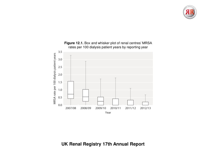
Figure 12.1. Box and whisker plot of renal centres MRSA rates per 100 dialysis patient years by reporting year UK Renal Registry 17th Annual Report
Figure 12.2. Funnel plot of the MRSA bacteraemia rate per 100 dialysis patient years by renal centre, 1st May 2012 to 30th April 2013 Dotted line depicts rate for whole cohort UK Renal Registry 17th Annual Report
Figure 12.3. Funnel plot of the MRSA bacteraemia two-year rate per 100 prevalent HD patients, 1st May 2011 to 30th April 2013 Dotted line depicts Renal Association standard UK Renal Registry 17th Annual Report
Figure 12.4. Box and whisker plot of renal centres MSSA rates per 100 dialysis patient years by reporting year The additional episodes were added by centres during the UKRR validation step of the data collection process UK Renal Registry 17th Annual Report
Figure 12.5. Funnel plot of the MSSA bacteraemia rate per 100 dialysis patient years by renal centre, 1st May 2012 to 30th April 2013 Dotted line depicts rate for whole cohort UK Renal Registry 17th Annual Report
Figure 12.6. Funnel plot of the CDI rate per 100 dialysis patient years by renal centre, 1st May 2012 to 30th April 2013 Dotted line depicts rate for whole cohort UK Renal Registry 17th Annual Report
Figure 12.7. Funnel plot of the Escherichia coli bacteraemia rate per 100 dialysis patient years by renal centre, 1st May 2012 to 30th April 2013 Dotted line depicts rate for whole cohort UK Renal Registry 17th Annual Report


