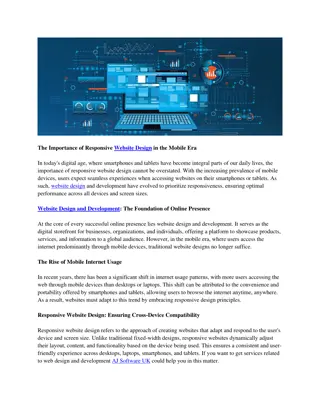
Learn the fundamentals of responsive web design from this informative guide. Explore the importance of creating websites that adapt to various devices and discover methods to ensure optimal user experience. Understand the significance of viewport, content sizing, and utilizing grid-view for effective layout. Enhance your skills in CSS and HTML to craft a responsive design that looks great on any screen size.
Please find below an Image/Link to download the presentation.
The content on the website is provided AS IS for your information and personal use only. It may not be sold, licensed, or shared on other websites without obtaining consent from the author. If you encounter any issues during the download, it is possible that the publisher has removed the file from their server.
You are allowed to download the files provided on this website for personal or commercial use, subject to the condition that they are used lawfully. All files are the property of their respective owners.
The content on the website is provided AS IS for your information and personal use only. It may not be sold, licensed, or shared on other websites without obtaining consent from the author.
E N D
Presentation Transcript
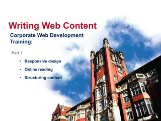
Responsive Design A very basic introduction John Beckett CPTE 212 9/13/2022 Based on https://www.w3schools.com/css/css_rwd_intro.asp
The wrong way This page looks better on my computer, in Talge hall room _______.
Why Responsive Design? Wide variety of devices used to access your Web site Looking good and functioning well is your responsibility, not theirs W3Schools term: Best experience We use CSS and HTML to resize, hide, shrink, enlarge, or move content to make it look good on any screen.
Methods Adjust layout according to device width Show or hide elements as appropriate Adjust font size as needed To conserve bandwidth, consider serving pixels with appropriate width
Viewport The viewport is the user s visible area of a Web page. <meta name="viewport" content="width=device- width, initial-scale=1.0"> The width=device-width part sets the width of the page to follow the screen- width of the device (which will vary depending on the device) The initial-scale=1.0 part sets the initial zoom level when the page is first loaded by the browser.
Size your Content Do NOT use large fixed width elements If an image is displayed at a width wider than the viewport, it can cause the viewport to scroll horizontally. Do NOT let the content rely on a particular viewport width to render well Since screen dimensions and width in CSS pixels vary widely between devices, content should not rely on a particular viewport width to render well. Use CSS media queries to apply different styling for small and large screens Use relative width values such as width: 100%. Don t use large absolute positioning values Test your site on various devices - And IP connections
Using Grid-view Using a grid-view makes it easier to place elements on the page. DEMO DEMO
Use a responsive grid-view .col-1 {width: 8.33%;} .col-2 {width: 16.66%;} .col-3 {width: 25%;} .col-4 {width: 33.33%;} .col-5 {width: 41.66%;} .col-6 {width: 50%;} .col-7 {width: 58.33%;} .col-8 {width: 66.66%;} .col-9 {width: 75%;} .col-10 {width: 83.33%;} .col-11 {width: 91.66%;} .col-12 {width: 100%;} Demo 12 columns is a good number class= col- and a number defining how many columns the section should span * { box-sizing: border-box; } Demo
Media Query Uses the @media rule to include a block of CSS properties only if a certain condition is true. @media only screen and (max-width: 600px) { body { background-color:lightblue; } } Breakpoint Demo
Two Breakpoints If you want to support three types of devices Always design for mobile first Makes display work faster on smaller devices It s tempting to assume the user in the field has the same bandwidth you have. Not so! Change style when the width gets larger than 768px Demo Demo
W3Schools suggests 5 options Extra small (Phones 600px and down) @media only screen and (max-width: 600px) Small (Portrait tablets, large phones 600px+) @media only screen and (min-width: 600px) Medium (Landscape tablets 768+) @media only screen and (min-width: 768px) Large (Laptops/desktops, 992+) @media only screen and (min-width: 992px) Extra large (Large laptops/desktops, 1200px+) @media only screen and (min-width: 1200px) Demo
Other things you can do: Base rule on orientation - Demo Hide elements - Demo Change font - Demo
Images Width to a percentage and height auto the image will scale up and down - Demo Max-width scale down, but never bigger than original - Demo
Frameworks Pre-packaged CSS that you can use easily w3.css DEMO Tutorial Bootstrap popular, but requires jquery - Demo


:")