The Internet for All: Web Standards and Accessibility
This collection of images and text highlights the importance of web accessibility, focusing on universal design principles, exclusion factors, contrast/font selection, sensory characteristics, and more. It emphasizes the need for inclusive web practices to ensure equal access for all users.

Download Presentation

Please find below an Image/Link to download the presentation.
The content on the website is provided AS IS for your information and personal use only. It may not be sold, licensed, or shared on other websites without obtaining consent from the author.If you encounter any issues during the download, it is possible that the publisher has removed the file from their server.
You are allowed to download the files provided on this website for personal or commercial use, subject to the condition that they are used lawfully. All files are the property of their respective owners.
The content on the website is provided AS IS for your information and personal use only. It may not be sold, licensed, or shared on other websites without obtaining consent from the author.
E N D
Presentation Transcript
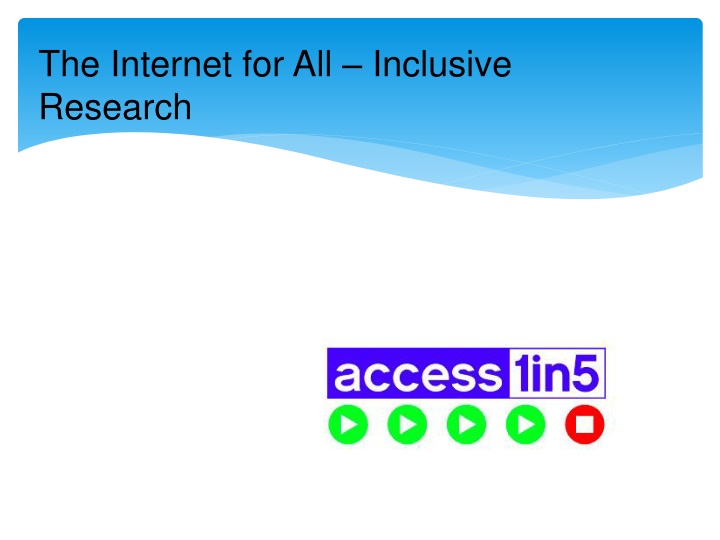
The Internet for All Inclusive Research
Web Standards HTML is designed for universal access The power of the Web is in its universality. Access by everyone regardless of disability is an essential aspect. - Tim Berners-Lee, director of the Word Wide Web Consortium and inventor of the World Wide Web.
Whos Excluded? Internet only accessibility/skill/inclination Landline Survey No landline, Deaf Print Only Print Disabled Check your process only hard copy good enough for sign up?
Contrast, font and size This is too light although the second part is better Better but still not good This is much better Hard to see? Much easier Probably not the easiest font Good old sans serif Arial STILL NOT SO GOOD CAPS ARE HARD TO READ And this is better still
Use of Multiple Sensory Characteristics Use of colour, or sound, alone to convey meaning. John Smith Fred Jones or John Smith FAIL Fred Jones PASS
Turing Might Have Tried too Hard Avoiding SPAM is important Avoiding users is more so Don t use CAPTCHA
Structure Logical Consistent Headings Clear
Documents Fonts Images Links Tables Headings http://blindfoundation.org.nz/learn/acc essible-information/accessible- documents
Documents 2 Word 2010 Accessibility Checker Create simple pdf from Word
Great resources webaim.org/resources/designers http://webaim.org/resources/quickref/ Note text and infographic options http://wave.webaim.org/
Thank You and Questions Kevin Prince kevin@access1in5.co.nz 021 2220638