Types of Graphs and Data Visualization
Different types of graphs such as line graphs, scatter plots, histograms, and bar graphs to represent and analyze data effectively. Learn how to interpret correlations, variability, and statistical analysis for better data understanding.

Download Presentation

Please find below an Image/Link to download the presentation.
The content on the website is provided AS IS for your information and personal use only. It may not be sold, licensed, or shared on other websites without obtaining consent from the author.If you encounter any issues during the download, it is possible that the publisher has removed the file from their server.
You are allowed to download the files provided on this website for personal or commercial use, subject to the condition that they are used lawfully. All files are the property of their respective owners.
The content on the website is provided AS IS for your information and personal use only. It may not be sold, licensed, or shared on other websites without obtaining consent from the author.
E N D
Presentation Transcript
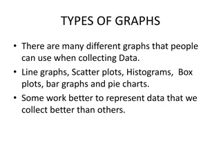
Data Literacy Graphing and Statisitics
TYPES OF GRAPHS There are many different graphs that people can use when collecting Data. Line graphs, Scatter plots, Histograms, Box plots, bar graphs and pie charts. Some work better to represent data that we collect better than others.
Does it ask if there is a correlation? Are two numbers or factors correlated If so then you can use a Scatter plot or a Line Graph Height vs Shoe Size. Scatter plot. Something changing over time than use a Line Graph.
Scatter plots Is the Fuel efficiency of a car related to Weight? Are smoking rates correlated with medium income? How are temperature and pressure related to a fixed volume?
Line Graphs Have summer lake water temps increased over the last ten years? How have the height of humans changes over the past century?
Does your question ask about the variability of a group of data points? Such as the range of the data , the shape of the distribution, or what is the center of the data. Use Histograms, Dot plots or Box plot Examples: Do all high tides rise to the same height? What is the range and distribution of the incomes in the United States? How variable are wind speeds in Blaine?
Bar Graphs Use these graphs if you are comparing single numbers. Such as Median, Mean, or Total. Was the snowfall greater this year compared to last winter? How do Median incomes in the U.S. compare to the median incomes in Sweden?
Statistics Statistical analysis is used to collect a sample size of data which can infer what is occurring in the general population More practical for most biological studies Requires math and graphing data Typical data will show a normal distribution (bell shaped curve). Range of data
Statistical Analysis Two important considerations How much variation do I expect in my data? What would be the appropriate sample size?
Descriptive statistics is used to estimate important parameters of the sample data set. measurements of central tendencies such as mean, median, and mode; and standard error of the mean, which helps you determine your confidence in the sample mean. Bozeman Science: standard deviation (7 50 ) and standard error of the mean (7 05 )
Standard Deviation: A measure of how spread out the data is from the mean
Measures of Variability Standard Deviation In normal distribution, about 68% of values are within one standard deviation of the mean Often report data in terms of +/- standard deviation It shows how much variation there is from the "average" (mean). If data points are close together, the standard deviation with be small If data points are spread out, the standard deviation will be larger
Lower standard deviation: Data is closer to the mean Greater likelihood that the independent variable is causing the changes in the dependent variable Higher standard deviation: Data is more spread out from the mean More likely factors, other than the independent variable, are influencing the dependent variable
= standard deviation 68% of data fall within 1s of mean 95% of data fall within 2s of mean 99% of data fall within 3s of mean
The magnitude of the standard deviation depends on the spread of the data set Two data sets: same mean; different standard deviation
Calculating standard deviation, s 1. 2. Calculate the mean (x) Determine the difference between each data point, and the mean Square the differenes Sum the squares Divide by sample size (n) minus 1 Take the square root 3. 4. 5. 6.
http://www.bozemanscience.com/standard- deviation
Calculating Standard Deviation Grades from a quiz 96, 96, 93, 90, 88, 86, 86, 84, 80, 70 Measure Number 1 2 3 4 5 6 7 8 9 10 TOTAL Mean, X Measured Value x 96 96 92 90 88 86 86 84 80 70 868 87 (x - X) 9 9 5 3 1 -1 -1 -3 -7 -17 TOTAL Std Dev (x - X)2 81 81 25 9 1 1 1 9 49 289 546 1st Step: find the mean (X)
Calculating Standard Deviation 2nd Step: determine the deviation from the mean for each grade then square it Measure Number 1 2 3 4 5 6 7 8 9 10 TOTAL Mean, X Measured Value x 96 96 92 90 88 86 86 84 80 70 868 87 (x - X) 9 9 5 3 1 -1 -1 -3 -7 -17 TOTAL Std Dev (x - X)2 81 81 25 9 1 1 1 9 49 289 546
Calculating Standard Deviation Measure Number 1 2 3 4 5 6 7 8 9 10 TOTAL Mean, X Measured Value x 96 96 92 90 88 86 86 84 80 70 868 87 Step 3: (x - X) 9 9 5 3 1 -1 -1 -3 -7 -17 TOTAL Std Dev (x - X)2 81 81 25 9 1 1 1 9 49 289 546 Calculate degrees of freedom (n-1) where n = number of data values So, 10 1 = 9
Calculating Standard Deviation Measure Number 1 2 3 4 5 6 7 8 9 10 TOTAL Mean, X Measured Value x 96 96 92 90 88 86 86 84 80 70 868 87 Step 4: (x - X) 9 9 5 3 1 -1 -1 -3 -7 -17 TOTAL Std Dev (x - X)2 81 81 25 9 1 1 1 9 49 289 546 8 Put it all together to calculate S S = (546/9) = 7.79 = 8
Standard Error: Indication of how well the mean of a sample (x) estimates the true mean of a population ( ) Measure of accuracy, if the true mean is known Measure of precision, if true mean is not known
Accuracy How close a measured value is to the actual (true) value Precision How close the measured values are to each other.
Calculating Standard Error, SE 1. 2. Calculate standard deviation Divide standard deviation by square root of sample size
How do we use Standard Error? Create bar graph mean on Y-axis sample(s) on the X-axis chemical 1 mean = 30 cm chemical 2 mean = 50 cm
Add error bars! SE Indicate in figure caption that error bars represent standard error (SE)
Analyze! Look for overlap of error lines: If they overlap: The difference is not significant If they don t overlap: The difference may be significant
Which is a valid statement? Fish2Whale food caused the most fish growth Fish2Whale food caused more fish growth than did Budget Fude
Statements: In all four regions, more males exhibited the trait measured than did females. More males in region 3 exhibited the measured trait than did females
Mean belief scores for misleading ads vmPFC = damage to ventromedial prefrontal cortex BDC = brain damaged comparison group # of ads identified as misleading Statements: 1. The vmPFC group identified fewer ads as misleading than did the normal group 2. The BDC group identified more ads as misleading than did the normal group.
Calculating Standard Error So for the class data: Mean = 87 Standard deviation (S) = 8 1 s.d. would be (87 8) thru (87 + 8) or 81-95 So, 68.3% of the data should fall between 81 and 95 2 s.d. would be (87 16) thru (87 + 16) or 71-103 So, 95.4% of the data should fall between 71 and 103 3 s.d. would be (87 24) thru (87 + 24) or 63-111 So, 99.7% of the data should fall between 63 and 111
Measures of Variability Standard Error of the Mean (SEM) Accounts for both sample size and variability Used to represent uncertainty in an estimate of a mean As SE grows smaller, the likelihood that the sample mean is an accurate estimate of the population mean increases
Calculating Standard Error Using the same data from our Standard Deviation calculation: Mean = 87 S = 8 n = 10 SEX = 8/ 10 = 2.52 = 2.5 Bozeman video: Standard Error This means the measurements vary by 2.5 from the mean
Graphing Standard Error Common practice to add standard error bars to graphs, marking one standard error above & below the sample mean (see figure below). These give an impression of the precision of estimation of the mean, in each sample. Which sample mean is a better estimate of its population mean, B or C? Identify the two populations that are most likely to have statistically significant differences?
Consider these 3 plant populations: When two SEM error bars don't overlap at all (like Pop. 1 and Pop. 3), and they are representing +/- 2 SEM, then you can be 95% confident there is a significant difference between the two populations (you can do other statistical tests to affirm this). (You can say, the difference between Pop. 1 and Pop. 3 is significant at p<0.05 .) When the +/- 2 SEM error bars do overlap but don't overlap the mean then you don't really know without a test--it might be or might not be a significant difference. Comparing Pop. 2 and Pop. 3 is this type of situation. Finally, if the error bars overlap and that overlap includes the means, then you can be fairly confident there is no real difference. This is the situation comparing Pop. 1 and Pop 2.
Little overlap, likely to be significantly different So much overlap, may not be significantly different