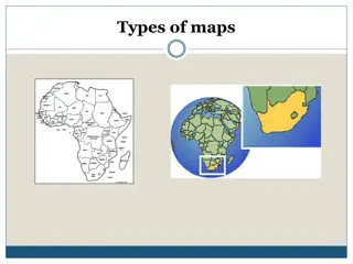
Types of Thematic Maps and Best Map for Showing Population by County
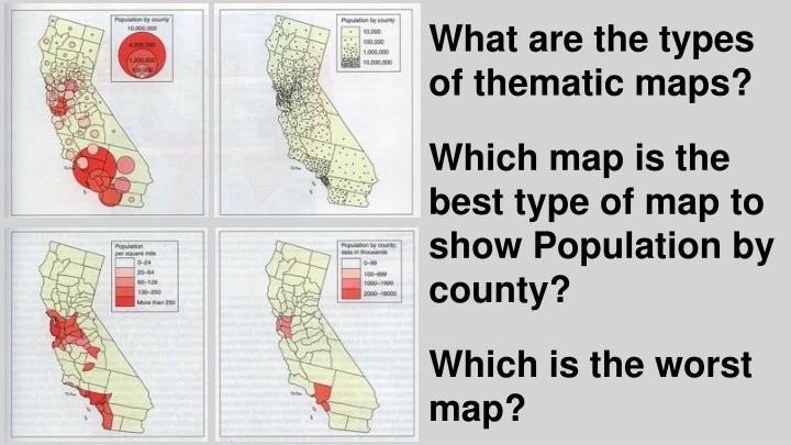
Thematic maps categorize data to convey specific information effectively. Choosing the right map type, such as Choropleth for displaying population by county, is crucial for clear representation. Different map types serve various purposes, with Dot, Graduated, Circle, Choropleth, and Isoline maps each offering unique advantages. Understanding the best and worst maps for showcasing specific data, like the total number of Muslim people, is essential for impactful data visualization.

Download Presentation

Please find below an Image/Link to download the presentation.
The content on the website is provided AS IS for your information and personal use only. It may not be sold, licensed, or shared on other websites without obtaining consent from the author.If you encounter any issues during the download, it is possible that the publisher has removed the file from their server.
You are allowed to download the files provided on this website for personal or commercial use, subject to the condition that they are used lawfully. All files are the property of their respective owners.
The content on the website is provided AS IS for your information and personal use only. It may not be sold, licensed, or shared on other websites without obtaining consent from the author.
E N D
Presentation Transcript
What are the types of thematic maps? Which map is the best type of map to show Population by county? Which is the worst map?
What are the types of thematic maps? Dot Graduated Circle Which map is the best type of map to show Population by county? Choropleth Isoline Which is the worst map?
What are the types of thematic maps? Dot Graduated Circle Which map is the best type of map to show Population by county? 1st 2nd Choropleth Isoline Which is the worst map? 4th 3rd
1 2 3 4 5 Which two maps are the worst for showing the total Number of Muslim People? Which three maps are the best for showing the total Number of Muslim People?
2 3 2nd 3rd Which map is best for showing the Number of Muslim People? 5 1st