Understanding Data Visualization: Importance and Techniques
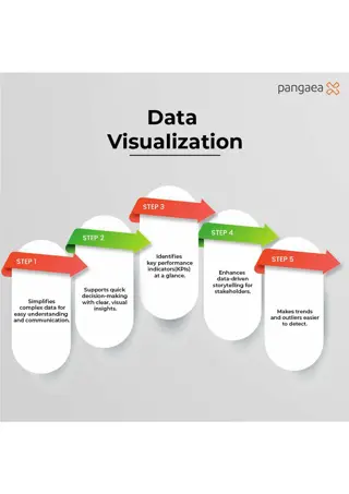
Discover the significance of data visualization in today's data-driven world, its transformative power from symbolic to geometric, and why creating visualizations is crucial for answering questions, making decisions, and telling compelling stories.

Download Presentation

Please find below an Image/Link to download the presentation.
The content on the website is provided AS IS for your information and personal use only. It may not be sold, licensed, or shared on other websites without obtaining consent from the author. If you encounter any issues during the download, it is possible that the publisher has removed the file from their server.
You are allowed to download the files provided on this website for personal or commercial use, subject to the condition that they are used lawfully. All files are the property of their respective owners.
The content on the website is provided AS IS for your information and personal use only. It may not be sold, licensed, or shared on other websites without obtaining consent from the author.
E N D
Presentation Transcript
Exploratory Experiment through Visualization Dan Pei Advanced Network Management, Tsinghua University
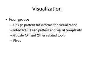
Roadmap Background Motivating Example: Storytelling with data Introduction to Data Visualization
The value of data visualization The ability to take data to be able to understand it, to process it, to extract value from it, to visualize it, to communicate it that s going to be a hugely important skill in the next decades, ... because now we really do have essentially free and ubiquitous data. So the complimentary scarce factor is the ability to understand that data and extract value from it. Hal Varian, Google s Chief Economist The McKinsey Quarterly, Jan 2009 Slides adopted from CSE 512 Data Visualization, University of Washington, by Jeffrey Heer
What is Visualization? What is Visualization? Transformation of the symbolic into the geometric [McCormick et al. 1987] ... finding the artificial memory that best supports our natural means of perception. [Bertin 1967] The use of computer-generated, interactive, visual representations of data to amplify cognition. [Card, Mackinlay, & Shneiderman 1999] Slides adopted from CSE 512 Data Visualization, University of Washington, by Jeffrey Heer
Why Create Visualizations? Why Create Visualizations? Answer questions (or discover them) Make decisions See data in context Expand memory Support graphical calculation Find patterns Present argument or tell a story Inspire Slides adopted from CSE 512 Data Visualization, University of Washington, by Jeffrey Heer
Scientific Experiment for a first grader 6
Some Experiments in AIOps Have a hypothesis: Y increases when A increases, B decreases, or C&D together satisfy some conditions Design experiments (process the data): Exploratory visualization using scatter plot, average bar/line; candle-stick, where y-axis is Y; x-axis is A (sometimes binned) Pearson/Kendall/Spearman Correlation; see if Y is correlated with A, B, based on the correlation score Linear Regression; find the coeffient Y=alpha + beta * A Information Gain; See if A, B, C, D has any influence on Y Decision Tree; C>20& D<=5 Y is bad; Regression Trees. Y=alpha + beta *C + gamma*D if A>5 & D<=10 Feature engineering, feature selection, model selection Machine learning: random forest, XGBoost etc. Deep learning: CNN, RNN Observations e.g.: Y increases when A increases; When C increases by s%, Y will increase by t%; J outperform K by 30% . Conclusions 7
Why Create Visualizations? Why Create Visualizations? Answer questions (or discover them) Make decisions See data in context Expand memory Support graphical calculation Find patterns Present argument or tell a story Inspire Slides adopted from CSE 512 Data Visualization, University of Washington, by Jeffrey Heer
Story Telling with Data Figures copied from the book Story Teling with Data a data visualization guide for business professionals By Cole Nussbaumer Knaflic
Story Suppose you manage an IT team and want to show the volume of incoming tickets exceeds your team s resources
Focusing audiences attention (1): Push everything to the background
Focusing audiences attention (2): Make the data stand out
Focusing audiences attention (3): Too many data labels feels cluttered
Focusing audiences attention (4): Data Labels used sparingly help draw attention


: Remove chart border")
: Remove gridlines")
: Remove data markers")
: Clean up axis labels")
: Label data directly")
: Leverage consistent color")

:")
:")
:")
:")