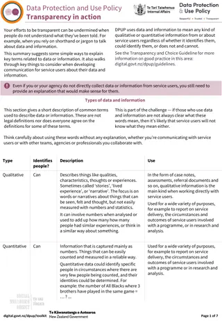
Understanding Data Visualization Techniques in Descriptive Statistics
Explore graphical methods and data examples to effectively describe and interpret data, including histograms, pie charts, bar charts, and time series plots. Understand the characteristics of histograms and learn how to categorize and analyze data effectively.

Uploaded on | 0 Views
Download Presentation

Please find below an Image/Link to download the presentation.
The content on the website is provided AS IS for your information and personal use only. It may not be sold, licensed, or shared on other websites without obtaining consent from the author. If you encounter any issues during the download, it is possible that the publisher has removed the file from their server.
You are allowed to download the files provided on this website for personal or commercial use, subject to the condition that they are used lawfully. All files are the property of their respective owners.
The content on the website is provided AS IS for your information and personal use only. It may not be sold, licensed, or shared on other websites without obtaining consent from the author.
E N D
Presentation Transcript
Chapter 2 Describing Data
Graphical Methods - 1 Variable After data are collected, they can be sorted into categories/ranges of values so that each individual observation falls in exactly one category/range Numeric Responses: Break range of values into non- overlapping bins and count number of units in each bin Categorical Responses: List all possible categories (with Other if needed), and count numbers of units in each Pie Chart: Displays percent in each category/range Bar Chart: Displays frequency/percent per category Histogram: Displays frequency/percent per range
. Data Examples Categorical Blues Guitarists Styles (Born 1874-1940) 93 Blues Guitarists Region 1=East, 2=Delta, 3=Delta Birth Year (Categorized) 1=Post-1906, 0=Pre-1906 Hand Posture 1=Extended, 2=Stacked, 3=Lutiform Thumb Style 1=Alternating, 2=Utility, 3=Dead Numeric Philadelphia Monthly Rainfall (1825-1869) 540 months - 1/100thinch - (min=19,max=1582) Pie Chart and Histogram, bins are 0-50, ,1550-1600 Categorized by Month for Box Plot Source1: A.M. Cohen (1996). "The Hands of Blues Guitarists," American Music, Vol. 14, #4, pp. 455-479 Source2: Pliny Earl Chase (1869). "Monthly Variations of Rainfall at Philadelphia", Proceedings of the American Philosophical Society, Volume 11, #81, pp. 314-315
Interpreting Histograms Probability: Heights of bars over the class intervals are proportional to the chances an individual chosen at random would fall in the interval Unimodal: A histogram with a single major peak Bimodal: Histogram with two distinct peaks (often evidence of two distinct groups of units) Uniform: Interval heights are approximately equal Symmetric: Right and Left portions are same shape Right-Skewed: Right-hand side extends further Left-Skewed: Left-hand side extends further
Time Series Plots Many datasets represent a single variable measured on a single unit at different time points When measurements are made at equally spaced time points, goal is often to describe temporal variation Annual measurements can reveal long-term trends Sub-annual (weekly, monthly, quarterly) measurements can reveal long-term trends as well as seasonal fluctuations Plots generally have measurement on vertical axis and time period on horizontal. Some plots include bars around points to represent fluctuations within that time period
Numerical Descriptive Measures Numeric summaries of a set of measurements Measures of Central Tendency describe the location or center of a set of measurements Measures of Variabilitydescribe the spread or dispersion of a set of measurements Parameters: Numeric descriptive measures based on Populations of measurements Statistics: Numeric descriptive measures based on Samples of measurements
Measures of Central Tendency - I Mode: Most often occurring outcome (typically only of interest for variables taking on only discrete values) Median: Middle value when measurements ordered from smallest to largest. Calculation based on ordered data and whether the number of observations is odd or even. Mean: Sum of all measurements, divided by total numberof measurements (equal distribution of total).
Measures of Central Tendency - II y i = Population Mean ( elements): i N N y i = Sample Mean ( elements): i n y n + Population Median: Ordered Data: ... y y (1) ( ) N y y N N + 1 2 2 = = Odd: Even: N M y N M + 1 N 2 2 Sample Median: Ordered Dat a: ... y y (1) ( ) n + y y n n + 1 ^ ^ 2 2 = = Odd: Even: n M y n M + 1 n 2 2
Example - Philadelphia Rainfall = 540 Months (Treating as Population) Mean: N 198547 540 N = 540 = = = 198547 367.68 y i = 1 i 540 2 N = = + = Median: 540 270 1 271 N 2 2 M = Mean of 270th and 271st ordered measurements + 339 341 2 = = = = Ordered Amounts: 339 34 1 340 (270) y (271) y M Note: The mean is higher than median as a few very large amounts were observed which have effect on the total, not the center of the distribution.
Measures of Central Tendency - III Outlier: Individual measurement(s) falling far away from others. Can have large effect on mean, not median Trimmed Mean (TM): Mean that is based on central measurements (deleting extreme measurements). Mode: For continuous (smooth) distributions, mode is value corresponding to the peak of the frequency curve Skewness: Shape of the distribution: Mound-Shaped Distributions: Mode Median Mean TM Right-Skewed Distributions: Mode < Median < TM < Mean Left-Skewed Distributions: Mean < TM < Median < Mode
Measures of Variability - I Variability: Magnitude of dispersion in data. Range: Difference between largest and smallest measurements in a set. pth-Percentile: Value that has at most p% of measurements below, and (100-p)% above it (0<p<100) Lower Quartile = 25th Percentile (Q1) Median = 50th Percentile (Q2) Upper Quartile = 75th Percentile (Q3) Interquartile Range: Difference between the upper and lower quartiles (measures the amount of spread in he middle 50% of ordered measurements). IQR = Q3-Q1
Quantile Plot Quantile: Q(u) Number that divides a dataset such that the fraction of observations below Q(u) = u and the fraction above Q(u) = 1-u Quantile plot Plot of Q(u) on vertical axis versus u on horizontal axis Place scale on horizontal axis ranging over 0 to 1 Order data: y(1) y(2) y(n) and scale vertical axis to include full range of y-values Plot y(i) versus ui = (i 0.5)/n for i= 1,2, ,n
Right skew seen in stretched out portion on the right part of graph
Measures of Variability - II Deviation: Distance between an individual measurement and the group mean: Variance: Average squared deviation Standard Deviation: Square root variance (data s units) y y 2 ( ) y i = = + 2 2 Population ( elements) Variance : : Std. Dev. i N N 2 ( ) y y i = = + 2 2 Sample ( elements) n Variance : : Std. Dev. i s s s 1 n Empirical rule (measurements with mound-shaped histogram) Approximately 68% of measurements lie within 1 SD of mean Approximately 95% of measurements lie within 2 SD of mean Virtually all of measurements lie within 3 SD of mean
Example - Philadelphia Rainfall (Population) th 25 Percentile 232.75 : th 75 Percentile 468 : = = Inter = i - Quartile Range : 468 232 75 . 235 . 25 IQR 540 = 2 ( ) 19822752 iy 1 19822752 = = 2 36708 8 . 540 = = 36708 8 . 191 6 . 367 7 . 191 6 . 176 ( , 1 . 559 ) 3 . * 2 367 7 . 383 2 . 0 ( , 750 ) 9 . Note: 383 (71%) Months lie within 1 of and 518 (96%) within 2
Other Measures of Variation Median Absolute Deviation (MAD) Median of the absolute values of differences between observed data values and the sample median. When divided by 0.6745 (due to properties of normal distribution), this provides estimate of Coefficient of Variation (CV) Standard deviation as a fraction of mean (assuming 0). Often reported as a percentage: ( ) = 100 % CV s y 120 0.6745 MAD MAD 120 CV(%) 52.15765 = = = 177.9 191.6 0.6745
Higher Order Moments Skewness A measure of the symmetry of a distribution of measurements. Positive values imply right-skewed, negative values imply left-skewed, values near 0 imply symmetric. Philly Rainfall: 1.236 Kurtosis A measure of the heaviness of the tails of a distribution of measurements. Positive values imply more extreme values than a normal distribution (heavier tails), negative values imply fewer extreme values (lighter tails). Philly Rainfall: 3.459 ( ) N n 3 ( ) 3 y y y i i m s = = = = Skewness: Population: where Sample: where 3 3 1 3 3 1 i i m 3 3 N n ( ) N n 4 ( ) 4 y y y i i m s = = = = Kurtosis: Population: 3 where Sample: 3 where 1 1 i i 4 4 4 4 m 4 4 N n
Boxplots Graph highlighting spread of set of measurements, highlighting quartiles and outliers. Constructing a boxplot: Draw box with top at Q3, bottom at Q1, and line crossing at median (Q2). Height of box is IQR = Q3 - Q1 Compute lower inner fence = Q1-1.5(IQR) = LIF Compute upper inner fence = Q3+1.5(IQR) = UIF Compute lower outer fence = Q1-3.0(IQR) = LOF Compute upper outer fence = Q3+3.0(IQR) = UOF Draw line from Q3 to max(UIF, largest y value). Place * for any y values between UIF and UOF, o for any above UOF Draw line from Q1 to min(LIF, smallest y value). Place * for any y values between LIF and LOF, o for any below LOF
Summarizing Data of More than One Variable Contingency Table: Cross-tabulation of units based on measurements of two qualitative variables simultaneously Stacked Bar Graph: Bar chart with one variable represented on the horizontal axis, second variable as subcategories within bars Cluster Bar Graph: Bar chart with one variable forming major groupings on horizontal axis, second variable used to make side-by-side comparisons within major groupings (displays all combinations in factorial expt) Scatterplot: Plot with quantitaive variables y and x plotted against each other for each unit Side-by-Side Boxplot: Compares distributions by groups
Example - Ginkgo and Acetazolamide for Acute Mountain Syndrome Among Himalayan Trekkers AMS 40 14 43 18 115 No AMS 79 104 81 108 372 Total 119 118 124 126 487 Placebo Acet Ginkgo Acc+Gi Total Contingency Table (Counts) AMS 33.61 11.86 34.68 14.29 No AMS 66.39 88.14 65.32 85.71 Total 100 100 100 100 Percent Outcome by Treatment Placebo Acet Ginkgo Acc+Gi
Scatterplots Identify the explanatory and response variables of interest, and label them as x and y Obtain a set of individuals and observe the pairs (xi , yi) for each pair. There will be n pairs. Statistical convention has the response variable (y) placed on the vertical (up/down) axis and the explanatory variable (x) placed on the horizontal (left/right) axis. (Note: economists reverse axes in price/quantity demand plots) Plot the n pairs of points (x,y) on the graph
Triple Hop Distance and Vertical Leap Individuals: 40 Collegiate Soccer Players Response (y): Vertical Leap (cm) Explanatory Variable (x): Triple Hop Distance (cm) Data generated to match means, SDs, correlation player 1 2 3 4 5 6 7 8 9 10 triple 383.00 781.00 561.62 624.52 446.24 515.30 449.22 560.91 519.12 595.38 vertical 33.00 71.10 62.25 61.33 40.19 38.96 39.69 46.51 37.68 53.48 player 11 12 13 14 15 16 17 18 19 20 triple 686.42 601.67 553.23 529.22 561.16 465.88 497.30 592.71 679.95 531.92 vertical 65.85 57.60 37.66 41.70 48.98 34.14 56.12 53.91 67.60 51.29 player 21 22 23 24 25 26 27 28 29 30 triple 562.83 447.53 683.56 630.60 644.69 479.34 745.95 667.12 411.63 483.32 vertical 53.82 42.05 48.55 66.76 59.38 43.68 66.14 61.50 37.65 37.59 player 31 32 33 34 35 36 37 38 39 40 triple 638.67 477.62 467.60 400.31 586.62 513.26 464.71 403.22 475.63 568.04 vertical 60.10 42.57 49.97 48.42 52.41 42.27 35.76 34.96 41.84 47.53 Source: R.T. Hamilton, S.J. Schultz, R.J. Schmitz, D.H. Perrin (2008). "Triple-Hop Distance as a Valid Predictor of Lower Limb Strength and Power," Journal of Athletic Training, Vol. 43, #2, pp. 144-151.
Example - Pharmacodynamics of LSD Response (y) - Math score (mean among 5 volunteers) Explanatory (x) - LSD tissue concentration (mean of 5 volunteers) Raw Data and scatterplot of Score vs LSD concentration: Score (y) 78.93 58.20 67.47 37.47 45.65 32.92 29.97 LSD Conc (x) 1.17 2.97 3.26 4.69 5.83 6.00 6.41 Source: Wagner, Agahajanian, and Bing (1968). Correlation of Performance Test Scores with Tissue Concentration of Lysergic Acid Diethylamide in Human Subjects. Clinical Pharmacology and Therapeutics, Vol.9 pp635-638.
Covariance, Correlation, Regression ( )( ) N n ( )( ) X Y x x y y X Y i i = = = = = Population Covariance:COV , Sample Covariance: 1 1 i i X Y s XY XY 1 N n N ( )( ) X Y X Y s = = = = Population Correlation: Sample Correlation: 1 , 1 1 i XY r r XY XY XY XY XY X Y s s N N ( ) ( ) 2 2 X Y X Y X Y = = 1 1 i i ( )( ) n x x y y i i ^ y = + = = y b x = Sample Ordinary Least Squares Regression: 1 i b b x b b 0 1 1 0 1 ( ) n 2 x x i = 1 i i x_i(conc) y_i(score) (x-xbar) 1.17 2.97 3.26 4.69 5.83 6.00 6.41 4.33 1.935413 18.61085 (y-ybar) (x-xb)^2 (y-yb)^2 (x-xb)(y-yb) 10.0037 831.9104 -91.2258 1.8574 65.8185 -11.0567 1.1510 302.1637 -18.6493 0.1276 159.1923 -4.50612 2.2414 19.6882 -6.64304 2.7794 294.7108 -28.6201 4.3145 404.6994 -41.7862 1 2 3 4 5 6 7 78.93 58.20 67.47 37.47 45.65 32.92 29.97 50.09 -3.16 -1.36 -1.07 0.36 1.50 1.67 2.08 28.84 8.11 17.38 -12.62 -4.44 -17.17 -20.12 n-1 COV{x,y} r_XY 6 -33.7479 -0.93693 b1 b0 -9.00947 89.12387 Mean StdDev Sum 0.00 0.00 22.47 2078.18 -202.49


")