Understanding Graphical Elements and Data Relations in Stata
Explore the key concepts of graphical elements, data relation, and statistical analysis using Stata software in this comprehensive guide. Learn about geometric objects, variables, and essential components for effective data visualization.

Download Presentation

Please find below an Image/Link to download the presentation.
The content on the website is provided AS IS for your information and personal use only. It may not be sold, licensed, or shared on other websites without obtaining consent from the author. If you encounter any issues during the download, it is possible that the publisher has removed the file from their server.
You are allowed to download the files provided on this website for personal or commercial use, subject to the condition that they are used lawfully. All files are the property of their respective owners.
The content on the website is provided AS IS for your information and personal use only. It may not be sold, licensed, or shared on other websites without obtaining consent from the author.
E N D
Presentation Transcript
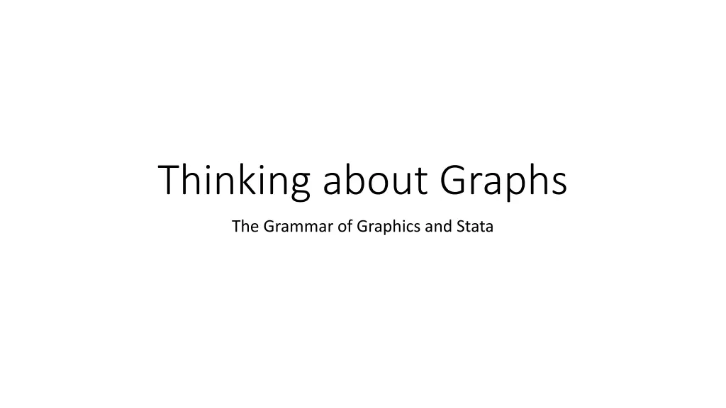
Thinking about Graphs The Grammar of Graphics and Stata
Reconstructing two examples From American Sociological Review, August 2005 in Kara Joyner and Grace Kao s Interracial Relationships and the Transition to Adulthood in Michael J. Rosenfeld and Byung-Soo Kim s The Independence of Young Adults and the Rise of Interracial and Same-Sex Unions
Questions toward reconstruction What are the graphical elements? (Geometric objects) How are they related to data? (Variables) How are they arranged on the screen/paper? (Coordinates and guides) How are they decorated? (Style and aesthetics)
Graphical elements/Geometric objects Rectangular boxes, bars
Graphical elements/Geometric objects Points and lines/line segments
Statas fundamental graphical elements help graph graph twoway graph matrix graph bar graph dot graph box graph pie help graph twoway scatter line/connected area bar spike/dropline dot contour plus a few more
Relation to data The height of each bar is a summary statistic. The horizontal position of each bar is given by a combination of two categorical variables.
Sufficient data The minimum data we need is three variables two categorical variables and a summary variable. race 1 1 1 2 2 2 3 3 3 agegroup 1 2 3 1 2 3 1 2 3 inter 7.31 4.68 4.64 14.86 13.46 2.63 37.5 35.29 31.25
Simple graph bar use "JoynerKao2005.dta", clear graph bar inter 40 graph bar inter, over(agegroup) graph bar inter, over(agegroup) over(race) 30 mean of inter 20 10 0 1 2 3 1 2 3 1 2 3 1 2 3
Cleanup no summary graph bar (asis) inter, over(agegroup) /// over(race) 40 See help graph_bar for a list of summary statistics you could use other than mean and asis 30 20 10 0 1 2 3 1 2 3 1 2 3 1 2 3
Cleanup no gap, add legend graph bar (asis) inter, over(agegroup) /// over(race) asyvars 40 asyvars is cryptic. To see multiple y variables with no grouping, try 30 20 graph bar inter race agegroup The idea here is that the groups in the first over() are displayed like multiple y variables. 10 0 1 2 3 1 3 2
Guides axes and legends Axes and legends help us keep track of the meaning of different graphical elements, so they also are connected to our data Variable labels Value labels See also help graph_bar##axis_options help graph_bar##legending_options
Variable labels label variable inter "Interracial (%)" label variable race "Race of Respondents" 40 label variable agegroup "Age Group" 30 graph bar (asis) inter, over(agegroup) /// Interracial (%) over(race) asyvars 20 10 0 1 2 3 1 3 2
Value labels label define racelbl 1 "Whites" 2 "Blacks" /// 3 "Hispanics" 40 label values race racelbl label define agelbl 1 "22-25 Age Group" 2 /// 30 "26-29 Age Group" 3 "30-35 Age Group" Interracial (%) label values agegroup agelbl 20 graph bar (asis) inter, over(agegroup) /// 10 over(race) asyvars 0 Whites Blacks Hispanics 22-25 Age Group 30-35 Age Group 26-29 Age Group
Bar labels graph bar (asis) inter, over(agegroup) /// over(race) asyvars blabel(bar) 40 37.5 35.29 31.25 30 Interracial (%) 20 14.86 13.46 10 7.31 4.68 4.64 2.63 0 Whites Blacks Hispanics 22-25 Age Group 30-35 Age Group 26-29 Age Group
Annotation and Aesthetics Titles, captions, and footnotes Color, weight, etc. of graphical elements Grid or guidelines Etc. there tend to be a large number of options at this point These attributes all have default values. A collection of default values is a scheme in Stata (or style ).
Black and white scheme graph bar (asis) inter, over(agegroup) /// over(race) asyvars blabel(bar) /// 40 37.5 scheme(s1mono) 35.29 31.25 30 Interracial (%) 20 14.86 13.46 10 7.31 4.68 4.64 2.63 0 Whites Blacks Hispanics 22-25 Age Group 30-35 Age Group 26-29 Age Group
Individual bar colors graph bar (asis) inter, over(agegroup) /// over(race) asyvars blabel(bar) /// 40 37.5 scheme(s1mono) bar(1, /// 35.29 fcolor(gs16)) bar(2, /// 31.25 30 fcolor(gs12)) bar(3, fcolor(black)) Interracial (%) 20 14.86 13.46 10 7.31 4.68 4.64 2.63 0 Whites Blacks Hispanics 22-25 Age Group 30-35 Age Group 26-29 Age Group
Titles, captions, notes graph bar (asis) inter, over(agegroup) over(race) asyvars /// blabel(bar) scheme(s1mono) bar(1, fcolor(gs16)) /// bar(2, fcolor(gs12)) bar(3, fcolor(black)) /// caption("Figure 2. Young Adult Relationships that Are Interracial", ring(5)) /// 40 37.5 35.29 note("NHSLS = National Health and Social Life Survey", ring(6))) 31.25 30 Interracial (%) 20 14.86 13.46 10 7.31 4.68 4.64 2.63 0 Whites Blacks Hispanics 22-25 Age Group 30-35 Age Group 26-29 Age Group Figure 2. Young Adult Relationships that Are Interracial NHSLS = National Health and Social Life Survey
Beginning from individual data We have been graphing a summary statistic The issue is whether or not our graph command can summarize as we want
Set up the data use "nhsls.dta", clear keep if sample == 2 gen wgt=hhsize*(3159/6008) keep if age <=35 keep if ethnic <= 4 forvalues i=1/4 { generate prace`i' = sprace`i' if sp2ply`i' < 3 } keep caseid age prace1-prace4 race ethnic wgt recode prace* (7/9 = .) recode age (18/21=1) (22/25=2)(26/29=3)(30/35=4), generate(agegroup) reshape long prace, i(caseid) j(partner) keep if prace~=. generate inter = ethnic ~= prace
A second look at graph bar graph bar inter // mean graph bar (percent) inter 100 * not what you expect! 80 graph bar (percent), over(inter) 60 percent tab inter 40 20 0 0 1
Add another categorical variable graph bar (percent), over(inter) over(agegroup) /// blabel(bar) 40 33.755 30 tab inter agegroup, col cell percent 21.2191 20.2415 20 14.5486 10 3.27775 2.6452 2.30017 2.01265 0 0 1 0 1 0 1 0 1 1 2 3 4
Problems Percents are percent of total rather than percent of category Bars for the unwanted category Solutions Work in fractions rather than percents Create a summary data set
As fractions graph bar inter, over(agegroup) over(race) /// blabel(bar) .5 .452381 .411765 .4 .4 mean of inter .3 .2 .12963 .109091 .1 .08 .059524 .054662 .053571 0 2 3 4 2 3 4 2 3 4 white, non-hisp. black, non-hisp. hispanic
With our other options applied Variable labels Value labels 0.41 0.41 0.41 .4 Scheme .3 Interracial (fraction) Bar color Axis label angle .2 0.16 Caption 0.14 .1 0.07 Note 0.07 0.05 0.05 0 Whites Blacks Hispanics One new option is the ytitle 22-25 Age Group 30-35 Age Group 26-29 Age Group Figure 2. Young Adult Relationships that Are Interracial NHSLS = National Health and Social Life Survey