Learn about pie charts, how to interpret them, and how they represent data through proportions. Discover examples of pie charts showing favorite colors, ice cream toppings, breakfast choices, and more. Gain insights into creating and reading pie charts with essential facts and practical examples.
Please find below an Image/Link to download the presentation.
The content on the website is provided AS IS for your information and personal use only. It may not be sold, licensed, or shared on other websites without obtaining consent from the author. If you encounter any issues during the download, it is possible that the publisher has removed the file from their server.
You are allowed to download the files provided on this website for personal or commercial use, subject to the condition that they are used lawfully. All files are the property of their respective owners.
The content on the website is provided AS IS for your information and personal use only. It may not be sold, licensed, or shared on other websites without obtaining consent from the author.
E N D
Presentation Transcript
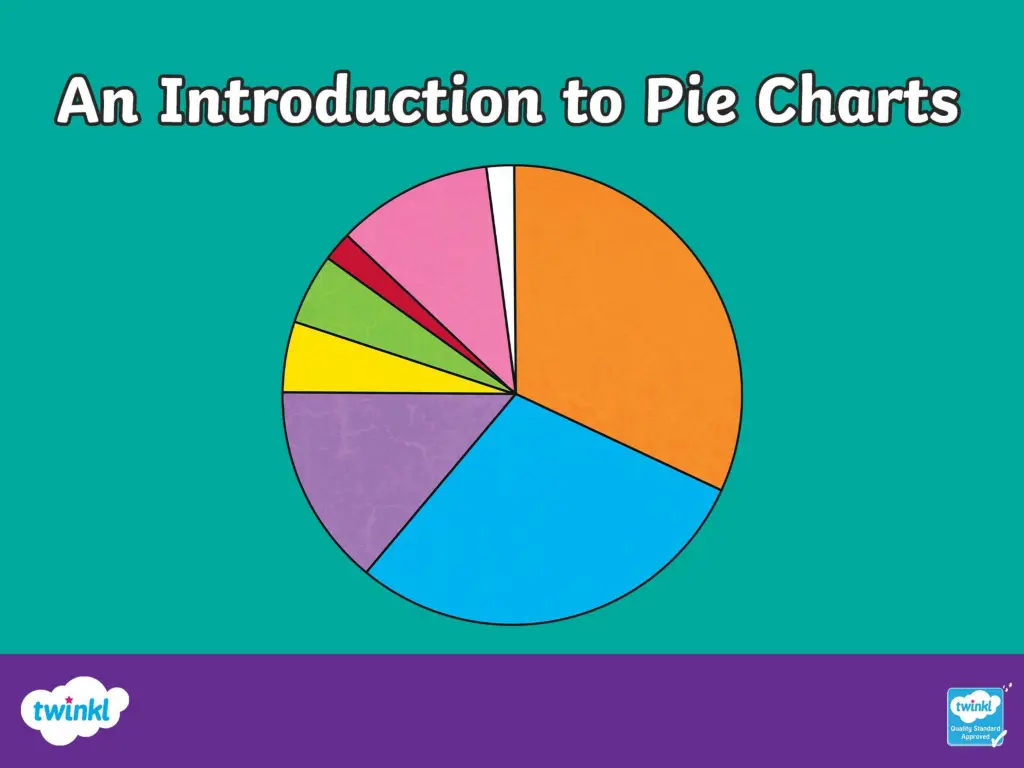
An Introduction to Pie Charts Pie charts are a way of displaying information or data. Each slice or sector of the chart or pie represents a different category. Pie charts do not show actual amounts - they show proportions that represent the actual amount. Favourite Colours Green 25% Red 50% Blue 25%
An Introduction to Pie Charts This pie chart shows the favourite colours of a group of 160 people surveyed. What information does this pie chart give us? In the group surveyed, half of the people liked red = 80 people. In the group surveyed a quarter of the people liked green = 40 people. A quarter of the people also liked blue = 40 people. Favourite Colours Green Red Blue
This pie chart tells us about the ice cream toppings a group of 20 people preferred. What other information does it give us? Half of the group surveyed preferred sprinkles on their ice cream. Ice CreamToppings One quarter of the group preferred hot fudge sauce on their ice cream. One quarter of the group preferred chocolate flakes. Hot fudge sauce How many people preferred each topping? Sprinkles = half of 20 = 10 people Sprinkles Chocolate Flake Hot fudge sauce = one quarter of 20 = 5 people Chocolate flakes = one quarter of 20 = 5 people
This pie chart shows the favourite choices of 48 children at a breakfast club. How many children chose toast and butter? Half of 48 = 24 How many children chose toast and jam? One quarter of 48 = 12 How many children chose fruit and yogurt? Breakfast Choices One eighth of 48 = 6 How many children chose cereal? Cereal One eighth of 48 = 6 Fruit and Yoghurt Toast and Butter Toast and Jam
The following facts are important to help us read, understand and create pie charts: A pie chart is a circle. A circle is a full turn of 360 . A pie chart represents a whole set of data or 100%. The sectors in a pie chart fit together to make 100%. Pie charts show fractions and percentages of a whole set of data. We can use data to find the angles and create the sectors of a pie chart. Fraction Angle Percentage one whole or 1 360 100% one half or 180 50% three quarters or 270 75% one quarter or 90 25% 36 one tenth or 10%
Creating a Pie Chart 36 pupils were asked about their favourite pizza topping. There are 36 pupils in the whole set of data, so 36 pupils equals 360 on the pie chart. 360 36 = 10 so one pupil is represented on the pie chart by 10 . Favourite Pizza Toppings Favourite Pizza Toppings Ham - 12 pupils so 12 10 = 120 Pepper - 15 pupils so 15 10 = 150 Cheese - 9 pupils so 9 10 = 90 Here is a pie chart displaying all the data. Cheese Ham Pepper
Creating a Pie Chart 36 people were asked what their favourite flower was. There are 36 people in the whole set of data, so 36 people equal 360 on the pie chart. 360 36 = 10 so one person is represented on the pie chart by 10 . What angle should each sector be? Favourite Flowers Favourite Flowers Daffodil = 18 people so 18 10 = 180 Sunflower = 11 people so 11 10 = 110 Rose = 7 people so 7 10 = 70 Sunflower Daffodil Here is a pie chart displaying all the data. Rose
Creating a Pie Chart A pie chart represents a whole set of data or a whole population. 100% is represented by 360 . 1800 people were asked their favourite holiday destination. Favourite Holiday Destination Number of people To calculate the angle for Scotland 580 360 = 116 1800 Scotland 580 Spain 465 Italy 148 To calculate the angle for Scotland 580 100 = 32% to 1800 France 343 Canada 264 the nearest whole percentage. Total 1800 Can you calculate the angle and percentage for the other holiday destinations?
Favourite Holiday Destination Number of people Number of degrees Percentage of the total Scotland 580 116 32% (to the nearest whole %) Spain 465 93 26% (to the nearest whole %) Italy 149 30 (to the nearest whole ) 8% (to the nearest whole %) France 341 68 (to the nearest whole ) 19% (to the nearest whole %) Canada 265 53 15% (to the nearest whole %) Total 1800 360 100% Can you draw the pie chart for this data? Label the sectors and include their percentage. Write two statements about the data you have displayed.