Understanding Run Charts: Key Concepts and Analysis Rules
"Learn about run charts in quality improvement projects, including special cause variation, causes of variation, analyzing rules, and limitations. Explore examples and guidelines for effectively using run charts."

Download Presentation

Please find below an Image/Link to download the presentation.
The content on the website is provided AS IS for your information and personal use only. It may not be sold, licensed, or shared on other websites without obtaining consent from the author. If you encounter any issues during the download, it is possible that the publisher has removed the file from their server.
You are allowed to download the files provided on this website for personal or commercial use, subject to the condition that they are used lawfully. All files are the property of their respective owners.
The content on the website is provided AS IS for your information and personal use only. It may not be sold, licensed, or shared on other websites without obtaining consent from the author.
E N D
Presentation Transcript
Understanding Run Charts Candice Foy, MD
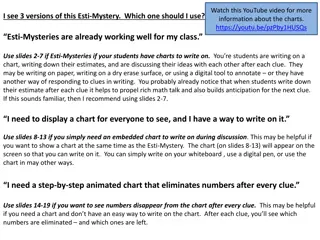
What is the QI term for Statically Signiant? SPECIAL CAUSE VARIATION! Special cause variation only occurs when a force acts upon a system to change the data. If you are implementing a change, your goal is to cause special cause variation
Run Chart Displays the data from the QI project overtime, allows annotations so the effect of each PDSA cycle can be visually appreciated Uses the median of the data to show how the data changes overtime Special cause variation is identified by a set of rules that identifies trends
Analyzing the Run Chart - 4 Rules To identify SPECIAL CAUSE VARIATION, the run chart must meet one of the following rules: 1. Data Shift 6+ consecutive points all above or below the median 2. Trend 5+ data points all increasing or decreasing in value 3. Astronomical data point Major Outlier 4. Too Few or Too Many Runs Data crosses the median too often or too rarely
Run Chart Limitations Bounds of system performance not easily identified Cannot easily identify subtle variation in data Difficult to easily define astronomical outliers
Control Chart Visual display of data overtime and its relationship to the mean and control limits Control limits help to determine if process is stable (only common cause variation) in addition to the 4 rules of the run chart Can better identify variation over time, identify different causes of variation, and identify early success in a project
Control Chart Rules Zone A Zone B Zone C https://upload.wikimedia.org/wikipedia/commons/7/72/Poster_-_Control_Charts_for_Nelson_Rules.svg
Control Chart Rules Zone A Zone B Zone C https://upload.wikimedia.org/wikipedia/commons/7/72/Poster_-_Control_Charts_for_Nelson_Rules.svg
Control Chart Example Rule 1 - Outlier Rule 5 Zone A Rule 3 - Trend