Understanding Scatter Plots: Analysis and Applications
Explore scatter plots and trend lines in algebra with examples and correlations explained. Learn to create, interpret, and make predictions using scatter plots.

Download Presentation

Please find below an Image/Link to download the presentation.
The content on the website is provided AS IS for your information and personal use only. It may not be sold, licensed, or shared on other websites without obtaining consent from the author. If you encounter any issues during the download, it is possible that the publisher has removed the file from their server.
You are allowed to download the files provided on this website for personal or commercial use, subject to the condition that they are used lawfully. All files are the property of their respective owners.
The content on the website is provided AS IS for your information and personal use only. It may not be sold, licensed, or shared on other websites without obtaining consent from the author.
E N D
Presentation Transcript
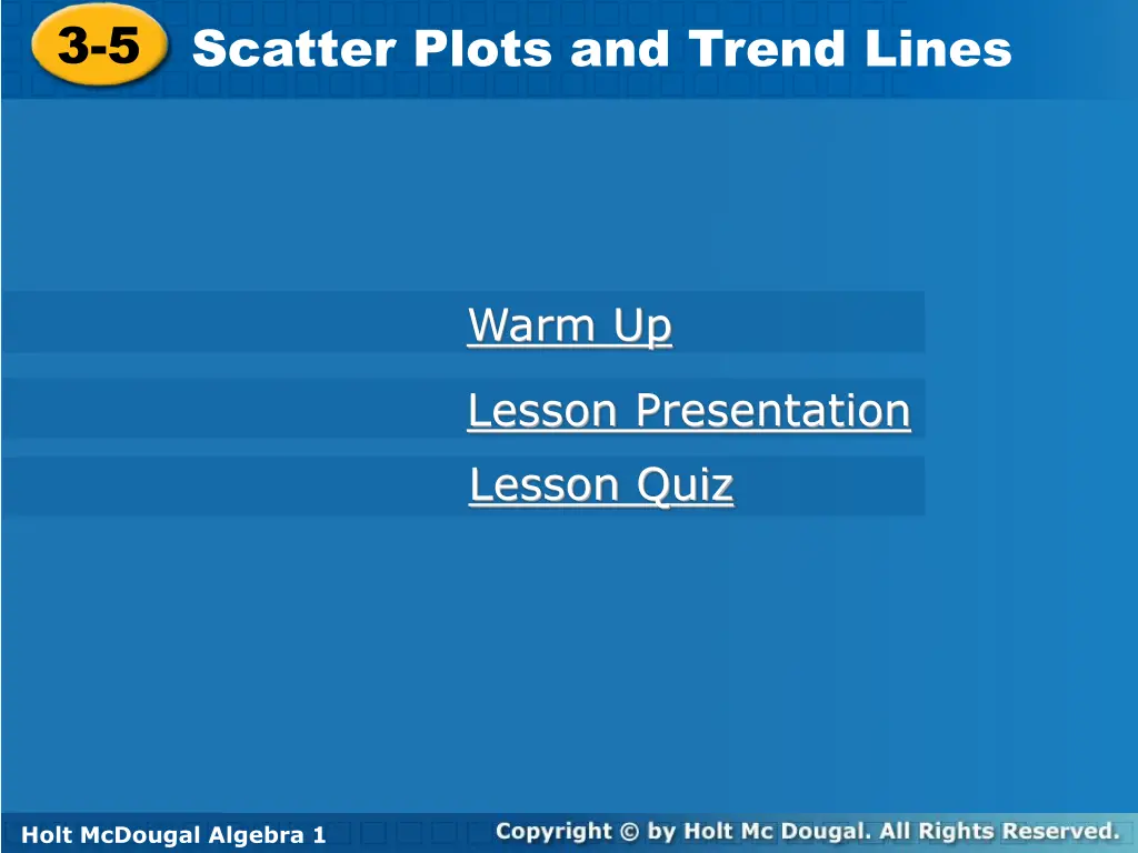
3-5 Scatter Plots and Trend Lines 3-5 Scatter Plots and Trend Lines Warm Up Warm Up Lesson Presentation Lesson Presentation Lesson Quiz Holt McDougal Algebra 1 Holt Algebra 1 Holt McDougal Algebra 1
3-5 Scatter Plots and Trend Lines Objectives Create and interpret scatter plots. Use trend lines to make predictions. Holt McDougal Algebra 1
3-5 Scatter Plots and Trend Lines Example 1: Graphing a Scatter Plot from Given Data The table shows the number of cookies in a jar from the time since they were baked. Graph a scatter plot using the given data. Use the table to make ordered pairs for the scatter plot. The x-value represents the time since the cookies were baked and the y-value represents the number of cookies left in the jar. Plot the ordered pairs. Holt McDougal Algebra 1
3-5 Scatter Plots and Trend Lines Check It Out! Example 1 The table shows the number of points scored by a high school football team in the first four games of a season. Graph a scatter plot using the given data. Game Score 1 6 2 3 4 21 46 34 Use the table to make ordered pairs for the scatter plot. The x-value represents the individual games and the y-value represents the points scored in each game. Plot the ordered pairs. Holt McDougal Algebra 1
3-5 Scatter Plots and Trend Lines Holt McDougal Algebra 1
3-5 Scatter Plots and Trend Lines Example 2: Describing Correlations from Scatter Plots Describe the correlation illustrated by the scatter plot. As the average daily temperature increased, the number of visitors increased. There is a positive correlation between the two data sets. Holt McDougal Algebra 1
3-5 Scatter Plots and Trend Lines Check It Out! Example 2 Describe the correlation illustrated by the scatter plot. As the years passed, the number of participants in the snowboarding competition increased. There is a positive correlation between the two data sets. Holt McDougal Algebra 1
3-5 Scatter Plots and Trend Lines Example 3A: Identifying Correlations Identify the correlation you would expect to see between the pair of data sets. Explain. the average temperature in a city and the number of speeding tickets given in the city You would expect to see no correlation. The number of speeding tickets has nothing to do with the temperature. Holt McDougal Algebra 1
3-5 Scatter Plots and Trend Lines Example 3B: Identifying Correlations Identify the correlation you would expect to see between the pair of data sets. Explain. the number of people in an audience and ticket sales You would expect to see a positive correlation. As ticket sales increase, the number of people in the audience increases. Holt McDougal Algebra 1
3-5 Scatter Plots and Trend Lines Example 3C: Identifying Correlations Identify the correlation you would expect to see between the pair of data sets. Explain. a runner s time and the distance to the finish line You would expect to see a negative correlation. As time increases, the distance to the finish line decreases. Holt McDougal Algebra 1
3-5 Scatter Plots and Trend Lines Example 4: Matching Scatter Plots to Situations Choose the scatter plot that best represents the relationship between the age of a car and the amount of money spent each year on repairs. Explain. Graph A Graph B Graph C Holt McDougal Algebra 1
3-5 Scatter Plots and Trend Lines Example 4 Continued Choose the scatter plot that best represents the relationship between the age of a car and the amount of money spent each year on repairs. Explain. Graph A Graph C Graph B Graph A shows negative values, so it is incorrect. Graph C shows negative correlation, so it is incorrect. Graph B is the correct scatter plot. Holt McDougal Algebra 1
3-5 Scatter Plots and Trend Lines Check It Out! Example 4 Choose the scatter plot that best represents the relationship between the number of minutes since a pie has been taken out of the oven and the temperature of the pie. Explain. Graph B Graph C Graph A Holt McDougal Algebra 1
3-5 Scatter Plots and Trend Lines Check It Out! Example 4 Choose the scatter plot that best represents the relationship between the number of minutes since a pie has been taken out of the oven and the temperature of the pie. Explain. Graph B Graph C Graph A Graph B shows the pie cooling while it is in the oven, so it is incorrect. Graph C shows the temperature of the pie increasing, so it is incorrect. Graph A is the correct answer. Holt McDougal Algebra 1
3-5 Scatter Plots and Trend Lines Example 5: Fund-Raising Application The scatter plot shows a relationship between the total amount of money collected at the concession stand and the total number of tickets sold at a movie theater. Based on this relationship, predict how much money will be collected at the concession stand when 150 tickets have been sold. Draw a trend line and use it to make a prediction. Draw a line that has about the same number of points above and below it. Your line may or may not go through data points. Find the point on the line whose x-value is 150. The corresponding y-value is 750. Based on the data, $750 is a reasonable prediction of how much money will be collected when 150 tickets have been sold. Holt McDougal Algebra 1
3-5 Scatter Plots and Trend Lines Check It Out! Example 5 Based on the trend line, predict how many wrapping paper rolls need to be sold to raise $500. Find the point on the line whose y-value is 500. The corresponding x-value is about 75. Based on the data, about 75 wrapping paper rolls is a reasonable prediction of how many rolls need to be sold to raise $500. Holt McDougal Algebra 1