Explore a variety of charts and graphs, such as tally charts, pie charts, bar graphs, and composite bar graphs, used to present data effectively. Understand the significance of frequency columns, tally marks, and differences in bar charts through practical examples. Learn how to create and interpret data representations like a pro.
Please find below an Image/Link to download the presentation.
The content on the website is provided AS IS for your information and personal use only. It may not be sold, licensed, or shared on other websites without obtaining consent from the author. If you encounter any issues during the download, it is possible that the publisher has removed the file from their server.
You are allowed to download the files provided on this website for personal or commercial use, subject to the condition that they are used lawfully. All files are the property of their respective owners.
The content on the website is provided AS IS for your information and personal use only. It may not be sold, licensed, or shared on other websites without obtaining consent from the author.
E N D
Presentation Transcript
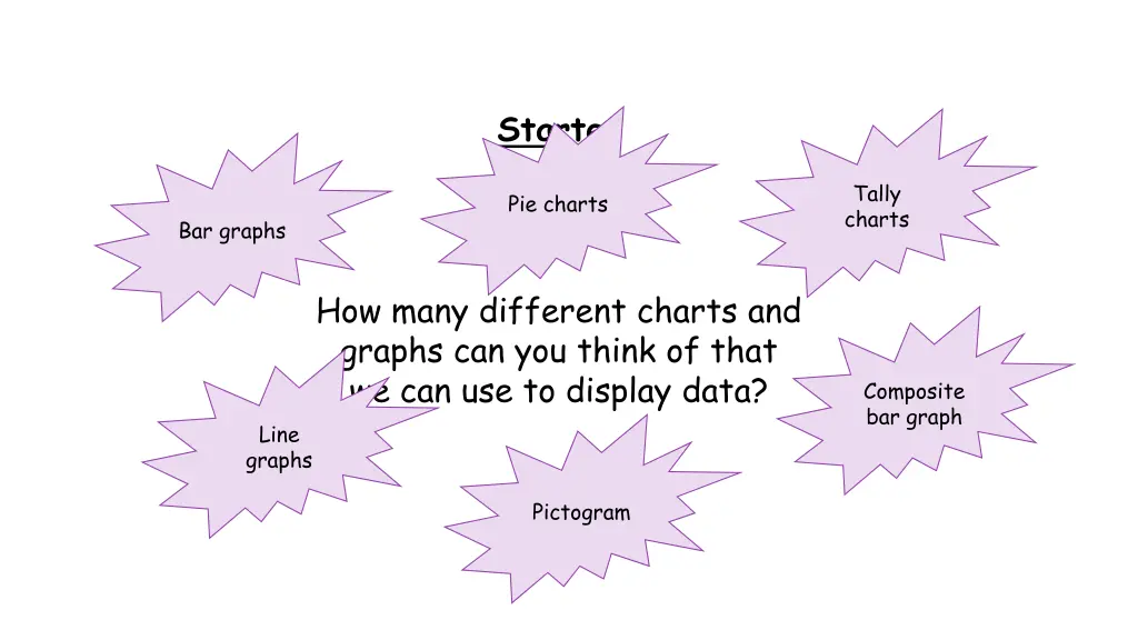
Starter Tally charts Pie charts Bar graphs How many different charts and graphs can you think of that we can use to display data? Composite bar graph Line graphs Pictogram
Below is a list of how a class travel to school. Walk, bus, bike, walk, bike, bus, walk, car, walk, bike, bike, bus, walk, walk, walk, car, bus, walk, bus, bus, walk, car, car, walk, walk, train, bike, bus, walk, walk How many students walk to school? A simple list is often inefficient.
Transport Walk Bus Car Bike Train Tally |||| |||| ||| |||| || |||| |||| | Frequency 13 7 4 5 1 Why do we need a frequency column? How many students were in the class in total?
Copy this table into your books: Colour Green Blue Red Yellow Tally Frequency Use the next slide to help you fill it in. You will need to watch carefully!
my-house-01 my-house-01 my-house-01 my-house-01 my-house-01 my-house-01 GAME OVER
Starter Find the differences between the two bar charts. Find the differences between the two bar charts. Find the differences between the two bar charts. Which one is correct?
Rules for a bar chart Find the differences between the two bar charts. 1. 2. Frequency on vertical axes 3. Labels on axes 4. Right scales 5. Space between bars 6. Bars with equal widths Title of chart
Tree Oak Birch Evergreen 8 Pine Cedar Frequency 2 5 Draw a bar chart for the information in this table. A bar chart to show types of trees in the park 10 10 7 8 Frequency 6 4 2 0 Birch Evergreen Pine Cedar Oak Type of tree
Copy and complete the tally charts based on the students in your class. Once you have asked everybody, draw a bar chart for each in your book to show the results. Eye Colour Blue Brown Green Tally Frequency Favourite Season Winter Spring Summer Autumn Tally Frequency
Comparative Bar Charts We can compare two sets of data using bar charts. We must draw the bars for the two sets of data next to each other for each category.
Eye Colour Blue Green Brown Boys Girls Draw a bar chart for the information in this table. A bar chart to compare boys and girls eye colour 9 4 2 7 4 4 10 8 Frequency 6 Boys 4 Girls 2 0 You must include a key to show which bar represents which data set Green Blue Brown Eye colour
a) Which tutor group had the boys with the most merits? b) In which tutor groups did the boys receive more merits than the girls? c) In which tutor group did the boys and girls receive the same number of merits? d) Who received more merits; 8D or 8S? 8W 8R, 8I, 8W 8H 8D
Answers A bar chart to show gold medals won by Great Britain and Australia a. 3 Olympics out of 5 Great Britain b. 5 medals more 25 Australia c. Australia 8 and Great Britain 26 because they have been quite consistent the last 2 Olympics 20 Medals won 15 10 5 0 Great Britain Sydney Athens Beijing 2000 2004 2008 2012 2016 Rio Olympic location and year
Answers a. New York A bar chart to show temperature in Rome and New York Rome b. Rome New York 25 c. 3 months Average temperature ( C) 20 d. 2 C difference 15 e. Rome I don t like it too hot! 10 5 0 September August June July May Month
Results Colour Green Blue Red Yellow Tally |||| ||| |||| || |||| || |||| |||| Frequency 8 7 7 9 Yellow Which car colour was most common?
Mr Khan asked the 22 students in his class what activity they wanted to do on a school trip. Here are the results. Complete the frequency table. Bowling Swimming Roller Skating Swimming Cinema Swimming Swimming Bowling Swimming Cinema Roller Skating Bowling Roller Skating Roller Skating Roller Skating Bowling Swimming Swimming Roller Skating Swimming Cinema Swimming Activity Bowling Swimming Roller Skating Cinema Tally Frequency 4 9 6 3 |||| |||| |||| |||| | |||
1. Make sure that you include a title to tell the reader what your pictogram is about. A pictogram showing pupils favourite colours 3. Use an appropriate picture to represent your data. Red Blue Yellow 4. Make sure that you include a key to explain what each of the pictures represents. Green 2. Put the answers or groups down one side of the page and then draw a line. White Each face represents 2 pupils
Method of Travel Walk Bike Car Bus Tally Frequency 9 3 6 12 |||| |||| ||| |||| | |||| |||| || WALK BIKE = 2 people CAR BUS
Age of Children 7 8 9 10 11 12 Frequency 7 10 13 10 6 14 7 years 8 years 9 years = 2 people 10 years 11 years 12 years


 Which tutor group had the boys with the most merits?")