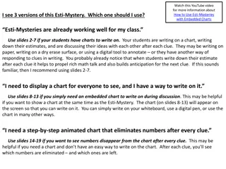
Unveiling Deceptive Charts
Discover the art of crafting deceptive charts, from poorly designed visuals to misleading patterns, and learn how to decipher the truth hidden within data representations. Explore the nuances of chart design that can lead to misinterpretation and manipulation, and empower yourself to navigate data visualizations with clarity and discernment.

Download Presentation

Please find below an Image/Link to download the presentation.
The content on the website is provided AS IS for your information and personal use only. It may not be sold, licensed, or shared on other websites without obtaining consent from the author.If you encounter any issues during the download, it is possible that the publisher has removed the file from their server.
You are allowed to download the files provided on this website for personal or commercial use, subject to the condition that they are used lawfully. All files are the property of their respective owners.
The content on the website is provided AS IS for your information and personal use only. It may not be sold, licensed, or shared on other websites without obtaining consent from the author.
E N D
Presentation Transcript
How Charts Work Any chart, no matter how well designed, will misled us if we don t pay attention to it. 1. Title, introduction(or caption) and source 2. Measurements, units, scales and legends 3. Methods of visual encoding 4. Read annotations 5. Take a bird s-eye view to spot patterns, trends and relationship
Charts that lie by being poorly designed
In mid-December, the White House tweeted: Good news: Americas high school graduation rate has increased to an all-time high
90% 80% 70% 60% 50% 40% 30% 20% 10% 0% 08 09 10 11 12 13 14
Charts that lie by displaying dubious data
Charts that lie by displaying insufficient data
Charts that lie by suggesting misleading patterns