Explore the basics of Tableau, timeseries analysis, maps, data blending, advanced dashboards, and data preparation through a series of informative sections. Learn techniques like creating barcharts, scatterplots, dual axis charts, and more to enhance your data visualization skills.
Please find below an Image/Link to download the presentation.
The content on the website is provided AS IS for your information and personal use only. It may not be sold, licensed, or shared on other websites without obtaining consent from the author. If you encounter any issues during the download, it is possible that the publisher has removed the file from their server.
You are allowed to download the files provided on this website for personal or commercial use, subject to the condition that they are used lawfully. All files are the property of their respective owners.
The content on the website is provided AS IS for your information and personal use only. It may not be sold, licensed, or shared on other websites without obtaining consent from the author.
E N D
Presentation Transcript
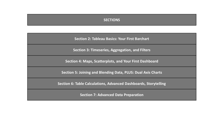
SECTIONS Section 2: Tableau Basics: Your First Barchart Section 3: Timeseries, Aggregation, and Filters Section 4: Maps, Scatterplots, and Your First Dashboard Section 5: Joining and Blending Data, PLUS: Dual Axis Charts Section 6: Table Calculations, Advanced Dashboards, Storytelling Section 7: Advanced Data Preparation
Data Conceptual Visualisation Section 2: Tableau Basics: Your First Barchart Connect to CSV Calc field Barchart Colours Labels Formatting Exporting
Data Conceptual Visualisation Section 3: Timeseries, Aggregation, and Filters Excel file Timeseries as measures Line chart Data extracts Timeseries as dimensions Shapes Aggregation Show-me Granularity Area chart Filter Highlighting Quick filter
Data Conceptual Visualisation Section 4: Maps, Scatterplots, and Your First Dashboard Data joins Hierarchies Map Filter on multiple sheets Circles on a map Dashboard: adding charts Scatterplot Dashboard: quickfilter Dashboard: layout Dashboard: filter action Dashboard: highlight action
Data Conceptual Visualisation Section 5: Joining and Blending Data, PLUS: Dual Axis Charts Join theory Calc field in a blend Dual axis charting Blending data Joining vs blending