Visualizing Passenger Flows on Metro: Insights from Tokyo Data
This paper visualizes the impact of transportation disruptions in Tokyo Metro using smart card data. It explores changes in passenger behavior after incidents and uncovers unexpected phenomena in crowdedness and flows, aiding in urban transport planning.
Download Presentation

Please find below an Image/Link to download the presentation.
The content on the website is provided AS IS for your information and personal use only. It may not be sold, licensed, or shared on other websites without obtaining consent from the author.If you encounter any issues during the download, it is possible that the publisher has removed the file from their server.
You are allowed to download the files provided on this website for personal or commercial use, subject to the condition that they are used lawfully. All files are the property of their respective owners.
The content on the website is provided AS IS for your information and personal use only. It may not be sold, licensed, or shared on other websites without obtaining consent from the author.
E N D
Presentation Transcript
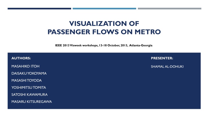
VISUALIZATION OF PASSENGER FLOWS ON METRO IEEE 2013 Visweek workshops, 13-18 October, 2013, Atlanta-Georgia AUTHORS: PRESENTER: MASAHIKO ITOH SHAMAL AL-DOHUKI DAISAKUYOKOYAMA MASASHI TOYODA YOSHIMITSUTOMITA SATOSHI KAWAMURA MASARU KITSUREGAWA
OUTLINE Abstract Introduction The aim of the paper Data Set Analysis of passenger flows Visualization of passenger flows Case study 1 Case study 1I Conclusion Future work References
ABSTRACT This Paper visualize the propagation of the effect of troubles and changes in transportation flows in a wide area using data on the Tokyo Metro extracted from a smart card system from March 2011 to April 2013. Their system enables users to not only explore changes in passengers actions after accidents or disasters but also to discover unusual and unexpected phenomena and explore their details and reasons.
INTRODUCTION Railway and metro systems in big cities often suffer delays and accidents. Natural disasters such as earthquakes and typhoons stop several lines. Events such as concerts and baseball games group thousands of people into the nearest stations. Understanding such changes quantitatively is important. Visualization of changes in the flows of people in a wide range of spatio-temporal space enables us to explore the influence of such phenomena.
THE AIM OF THIS PAPER First, they visualizes an overview of spatio-temporal crowdedness on a 2D HeatMap View. Second, they visualizes changes in passenger flows on a 3D RouteMap View using 3D colored bands.
DATA SET They use a large scale data set of travel records (two years worth) on the Tokyo Metro extracted from the smart card system. Each record consists of the origin, destination, and exit time. They estimate the probable route of each trip and then count how many passengers were on each section of each line for every 10 minutes. Average and standard deviation are calculated for discovering whether it is less or more crowded than usual.
ANALYSIS OF PASSENGER FLOWS They analyzed large scale log data covering almost all of the business area of Tokyo. It consists of 28 lines, 540 stations, and about one billion trips. There are several possible paths to travel from an origin station to a destination station. A smart card log contains information about where a passenger touched in and where and when he/she touched out. It does not include the entrance time and transfer stations information.
ANALYSIS OF PASSENGER FLOWS (CONT.) They want to find unusual phenomena that differ from the usual cyclical patterns of the passengers. They therefore accumulate a number of passengers who traveled a certain section in a certain time period and calculate their average and standard deviation.
VISUALIZATION OF PASSENGER FLOWS HeatMap View (Fig. 1) visualizes spatio-temporal crowdedness of sections. It uses x-axis for the timeline and y-axis for lines. The timeline is divided every 10 minutes. Each line is represented by different colors, and both directions (up and down) are treated separately. Each up/down line consists of sections (pairs of stations). The color code represents the crowdedness. Red represents higher crowdedness, and blue represents lower crowdedness.
VISUALIZATION OF PASSENGER FLOWS (CONT.) Fig. 1 (HeatMap View)
VISUALIZATION OF PASSENGER FLOWS (CONT.) RouteMap View (Fig. II) visualizes animated temporal changes in the number of passengers and crowdedness of each section. The number of passengers is represented by the height of stacked 3D bands, which consists of bands for two directions, on each section. Color represents the crowdedness. A bar on each station presents the number of passengers who exited from the station. Colors of bars also show the crowdedness.
VISUALIZATION OF PASSENGER FLOWS (CONT.) Fig. II (RouteMap View)
CASE STUDIES 1 (Before the earthquake) Fig. III
CASE STUDIES 1 (Just after the earthquake) Fig. IIII
CASE STUDIES 1 (After some lines restart) Fig. V
CASE STUDIES 1I (Before accident) Fig. VI
CASE STUDIES 1I (After accident) Fig. VII
CONCLUSION They proposed a novel system to visualize changes in flows of passengers in the Metro system using more than two years worth of data extracted from the smart card system. It enables them to explore changes in passengers actions after disasters, accidents, or public gatherings. Moreover, it helps them to discover unusual and unexpected phenomena and explore their details and reasons.
FUTURE WORK Automatic detection of unusual events and their reasons. Expand the system to simulate changes in passenger flows under manually specified accidents or events. This will supply very useful knowledge for improving services.
REFERENCES [1] I. Ceapa, C. Smith, and L. Capra. Avoiding the Crowds: Understanding Tube Station Congestion Patterns from Trip Data. In Proc. Urb- Comp 12, pages 134 141, 2012. [2] L. Sun, D.-H. Lee, A. Erath, and X. Huang. Using Smart Card Data to Extract Passenger s Spatio-temporal Density and Train s Trajectory of MRT System. In Proc. UrbComp 12, pages 142 148, 2012. [3] C. Tominski, H. Schumann, G. Andrienko, and N. Andrienko. Stacking-Based Visualization of Trajectory Attribute Data. IEEE Trans.Vis. Comput. Graph., 18(12):2565 2574, 2012.
