Workshop on Bi-Variate Data Analysis for Statistical Excellence
Explore challenging concepts in the standard AS 3.9 and effective teaching approaches, analyze borderline student work for grading decisions, discuss the nature of the relationship between emissions and energy consumption, train students to interpret data visually and contextually, and engage in activities to determine placement of trend lines.

Download Presentation

Please find below an Image/Link to download the presentation.
The content on the website is provided AS IS for your information and personal use only. It may not be sold, licensed, or shared on other websites without obtaining consent from the author.If you encounter any issues during the download, it is possible that the publisher has removed the file from their server.
You are allowed to download the files provided on this website for personal or commercial use, subject to the condition that they are used lawfully. All files are the property of their respective owners.
The content on the website is provided AS IS for your information and personal use only. It may not be sold, licensed, or shared on other websites without obtaining consent from the author.
E N D
Presentation Transcript
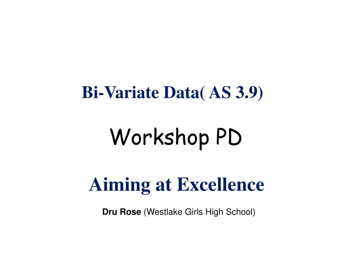
Bi-Variate Data( AS 3.9) Workshop PD Aiming at Excellence Dru Rose (Westlake Girls High School)
The Aims of this workshop Discuss some concepts in this standard that students appear to find difficult and share some possible teaching approaches Share some borderline A/M and M/E student work with our grading decisions and reasoning
2 Big ideas 1. The eyes have it 2. Context is everything What is the nature of the relationship between ??2emissions and energy consumption per person ? Can I use energy consumption to reliably predict ??2emissions? What are the limitations of my model?
How do we train students to use their eyes? Intially NO Technology(until they can identify key features of data and describe them in context.) Provide plenty of contrasting scatter plots with straightforward contexts
How do we train students to describe what they see in context? 1. Student voice: It s a decreasing trend Teacher modelling Rephrase: As the age of a car increases, there is a tendency for the price to decrease. We say there is a negative association between the price of a car and its age. (? ?????? ?)
How do we train students to describe what they see in context? 2. Writing templates with a prescribed structure TASVU Trend(Linear/Non-linear) Association(Positive/Negative) Strength (Strong/moderate/weak)- points are generally close to the trend/ fairly close/ there is quite a lot of scatter) Variation (in ?- does it change as ? ?????????? ) Unusual (outliers? Groups ?)
What do students appear to find difficult? 1. Scatter i.e.Variation in the vertical direction (In a box-plot variation is about spread in the x- direction )
X What does non-constant scatter really mean? As energy use per person increases, the variation in ??2 emissions seems to increase also.
What do students appear to find difficult? 2. Which variable goes on which axis? Outcome (predicted or response ) must go on the ? axis. Useful comparisons require comparing 2 predictor variables for the same outcome variable -which one gives the more precise prediction? We want to ask as ? increases,what happens to ?? - not the reverse
Start with data sets where it is obvious Tar content, nicotine content and weight are measured before the cigarette is smoked. The CO is emitted when the cigarette is smoked hence must be the outcome variable.
Consider situations where it might not matter Systollic BP (when heart muscle heart contracts) and Diastollic BP (when heart muscle relaxes between beats)
Move on to a rich multi-variate set Gapminder 2008 What might be a possible outcome variable? What might be possible predictor variables for that outcome? What are possible investigative questions we could pose?
What do students appear to find difficult? 3. What the trend equation tells us Linear Trend : Weight = 1.0766 * Height + -101.98 For every 1 cm increase in height, on average the weight of an American adult increases by about 1.08kg What does the -101.98 tell us? Wt of a baby of zero height - Is it a useful measure in this plot? - NO
What do students appear to find difficult? 4. The correlation coefficient: inappropriate use of r When does it tell us something useful and when should it not be used? Technology does what the user tells it to. Students need to continually ask questions: Is it sensible to put a line on a non-linear graph? Does the line I have added actually describe the trend in the majority of the data?
Anscombes Quartet : Same ? , ? , regression equation and r value 15 15 y = 0.50x + 3.00 r = 0.82 y = 0.50x + 3.00 r = 0.82 X 10 10 5 5 0 0 0 5 10 15 20 0 5 10 15 20 15 15 y = 0.50x + 3.00 r = 0.82 y = 0.50x + 3.00 r = 0.82 10 10 X 5 5 caution 0 0 0 5 10 15 20 0 5 10 15 20
What do students appear to find difficult? 5. Outliers and Groups They see outliers and groups where there are none They remove points or groups where they should not Key questions we want students to ask: Will this point (group) affect the position of the trend line(curve)? Will this point (group) affect the strength of the relationship? Do I need to do further analysis or further research or both?
Brunei Luxembourg iceland Why so different?
Outlier is clearly pulling trend line towards it- remove it to get an appropriate trend line for making a prediction
Not affecting trend line. No need to remove (tonnes/yr) ??2 emissions = 2.2706*Energyuse +0.6 Correlation = 0.87553 Tonnes of oil equivalent per yr (toe)
Making a forecast: What do we expect at Merit and Excellence level? For a country with energy use of 2 (toe pp/yr), ??2 emissions = 5.14 tonnes pp on average, but is likely somewhere between 2 and 8 tonnes per person. (around 60% relative error (5 3) so not that reliable) when energy use increases to 5 toe pp/yr. ??2 emissions = 11.95 tonnes pp on average, but is likely somewhere between 6.5 and 16.5 tonnes per person. A wider interval, not reliable (but actually a slighly smaller 42% relative error (12 5)) Limitation: Lack of data for energy consumption beyond 5 toe-should not extrapolate
Research needed only Chad
What do students appear to find difficult? 6. Confounding (lurking) variables The association we are observing may be an indirect relationship, where both the predictor and outcome variables are correlated with another related variable (called a confounder) With the big multi-variate data sets now available in INZIGHT students can now test out their thinking regarding potential confounding variables
What other variable might be connected with low life expectancy and a high number of children per woman? (or the reverse) Using INZIGHT we can quickly identify Chad as having the highest fertility rate. Why? Google question: Why does Chad have the highest number of children per woman?
What do we expect for MERIT? Some research to help explain the reason for the posed question A demonstration of understanding of the context and any statistical jargon used Some discussion on the reliability and usefulness of the forecast : e.g. limited range of x values, wide prediction interval? An overall conclusion which does come to a final decision in answer to the question.
What extra do we expect for Excellence? Sound research, referenced and integerated into the report Deeper thinking, beyond a formulaic approach Ability to cope with the unexpected No inappropriate use of statistical techniques and /or serious misunderstandings Discussion of the limitations of the analysis
")