Effective Strategies for Professional PowerPoint Presentations
In college, delivering presentations is common, requiring careful planning to ensure quality work. Follow essential rules for designing PowerPoint slides, such as using Slide Master, selecting backgrounds and colors wisely, and maintaining good contrast for readability. Learn the importance of aesthetics in slide design to enhance audience engagement and understanding.

Effective Strategies for Professional PowerPoint Presentations
PowerPoint presentation about 'Effective Strategies for Professional PowerPoint Presentations'. This presentation describes the topic on In college, delivering presentations is common, requiring careful planning to ensure quality work. Follow essential rules for designing PowerPoint slides, such as using Slide Master, selecting backgrounds and colors wisely, and maintaining good contrast for readability. Learn the importance of aesthetics in slide design to enhance audience engagement and understanding.. Download this presentation absolutely free.
Presentation Transcript
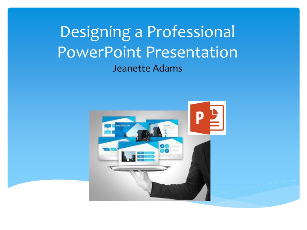
Designing a Professional PowerPoint Presentation Jeanette Adams
Introduction At College, you are often required to deliver small presentations As with any piece of work, planning is essential if you want to produce good quality work and avoid wasting time: o define the purpose of your presentation o Understand your audience and tailor your presentation to their tastes and expectations. o Research the subject and identify the key messages of your presentation o create an effective structure for your presentation o write the content and formatting your presentation The following slides provide some rules to follow when designing your PowerPoint slides
Rule 1 - Use the Slide Master Slide Master is a very useful tool to create slide templates. Slide Master can save slide layouts, including the background, colour, fonts, effects, bullets, etc. You can make changes to every current and future slide in your presentation by only adjusting the Slide Master. You can embed images and other graphics in Slide Master which will be visible (but cannot be changed)
Rule 2 Select Backgrounds and Colours Carefully Have a consistent colour scheme throughout your presentation. Contrast text colour with background colour - o Test colours on projected screen if possible, as it may look different than your monitor. o Lighting in the presentation room may effect how much contrast is displayed.
Bad Contrast and Color Fonts and backgrounds should compliment each other and be easy to read. The background color and font color should be distinctively different.
Good Contrast and Color When choosing background and font colors they should be complimentary. The font color should stand out on the chosen background color. Easy for audience to view!
Bad Backgrounds Backgrounds are important for aesthetics of your power point. They should never over power the words or information you are trying to display.
Bad Background When two properties must differ use fonts or colors to make the difference obvious. Backgrounds should not interfere.
Good Background When you are trying to portray a message when using clip art or images, always make sure they do not distract from the information.
Themes PowerPoint includes many themes that use bright colours, bold shapes, and textured backgrounds. Every theme won't be appropriate for every presentation, but you can probably find one that suits your content well. Here are a few examples:
Rule 3 - 5/5/5 To keep your audience from feeling overwhelmed, you should keep the text on each slide short and to the point. Some experts suggest using the 5/5/5 rule: no more than five words per line of text, five lines of text per slide, or five text- heavy slides in a row. Bulleted lists must be left aligned
Bad Bullets Bullets should be on the left hand side of the screen NOT the right. It is harder to read when they are lined up on the right.
Good Bullets Bullets should line up on the left. It is easier for the eye to follow from left to right. Well Done!
Rule 4 Use clear Fonts Use fonts that are easy to read avoid script fonts Stayaway from gimmicky fonts DONT USE ALL CAPS! Use 18-24 point size, with up to 32 point for titles Keeptypesizesconsistent Vary font for emphasis or to group words together. Use visually simple fonts. For a visually simulating appearance.
Rule 5 - Use Animations Sparingly When used sparingly animations can add to your presentation. For example, having bullet points appear as you address them rather than before can help keep your audience s attention. Appear has been used on this slide. What do you think? Being inundated with complicated animations and exciting slide transitions can become irritating however. Before including animations in your presentation, ask yourself: o Would this moment in the presentation be equally strong without an added effect? o Does it unnecessarily delay information? If the answer to either question is yes or even maybe leave it out
Rule 6 Use Transitions Sparingly Avoid using excessively complicated transitions. For instance, anything that makes it look like your presentation is shattering, blowing in the wind, or zooming around the screen is probably a bad idea. Before including transitions to your presentation, ask yourself: o Would this flow of the presentation be equally strong without a transition? o Does it unnecessarily delay the flow of the presentation? If the answer to either question is yes or even maybe leave it out There's no hard and fast rule for picking transitions just play around with them until you find one (and only one!) that highlights your content and layout. Fade has been used in this presentation. What do you think?
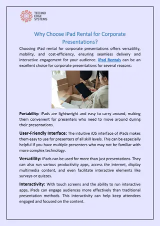
Rule 7 Include Appropriate Graphics/Charts/Multimedia Media should have a purpose and be high-quality; don t put it on if it doesn t add to your presentation. Balance text and graphics; pay attention to placement of the image Make sure your chart is legible and displays the right type of information If you have the data in Excel, copy and paste the chart from there Who will be watching your presentation? The same effects and funny clip art that would entertain a classroom full of young children might make you look unprofessional in front of fellow students and lecturers
Bad Graphics When using graphics, one good graphic will do better then several poor ones. Make good choices!
Good Graphics When choosing graphics they should relate to the information you are trying to portray. If someone could questionwhy you are using a graphic don t use it.
Bad Proximity In order for the eye to continue to move across the screen and View your chosen images and text, they should have close proximity. Otherwise the eye will stop in the wrong places.
Good Proximity When the proximity from the beginning to the end of your information is appropriate, eyes will move with the help of graphics.